Didatic 4

This book requires readers to open a piece of folded paper. In the paper there lies the word matriarch and a picuture. Matriarch means a woman who is the head of a family or tribe. The picture is a picture of a crown with the word queen in it. A queen represents a matriarch because it can be a mother of a king.

Didatic 3

The page requires readers to open a folded paper. The word on this page is exasperate. The definition of exasperate is to cause irritation or annoyance to. I drew a picture of a annoyed face to show the meaning of the word.

Didatic 2

The page on this book has a folded paper that requires you to open the paper and there you will discover and word. The word on this paper is afflatus. The definition of this word is a strong creatice impluse; a divine inspiration. I drew a picture of a lightbulb because it represents a idea. When getting inspired and a idea a lighted up light bulb usually represents that.

Color Harmony:Phase 1

Analogous by Erin Smith Glenn
Monochromatic by Basquiat
Complimentary by Irina Nakhova


The first photo is analogous because it’s showing colors that are very close to each other on the color wheel. The second photo is monochromatic because they are mostly the same color but have different tones. The last photo is complementary because it shows red and green which are complementary colors.


didactic 1

Didactic 1: Omnipotent.

This part of the book represents the word Omnipotent. I illustrated an eye. I drew an eye because an eye represents the sight and vision. Omnipotent has to do with the overwhelming dominance. I cut up a box and drew an eye because the eye can see everything that is going on around him. An eye also represents dominance because being a blind leader won’t work because in order to have complete control of every aspect you need to see and have visions of the future. Lastly dominance can put things in order.


Saturation Studies: Phase 3

Time: 2 hrs

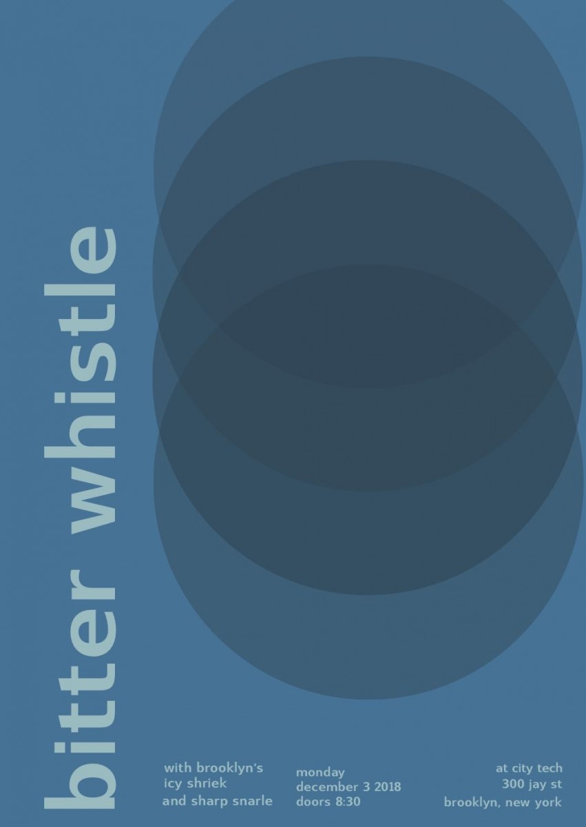
The temperature my group was cool, and we got the swiss poster called Pavement. My group decided to have the bitter whistle as our main word, and as our “featured bands” the names icy shriek, and sharp snarle. For a cool temperature you instantly think of blue, and especially of our words we wanted to have a blue poster. This particular poster didn’t use the font of “Universalis”, like how Professor Spevack’s was. Instead the other swiss font it had was called “Switzera”. The only thing i struggled with was that because it was the Switzera font for some reason I had to adjust the point size to what I thought was exact as the poster because it wasn’t exactly the same. Especially, since the word bitter whistle is longer than pavement.

Saturation Studies: Phase 2

These are guide colors that explains the mixture between two color and relationships.  There are three sets and each set has two rows, the  top is the original color and the bottom is for light colors that white color is added as well. This project is used with a Bristol paper and gouache paint. It took some time to get the function of mixing for a color and to be considerate of the proportion of paint used. To be honest, it was quite stressful but I did quite enjoy mixting and discovering colors.

Duration : 1-2 days (first day- 3-4 hours).

Color Interaction Parings: Phase 2

Shifting Value
Shifting value with color
Shifting hue
Shifting Hue and Value


This part of the phase took me a good two hours and a half to get done. It was a bit hard at first because I had to find out how to adjust different colors together and to make colors seem compatible. The last two was kind of hard for me too in a way because I didn’t understand the difference between the last two.

Didactic #1

The theme of this design will be focusing on the word “futile” and futile means something pointless, useless or incapable of doing something. So, I decided to design an character that might resemble to the topic with some significants element in the art piece. This art piece was made from printed paper cuttin in piece with the word “futile” on it and my drawing itself. After drawing the character, I took a chunck of pages, highlighted and cut it with the knifing tools. One side is covered with the chunky pieces with the word on it and the chunck pages were use to see what it through the open cut space.