Saturation Studies: Phase 4

This Project thought me a lot about warm and cool colors and how to represent them. It also thought me a lot about the different ways to combine colors to achieve each level of saturation and value. I also learned a lot about visual weight, balance, and symmetry. This was a very interesting project, one that I will look back on when creating future work.

Phase:1

Phase:2

Phase:3


Saturation Studies: Phase 3

  1. Garence.jspevackposter1

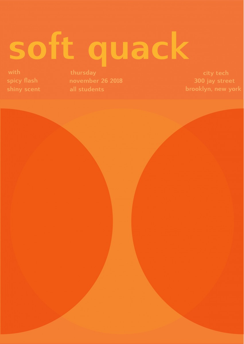
The color temperature or color scheme that was given to my group was Warm. we made a list of words used to describe our color temperature.  The words chosen would be used to create our band name. The words that we chose were Spicy and Hiss. Combined they become ” Spicy Hiss”. I decided to make this poster simple and bold. I chose the color Orange which is a warm color, for the background to give a warm feel. The word spicy should bold and hot, so I chose Hot pink,  a very warm color,  for the word Spicy. When thinking of the word hiss I think of a very settle color, I also want this color to fit in with the poster. I chose a muted Orange color for the word hiss. Together the colors of the poster really give it a warm feel and you can really hear the subtle hiss and taste the flaming hot explosions in your mouth.

Time: 2 hours 45 min


Value-Added Portraits: Phase 4 – Deliver

I learned a lot throughout this project. When presenting i got many feedback on my portraits and how to fix it, like my painting i should make my face lighter than the other parts of the clothes. For my lowkey portait it the colors of the background were hard to tell if its broad or lowkey.  I learned about broad, highkey and lowkey.

In phase 3 i changed my highkey portait to lowkey.

Phase 1

Phase 2

Phase 3


Saturation Studies Phase 4: Deliver

In this project i learned a lot about colors. In phase 1 we started out with a color wheel and slowly progressed to more colors.  In phase 2 we were required to paint and mix colors. Mixing the colors to get muted colors confused me a bit because the colors always comes out looking like a dirty green. But after practice and couple tries i got the colors to come out looking right. This project also used software on computers which i enjoyed. In the future i hope there will be more projects like this.

Phase 1

Phase 2

Phase 3

Value-Added Portraits: Phase 4 – Deliver

This project taught me that i need to get better with painting and using brushes. And also that i hate dealing with glue. There are many things i did during this project i wish i could have done differently, such as my planning and documentation.  I also wish that i didn’t have to see 15 cut out photos of myself. I think what’ll take away from this is that composition is just as important as the drawing aspect of it.

Phase 1

Phase 2

Phase 3

Value-Added Portraits: Phase 2

Broad range design, followed by Narrow (low key).

This first image was meant to be campy and more artistic, while the second piece is more grounded in reality.

hours spent, roughly 8