After reading, “The Magic and Logic of Color: How Josef Albers Revolutionized Visual Culture and the Art of Seeing“, I learned a lot about color and the many different ways it is perceived and the different ways you could interact with color. Josef Albers talks about how we don’t really know the full depth of color and all it has to offer. He explains how color to most people is experienced through how we perceive the world and how we use it to define things. Josefs believes to truly see and experience color, you must take a closer look at the things around you. You’ll start to notice how one and the same color can evoke countless readings and effects. Josef believes, through visual perception, there is a disparity between physical fact, how we perceive color through merely implied laws and rules of color, and physic effect, the effect color can have through vision and the through what you feel between the relationship of different colors.
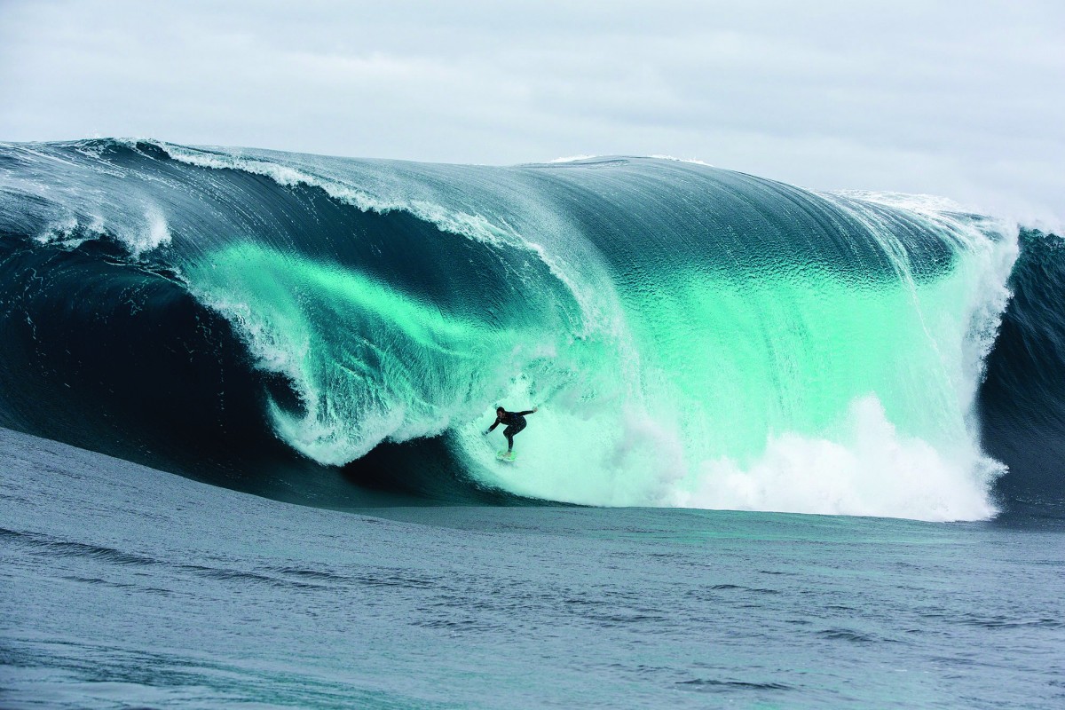
This image represents a monochromatic image because it only contains one color. The image has tinted colors located near the impact zone. The blue transforms into white. The image also shows tone progression from the color blue on the outside of the waves to the darker blue inside the barrel of the wave.
by Carol A. Analogous
This image represents an analogous image because it is an image created using colors that are near each other on the color wheel. An example would be a chart that shows gradients of a color. In the image above you see a gradient of the color red, orange, and yellow.
by Machi Complimentary
A complementary image is an image created using only colors that compliment each other. In the image above, the colors used were green and red. Green and Red are complimentary colors. They are colors that compliment each other.
This entire project, i would say, took me around an hour, it was fun to do designs for each color
For my partner in this project , Gary, I went with a deep dark blue. While getting to know him, he said his favorite color was black, but his personal interests were vibrant and held a lot of emotion in them. A music style he said he liked was jazz, which Immediately associated with the song ‘ rhapsody in blue’. so I chose this particular shade of blue because when you first glance at it, it’ll look black, but looking at it more you’ll see that it’s blue, which I hope can visually express how when you first meet Gary he might appear as g o t h but he’s actually really cultured and talented
“In visual perception a color is almost never seen as it really is — as it physically is. This fact makes color the most relative medium in art.”
First, it should be learned that one and the same color evokes innumerable readings. Instead of mechanically applying or merely implying laws and rules of color harmony, distinct color effects are produced-through recognition of the interaction of color-by making, for instance, two very different colors look alike, or nearly alike.”
– Josef Albers
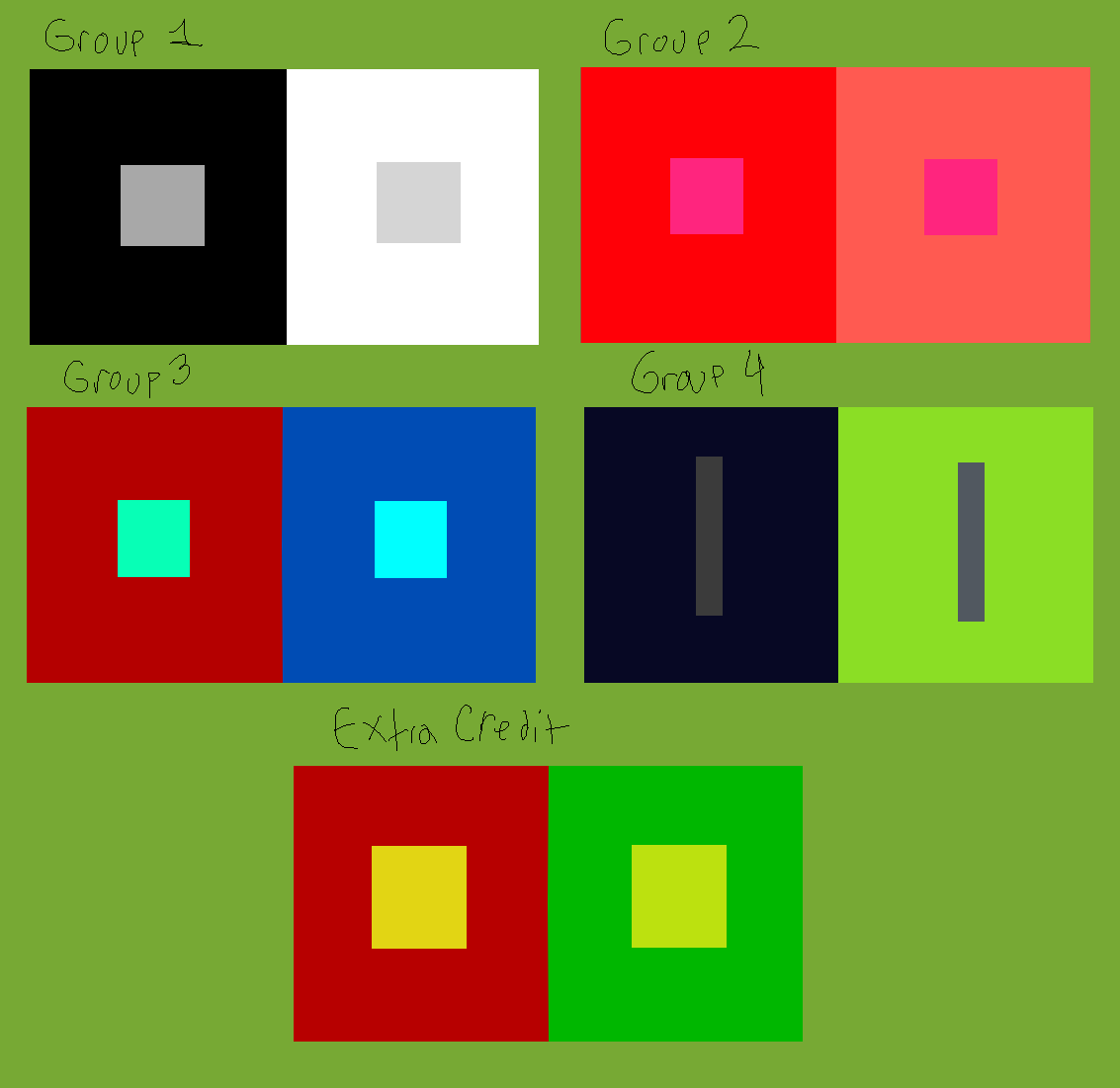
Josef Albers mentions that we cannot see the color’s true self. That’s what make colors so special. When colors are placed with another color, the colors you see may slightly change lighter or darker, the humans eyes believe its a different color when its the same. Therefore no human eyes can see colors properly.
Based on the articles presented, it seems that color, which was once thought of as a constant, is in fact, relative. According to Josef Albers in The Magic and Logic of Color;
“In visual perception a color is almost never seen as it really is”
So color is subjective, meaning in one way or another we all see color a little bit differently than the person next to us. from what I was able to gather based on my very small knowledge of color theory, it appears that having your color, lets say a green, beside or surrounded by a darker color, preferably one very different from it, such as a black, can make the color look darker, than if it had a white background, and comparing them, it almost tricks your brain into seeing one darker or lighter than the other.