This project was a fun project about colors. I learnt a lot about colors and you cannot see them how they really are. There’s more to colors than what you can see. In phase 2, i learned that complementary colors affect the way we see other colors when put together. Overall this was a nice project to learn about colors and how our eyes see different colors.
Color Interaction Studies: Phase 3
My partner was Saalik and i chose a lion for him. Lions are calm and laid back animals but when they’re hungry they’ll go for it, I believe Saalik is calm and laid back but when it comes to music, he strives for it similar to a lion getting what their prey. As for the color it was his favorite color and it also is a calm color. As for the middle blue, it was a shared color.
Color Interaction Studies: Phase 2
Spent around 2 hours on this.
Project#5:Color interaction pairings: Phase 1
After reading, “The Magic and Logic of Color: How Josef Albers Revolutionized Visual Culture and the Art of Seeing“, I learned a lot about color and the many different ways it is perceived and the different ways you could interact with color. Josef Albers talks about how we don’t really know the full depth of color and all it has to offer. He explains how color to most people is experienced through how we perceive the world and how we use it to define things. Josefs believes to truly see and experience color, you must take a closer look at the things around you. You’ll start to notice how one and the same color can evoke countless readings and effects. Josef believes, through visual perception, there is a disparity between physical fact, how we perceive color through merely implied laws and rules of color, and physic effect, the effect color can have through vision and the through what you feel between the relationship of different colors.
Color Interaction Parings: Phase 3
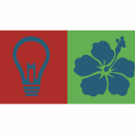
So for this design process, my partner chose a light bulb (on the left) to represent how i am a creative thinker that’s always coming up with new ideas so the light bulb always go off in my head. She chose the color red because i am very energetic and loud, basically more of an extrovert than introvert. For her, I chose an Hawaiian flower because its soft and sweet, and its her favorite flower so i wanted to incorporate that into the work. I chose green because of her personality. She’s calm and always at peace with things so i thought of a color that’s positive. The blue represents both of us because we both liked photography, so we associated that color with someone who’s caring and always looking out for their close friends so we thought of that color. The hours spent on this was about 45 minutes.
Color Interaction Parings: Phase 1
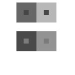
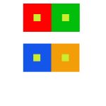
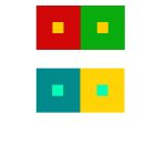
During my observation, i saw that the colors were complement to each others and that how the background color changes how the center object will appear with an illusion. That the hue will change between the two, like one will appear more warmer, while the other will seem more lighter. It also talks about how distinct color effects are produced-through recognition of the interaction of color-by making, for instance, two very different colors look alike, or nearly alike.
Color Interaction Parings: Phase 3
This entire project, i would say, took me around an hour, it was fun to do designs for each color
For my partner in this project , Gary, I went with a deep dark blue. While getting to know him, he said his favorite color was black, but his personal interests were vibrant and held a lot of emotion in them. A music style he said he liked was jazz, which Immediately associated with the song ‘ rhapsody in blue’. so I chose this particular shade of blue because when you first glance at it, it’ll look black, but looking at it more you’ll see that it’s blue, which I hope can visually express how when you first meet Gary he might appear as g o t h but he’s actually really cultured and talented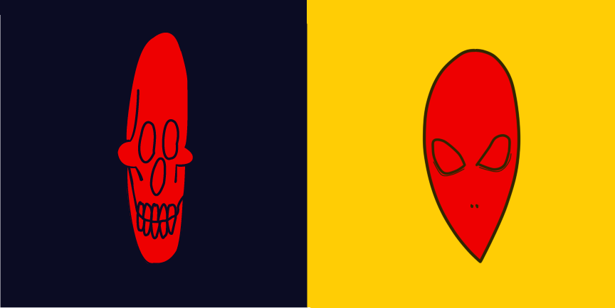
Color Interaction Parings: Phase 4
Creating an illusion with color was quite no a bad idea, I did enjoy learning the values of color, its illusion and discussing about the psychology between each color and what does it affect of people. I think one thing I could’ve done a bit better was for project #3 and maybe I could’ve add a little more details for the design while I was working in adobe illustrator. So far, I think I’ve learned a lot that i didn’t that coloring can also create a illusion in our perspective and I did mostly enjoy working with my partner (Rose) and discussing between our thoughts of character design.
Color Interaction Parings: Phase 3
This project will be focusing on animal theme that compares between our persona’s description or our ways of describing our characters. Rose and I decided to choose an animal theme that we have to think of an animal that could describe each other in general or basically about our own main character design. Before we started that, we had to choose as well the color that describes us first and then we come up with an idead of what we can place in our boxes. Rosa chosed an phoenix for the describtion of my fictional character and I chosed a chameleon for her fictional character as well.
Duration: 5-10 minutes.
Color Interaction Parings: Phase 1
“In visual perception a color is almost never seen as it really is — as it physically is. This fact makes color the most relative medium in art.”
First, it should be learned that one and the same color evokes innumerable readings. Instead of mechanically applying or merely implying laws and rules of color harmony, distinct color effects are produced-through recognition of the interaction of color-by making, for instance, two very different colors look alike, or nearly alike.”
– Josef Albers
Josef Albers mentions that we cannot see the color’s true self. That’s what make colors so special. When colors are placed with another color, the colors you see may slightly change lighter or darker, the humans eyes believe its a different color when its the same. Therefore no human eyes can see colors properly.


