Color Interaction Pairings: Phase 1

I learned that color was never seen as the greatest medium in art when it actually is.  In Josef Albers  Interaction of Color, he emphasizes on not only on seeing color, however also feeling the relationships between colors. According to an article about Josef Alber’s theory on color  The Magic and Logic of Color:

“Practical exercises demonstrate through color deception (illusion) the relativity and instability of color. And experience teaches that in visual perception there is a discrepancy between physical fact and psychic effect.”

Another point that Josef Alber talks about that I agree with and learned a bit from, is that our brains are conditioned to just look at something and point out the obvious, very literal things we see instead of really considering and admiring the richness of seeing. “And when he talked about visual perception, he meant something much more profound than just the way we look at the word – he would stop and look at the world look at the smallest object, smallest event, and see through it in a deep kind of way.”

Project#5:Color interaction pairings: Phase 4


Project#5 taught me a lot about hue and value changes and how you can use them to create an illusion making it as though color can be seen as two different colors. I also learned how color can represent different sets of emotions and personality. Trying to figure out the color that could represent my partner for this project was challenging, but also quite fun, I was able to learn a lot about my fellow student.  I found this project to be very interesting and useful for when I create any future work of my own. It allowed me to learn a new way to communicate using color.

Phase#1

Phase#2

Phase#3

Project#5:Color interaction pairings: Phase 3

Time:3 hours


Step 1: Color Research Process

Sam’s favorite color:

Red, Yellow, and Blue

Fav food: Mac and Cheese

Likes space and collecting rocks

Likes to Draw

Likes alternative music

Most active during the night likes the night time.

He is very funny and is comfortable to be around.


Step 2: Color Mockup

Orange Yellow is the color I chose to represent Sam.

This color represents the warmness that surrounds Sam

Step 3: Icon research

Sam’s interest for space and the night sky gave me the idea of making his icon be a little happy alien.

Step 4: Icon Mockup

I chose an alien to represent Sam to show his love of space and the night time. I chose the colors orange-yellow to represent the warmth Sam’s presence and personality brings when you get to know his. At first, Her energy starts off as a yellow and then gradually becomes a strong hot orange. This is because at first, it might be a little awkward but, he still is inviting and over time you begin to become more comfortable.

Color Interaction Parings: Phase 4

The things i learned for this project is about color mostly in which i enjoy. Knowing about the hue and what color complements each others. I learned about how to make the illusion of one color that’s the focus look different because of the background color that cause an effect of the focus color to look either more warmer or cooler. In which they pair next to each other where some saw the illusion while others struggle. The thing i could have done better with this project is that making the phase 3 symbol different and its color to. I would apply this to my daily life in case i visit a museum and some of the art piece has the same effect. I would know the knowledge of why is that and the reason behind it.

Phase 1

Phase 2

Phase 3

Color Interaction Parings: Phase 2

Since there is an illusion part of this, i had a hard time seeing this because of the background color that really effects what the square in the center looks like in which  the illusion is one supposed to look warmer while the other looks cooler. I spent at least 35 minutes on this.

Color Interaction: Phase 3

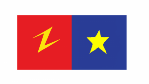
Ezra and I Choose and Lighting Bolt and a Star. Since we both like similar things like Pizza and Speedsters are symbols kind of complment each other. Ezra is a very straight forward people so I gave him bright Red because red to me is a color that shows some one who’s tenacious. Also Red is the color of his favorite food Pizza and his favorite superhero The Flash. I choose Yellow in the middle because the colors complment each other very well as the lighting bolt really makes it pops out.

Color Interaction Parings: Phase 2

Shifting Value (with color)
Shifting Value
Shifting Hue, Not Value
Shifting Hue and Value

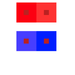
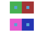
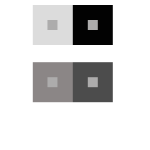
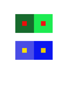
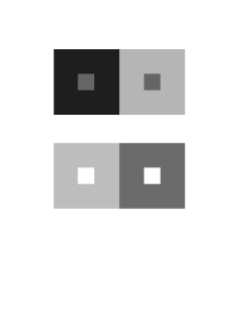
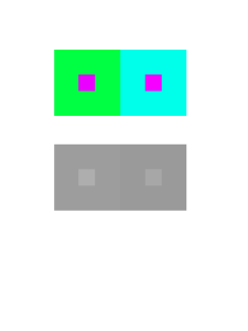
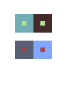
These Images were re-colored in Photoshop. The objective of this was to cause an illusion that the the middle square are the same color value. The bigger color is suppose to distract you from the smaller squares by using light and dark tone which causes the illusion. Number 1 is Color in Value. You can see that the larger squares are the same color but didn’t values. The bottom two square one Blue is more pure and the the other one has a mix of white. Number two is Shifting Hue as the green and baby blue are hue leading towards the cool colors. Number 3 is Shift in Value with gray coloring. You can see the different values of grey like white and black. And Number 4 is Shift in Hue and Value. As you see the Value of the colors are very mutend. Mixed with black.

Color Interaction Parings: Phase 1

Base on the article “Color Psychology: How Color Meanings  Affect Your Brand by Nicole Martins Ferreira” it states “Color plays an important role in how your brand is perceived. Whether you’re a fashion brand trying to connect to a youthful audience or a medical supplies store trying to strengthen customer trust, you can study color meanings to help you better attract and connect to your ideal customer. Color psychology can be used to help build a strong, relatable brand. In this article, we’ll explain what color psychology is and educate you on the color meanings for the most popular colors used.”

This quote shows that color plays a big role in life. If you want to do anything like making games ,dancing ,make up etc. People must like what there looking at. It must draw people in to be interested in your work.

Color Interaction Parings: Phase 4

I liked this project the most because it allowed me to freely illustrate something, with somewhat loose guidelines as to what the personalized image would look like, it was fun to relax with a drawing for once.

I learned that i’m a Yellow, and that i’m probably always gonna stick with the primary color as my main source of inspiration. For the next project i want to be as in control as possible, and try to create something that i would even want to put in a portfolio. I’m happy with the way this project came out.


Color Interaction Parings: Phase 1

Color Interaction Parings: Phase 2

Step 4: ICON MOCKUP

Color Interaction Parings: Phase 3