Cover Letter

300 Jay St, Brooklyn, NY 11201

12/19/18

fullname

title

address

Hi, Recipients name:

I’m writing to you in regards to your gallery, and propose an art instillation based on my work centered around the theme of altered books, inspired by Tom Phillips work, ‘A Humument’. I am an art student, currently studying communication design at city tech. My personal work, and pieces created within my altered book, both relate to my interest in illustration and love for texture within a 2D space.

My inspiration includes pieces, such as significant words, I’ve discovered while reading through text, then followed by an illustration depicting said word, for example ‘Weal , Shunned, Afflatus, and Osmosis‘ which will all be linked.  For each piece I work on, my technique varies, for some I use slow careful line work, trying to capture the weight of each mark, while others are more quick and tightly drawn. My goal is to use this method of a glossument (finding a word, and providing its definition via blog post, then to later visually show the word) as a means to branch out as an artist.

Sincerely yours,

okay

Color Harmony: Phase 2

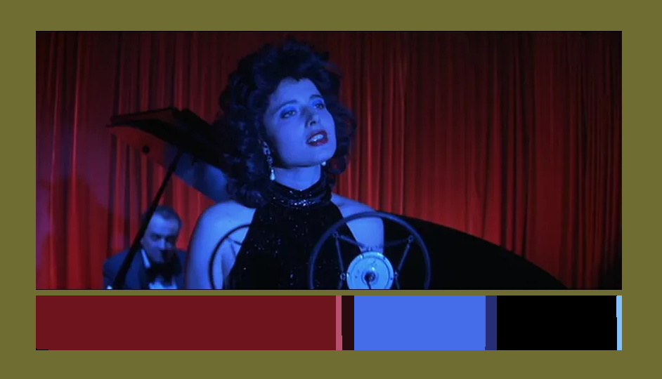
still from the movie Blue Velvet directed by David Lynch. Of Dorothy singing at a club.

Using the same colors from a still in a movie, and using it in a different medium can translate the emotion from the scene into your new image. I might try this again later with another piece.

20 minutes

Color Interaction Parings: Phase 4

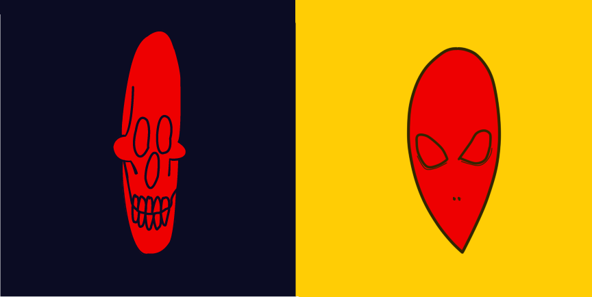
I liked this project the most because it allowed me to freely illustrate something, with somewhat loose guidelines as to what the personalized image would look like, it was fun to relax with a drawing for once.

I learned that i’m a Yellow, and that i’m probably always gonna stick with the primary color as my main source of inspiration. For the next project i want to be as in control as possible, and try to create something that i would even want to put in a portfolio. I’m happy with the way this project came out.


Color Interaction Parings: Phase 1

Color Interaction Parings: Phase 2

Step 4: ICON MOCKUP

Color Interaction Parings: Phase 3

Saturation Studies: Phase 4

This project taught me the most so far, i’ve never really studied colors, or color theory, and i went in knowing very little.  I think from what i learned, it can help me better understand the themes that i repeat on in my personal work. For this project , i think i could have done phase 2 a little neater? maybe i should’ve just used more tape, but overall i’m pretty content with everything done.


Phase 1: Discover

Phase 2: Define

Phase 3: Develop

Saturation Studies: Phase 3

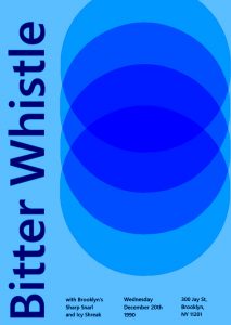
the  prompt we were given was ‘Cold’, so we went with band name that would showcase that, we all chose ‘Bitter Whistle’ because not only did it match our prompt, but i feel like you can almost feel it, i would describe it more as a cold wind. We also chose Icy Shriek and Sharp Snarl, to match.  To further evoke this feeling of a cold temperature, i went with lighter blues, and a navy blue for the text. While working on the poster, what i struggled with was the circular design. I wanted it to be near black in the center, but i couldn’t figure out how.

Color Harmony: Phase 1

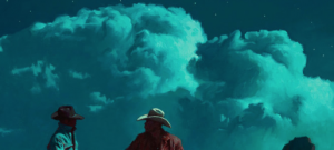
Monochromatic Mark Maggiori :shifting color from a pale teal, to a dark, muted blue from light to dark

post altogether took maybe 15 minutes?


Analogous vibrant reds paired with oranges and light yellows, and a small about of a dark red. red, orange, and yellow are next to each other.


Near- Complementary blue velvet strong reds, with blues and purples reds complementary is green, but blue is still near it, so they go together.

Color Interaction Parings: Phase 3

This entire project, i would say, took me around an hour, it was fun to do designs for each color

For my partner in this project , Gary, I went with a deep dark blue. While getting to know him, he said his favorite color was black, but his personal interests were vibrant and held a lot of emotion in them. A music style he said he liked was jazz, which Immediately associated with the song ‘ rhapsody in blue’. so I chose this particular shade of blue because when you first glance at it, it’ll look black, but looking at it more you’ll see that it’s blue, which I hope can visually express how when you first meet Gary he might appear as   g o t  h   but he’s actually really cultured and talented

Color Interaction Parings: Phase 1

Based on the articles presented, it seems that color, which was once thought of as a constant, is in fact, relative.  According to Josef Albers in The Magic and  Logic of Color;

“In visual perception a color is almost never seen as it really is”

So color is subjective, meaning in one way or another we all see color a little bit differently than the person next to us. from what I was able to gather based on my very small knowledge of color theory, it appears that having your color, lets say a green, beside or surrounded by a darker color, preferably one very different from it, such as a black, can make the color look darker, than if it had a white background, and comparing them, it almost tricks your brain into seeing one darker or lighter than the other.

Didactic four

Here, we can see a woman, loosely resembling the Virgin Mary in a contemporary style, weeping, surrounded by a red halo, and next to a heart, with a yellow bored around it, and thin blue, vaguely gothic archways in its corners. This piece is centered around the word ‘Afflatus’ meaning a divine creative impulse or inspiration, and can be seen above. In a way this piece captures the definition, its Devine inspiration is the Devine.

Marker, pen