Didactic three

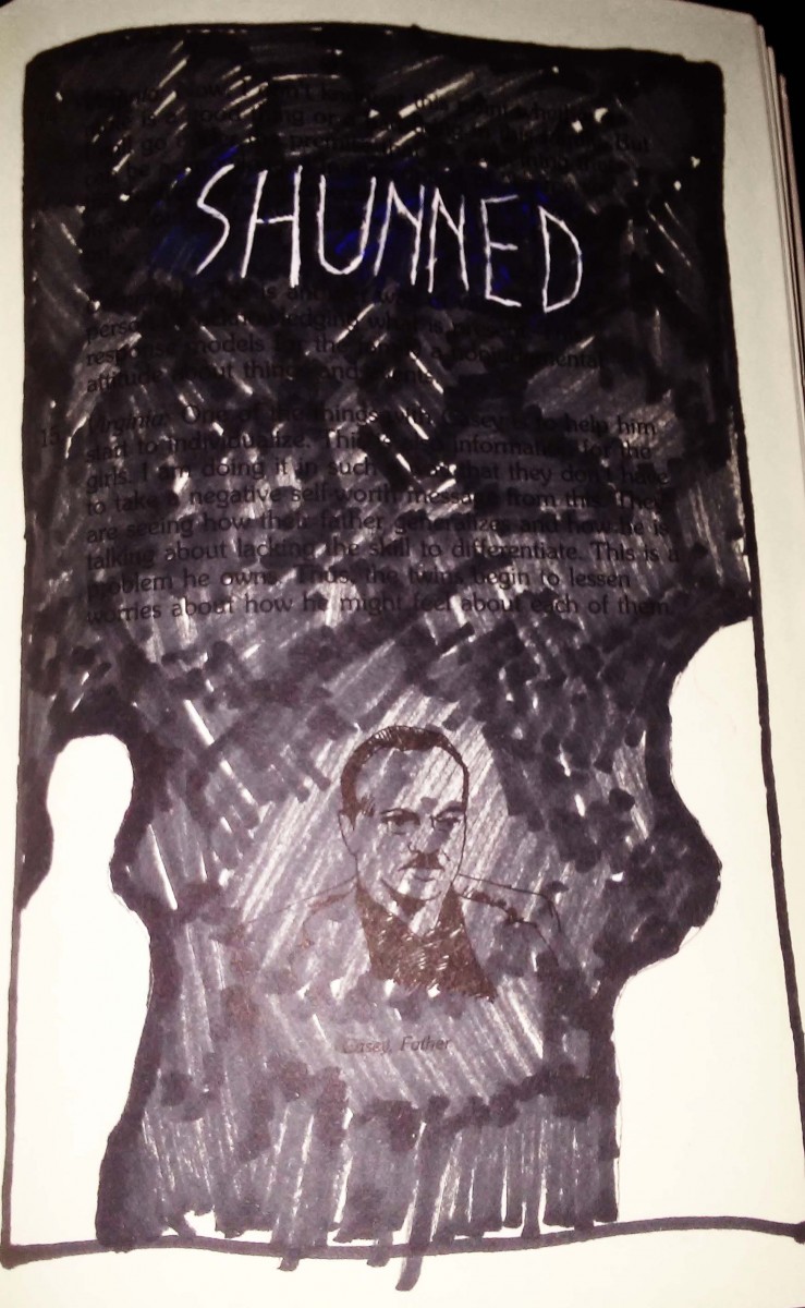
This piece, entitled ‘Shunned’ shows 3 figures, one in the background, one in the midground another in the foreground. Directly above the middle figure is the word ‘Shunned’ written in large letters, and it is this man that is trapped between the two blank figures, since he is the one being shunned, combined with the use of a dark heavy marker this artist further tries to fully direct the viewers attention toward the figure, and also way from it.

white gen pen, Marker, Pencil

Didactic two

This piece centers around the definition of ‘Weal’ that which is best for someone or something. The illustration depicts ole figures linking hands and forming a circle around the word, and the original text featured in the book. These figures come together in a supportive circle, much like other illustration featuring of people on earth standing together holding hands.

ink, watercolor

Value-Added Portraits: Phase 4 – Deliver

This project taught me that i need to get better with painting and using brushes. And also that i hate dealing with glue. There are many things i did during this project i wish i could have done differently, such as my planning and documentation.  I also wish that i didn’t have to see 15 cut out photos of myself. I think what’ll take away from this is that composition is just as important as the drawing aspect of it.

Phase 1

Phase 2

Phase 3

Value-Added Portraits: Phase 2

Broad range design, followed by Narrow (low key).

This first image was meant to be campy and more artistic, while the second piece is more grounded in reality.

hours spent, roughly 8

Didactic one

Ii wanted to use both definitions of the word to help guide me with this visual. The first definition being diffusion. and the second being a gradual assimilation of ideas.

Using the yellow paper, i like to think of it as Osmosis’ origin. This is where the word began or idea, however in the middle of the page, this paper turns white, signifying a change in origin, somewhere different, for this idea to pass through, only to come back out into it’s original space.

acrylic and marker on paper 

Sound Visualization Mashup: Phase 4

This project was pretty fun, it was really nice to mix art and music together, into almost one medium. I think the songs that were chosen were nice, but i do kind of wish i chose my own music, maybe i would have been able to create better designs. I think my biggest struggle with this project was time, i had so many issues with photoshop, and how to set everything up, it was a little annoying at first but i’m glad i know how to animate on photoshop now. If i could go back and fix one thing it would maybe be the animation, i would have really like to have made the lighting sync up wit the staccato beats, but i didn’t have time, otherwise i’d say i’m content with the project. Maybe for the next project i’ll try to personalize it more.

Phase 1: Discover

Phase 2: Define

Phase 3: Develop