Color Interaction: Phase 3

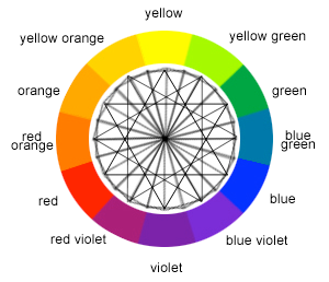
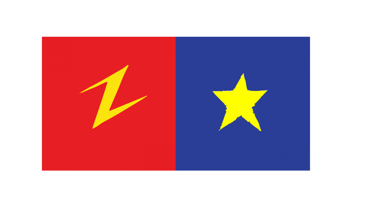
Ezra and I Choose and Lighting Bolt and a Star. Since we both like similar things like Pizza and Speedsters are symbols kind of complment each other. Ezra is a very straight forward people so I gave him bright Red because red to me is a color that shows some one who’s tenacious. Also Red is the color of his favorite food Pizza and his favorite superhero The Flash. I choose Yellow in the middle because the colors complment each other very well as the lighting bolt really makes it pops out.

Color Interaction Parings: Phase 2

Shifting Value (with color)
Shifting Value
Shifting Hue, Not Value
Shifting Hue and Value

These Images were re-colored in Photoshop. The objective of this was to cause an illusion that the the middle square are the same color value. The bigger color is suppose to distract you from the smaller squares by using light and dark tone which causes the illusion. Number 1 is Color in Value. You can see that the larger squares are the same color but didn’t values. The bottom two square one Blue is more pure and the the other one has a mix of white. Number two is Shifting Hue as the green and baby blue are hue leading towards the cool colors. Number 3 is Shift in Value with gray coloring. You can see the different values of grey like white and black. And Number 4 is Shift in Hue and Value. As you see the Value of the colors are very mutend. Mixed with black.

Color Interaction Parings: Phase 1

Base on the article “Color Psychology: How Color Meanings  Affect Your Brand by Nicole Martins Ferreira” it states “Color plays an important role in how your brand is perceived. Whether you’re a fashion brand trying to connect to a youthful audience or a medical supplies store trying to strengthen customer trust, you can study color meanings to help you better attract and connect to your ideal customer. Color psychology can be used to help build a strong, relatable brand. In this article, we’ll explain what color psychology is and educate you on the color meanings for the most popular colors used.”

This quote shows that color plays a big role in life. If you want to do anything like making games ,dancing ,make up etc. People must like what there looking at. It must draw people in to be interested in your work.

Color Harmony: Phase 1

This is Monochromatic By Olivier Degrace

You can see light and dark shades of blue

This is Analogous By Tanya Roberts

The blue is tuning into hot pink

This is Complementary By Mauro Moroni

the blue and orange are complementary colors

Value-Added Portraits: Phase 4 – Deliver

I’ve learn a lot about tone in color during this project. How to focus on something in a picture just by using light and dark tone. I’m not really used to painting so this is a new experience for me. This is one of the Projects I enjoyed the most because I’ve see art a lot different then I use to.

Links:

Phase 1:

https://openlab.citytech.cuny.edu/rosenspevackfylcf18/2018/11/05/value-added-portraits-phase-1-5/

Phase 2:

https://openlab.citytech.cuny.edu/rosenspevackfylcf18/2018/11/05/phase-2-define-completed-collages-2/

Phase 3:

https://openlab.citytech.cuny.edu/rosenspevackfylcf18/2018/11/12/value-added-portraits-phase-3-3/