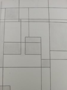
Here you have one stable and ambiguous figures. It took me a few minutes to do. I was inspired by the subway wall tiles where it’s all perfect and squares. So I wanted to incorporate that for the stable figure as one somewhat perfect square. For the ambiguous, I wanted to break that perfection and make it all distorted while adding new lines and shapes. This phase relates the other phase where we had to take pictures of stable and ambiguous and now we have to sketch it out for more understanding of it.

Ways of Seeing – FYLC Fall 2018
First Year Learning Community


Both of your images are very relatable! By taking a glimpse out of either one, I was able to see their relationship. From my perspective , the comparison between the two creates symbolism. Looking at this made me feel as though you’re trying to say, “everything is an extension of something else.” It is interesting that this was inspired by subway wall tiles. Great post!