
For this last project I worked on, I really enjoy it with finding some inspiration for my cover, looking at pictures that has monochromatic, analogous, and complementary. I can apply this for any future projects I have so I can look back on what I did. I could have done different is the pages for my book. I would have use a different design and maybe add some color to it.
Color Harmony: Phase 3
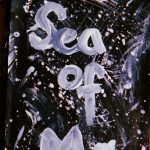
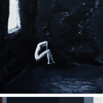
So for my book cover, I decided to use the sub-dominant color as the dominant while the main color is sub, but kept the colors in there. The painting was a good inspiration for my book cover because the theme I have was dark so I wanted to find a painting that help express it and the mood. The hours I spent on this was a good hour.
Color Interaction Parings: Phase 4
The things i learned for this project is about color mostly in which i enjoy. Knowing about the hue and what color complements each others. I learned about how to make the illusion of one color that’s the focus look different because of the background color that cause an effect of the focus color to look either more warmer or cooler. In which they pair next to each other where some saw the illusion while others struggle. The thing i could have done better with this project is that making the phase 3 symbol different and its color to. I would apply this to my daily life in case i visit a museum and some of the art piece has the same effect. I would know the knowledge of why is that and the reason behind it.
Color Interaction Parings: Phase 2
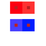
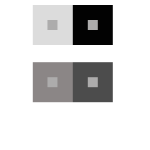

Since there is an illusion part of this, i had a hard time seeing this because of the background color that really effects what the square in the center looks like in which the illusion is one supposed to look warmer while the other looks cooler. I spent at least 35 minutes on this.
Color Interaction Parings: Phase 3
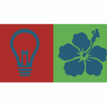
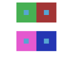
So for this design process, my partner chose a light bulb (on the left) to represent how i am a creative thinker that’s always coming up with new ideas so the light bulb always go off in my head. She chose the color red because i am very energetic and loud, basically more of an extrovert than introvert. For her, I chose an Hawaiian flower because its soft and sweet, and its her favorite flower so i wanted to incorporate that into the work. I chose green because of her personality. She’s calm and always at peace with things so i thought of a color that’s positive. The blue represents both of us because we both liked photography, so we associated that color with someone who’s caring and always looking out for their close friends so we thought of that color. The hours spent on this was about 45 minutes.
Color Interaction Parings: Phase 1
During my observation, i saw that the colors were complement to each others and that how the background color changes how the center object will appear with an illusion. That the hue will change between the two, like one will appear more warmer, while the other will seem more lighter. It also talks about how distinct color effects are produced-through recognition of the interaction of color-by making, for instance, two very different colors look alike, or nearly alike.
Color Harmony: Phase 2
So i found this image based off my book i design. My theme is dark so i wanted to find an image that represents it more. So i discover this artist and her work and i like the dark colors that she included and the idea of her showing what is like to have depression and anxiety. This color reference will be use in my book and any of future ideas i have, i can always come back to this. I spend about 25 minutes on this project alone.
Color Harmony: Phase 1
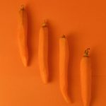
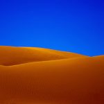

So the first image you see is carrots that are peeled and lined up. This is monochromatic because you can see the difference in the shade of orange and this is caused by the shadow of the carrots. Second image you see next is the desert that is purely saturated to show the contrast between the sand and the sharp blue sky. This is complementary because blue is complement to orange. The last image is analogous because the red, orange, and yellow is together just like in the color wheel.
Saturation Studies: Phase 4
For this project was slightly more challenging, but not impossible. For the color wheel, i had fun with choosing the topic of roses in different colors. For the painting, it was cool to mixed colors to get saturated, desaturated, and muted colors in each row. In the future, i would apply my painting skills to mixed colors i might not have in the kit, and used photoshop for future assignments. For the painting, i could blended more better to be more accurate. The poster was easy enough and i liked that i can make up my own name. Overall, this project was good, but won’t do again though.
Saturation Studies: Phase 3

So for this project, the main name is Luscious Fragrance because the topic me and my partner had was cool so we chose this name to help represent “cool.” So the colors you see below are in the cool side with the vibrant blue and violet. For colors, i wanted to keep the colors and its shape since it helps represent the idea. The hours spend on this was about 3 hours at most.

