This project was a mix bag for. I like how got to make a new friend during the project. Learn his likes and dislikes and also get portray him in my own why. But doing art digital I still have to get use to doing that. I’m so use to hand drawing all of my work. Hopefully it will get better in the future.
Color Harmony: Phase 2
By: ContempoGallery
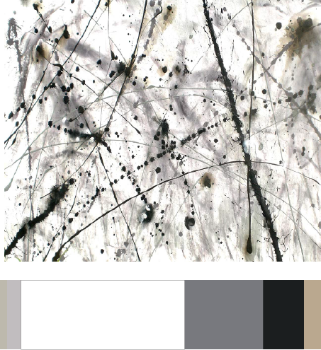
I used this painting because it relates to my theme. I found this painting on google when i was looking at splatter artwork. In my book majority of my pages were painted black similar to blackout poetry and has a white paper with the drawings inside. I want to make my book cover with white with a bit of splatter paint on it. I also chose these colors because in my book majority of the color is black and white with some muted colors. I spent around 30 minutes.
Color Interaction: Phase 3
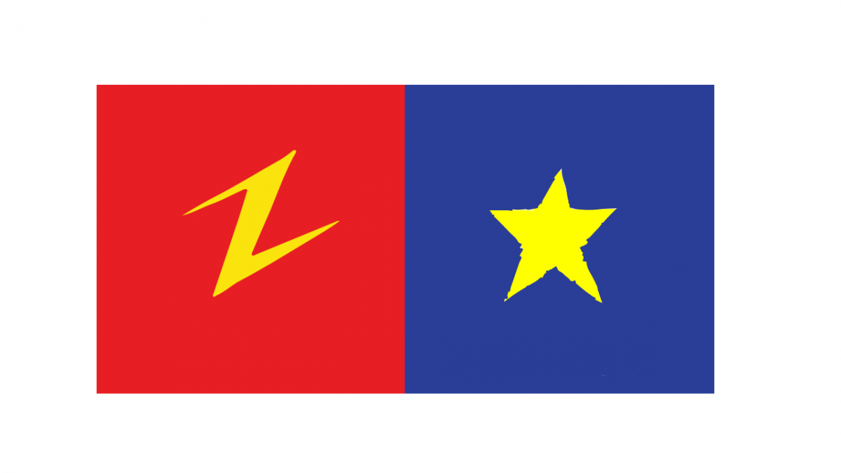
Ezra and I Choose and Lighting Bolt and a Star. Since we both like similar things like Pizza and Speedsters are symbols kind of complment each other. Ezra is a very straight forward people so I gave him bright Red because red to me is a color that shows some one who’s tenacious. Also Red is the color of his favorite food Pizza and his favorite superhero The Flash. I choose Yellow in the middle because the colors complment each other very well as the lighting bolt really makes it pops out.
Color Interaction Parings: Phase 2
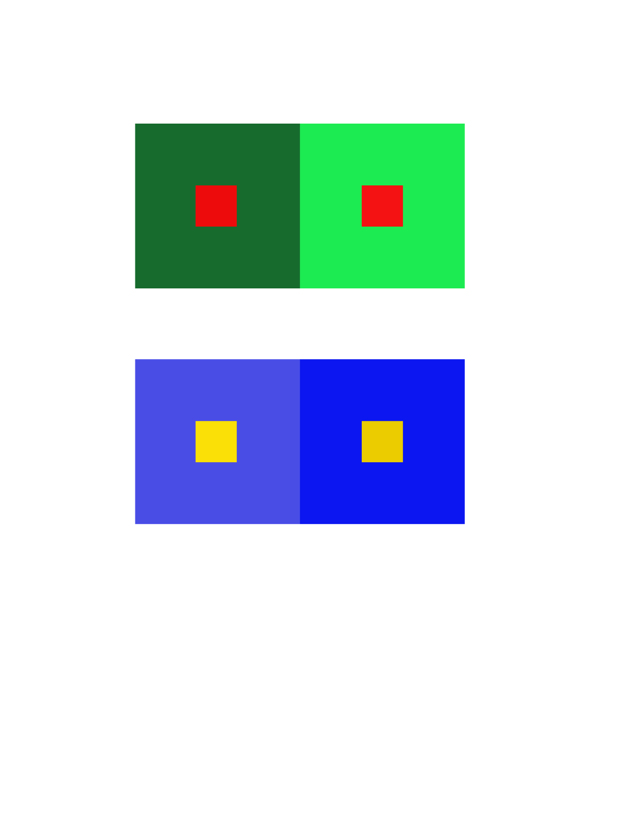
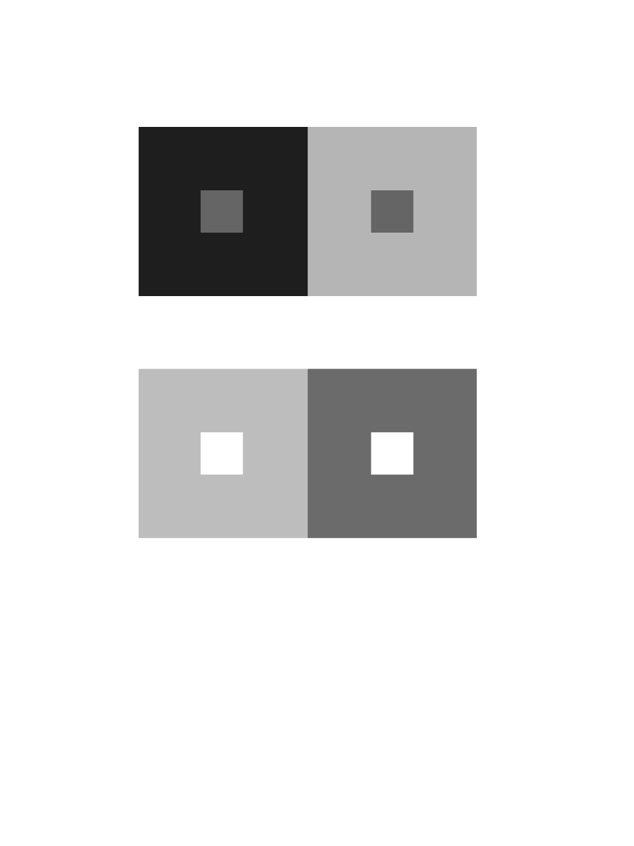
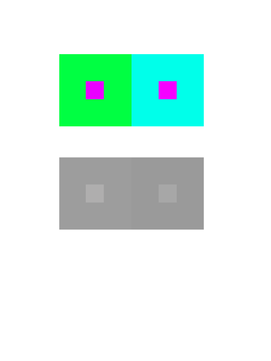
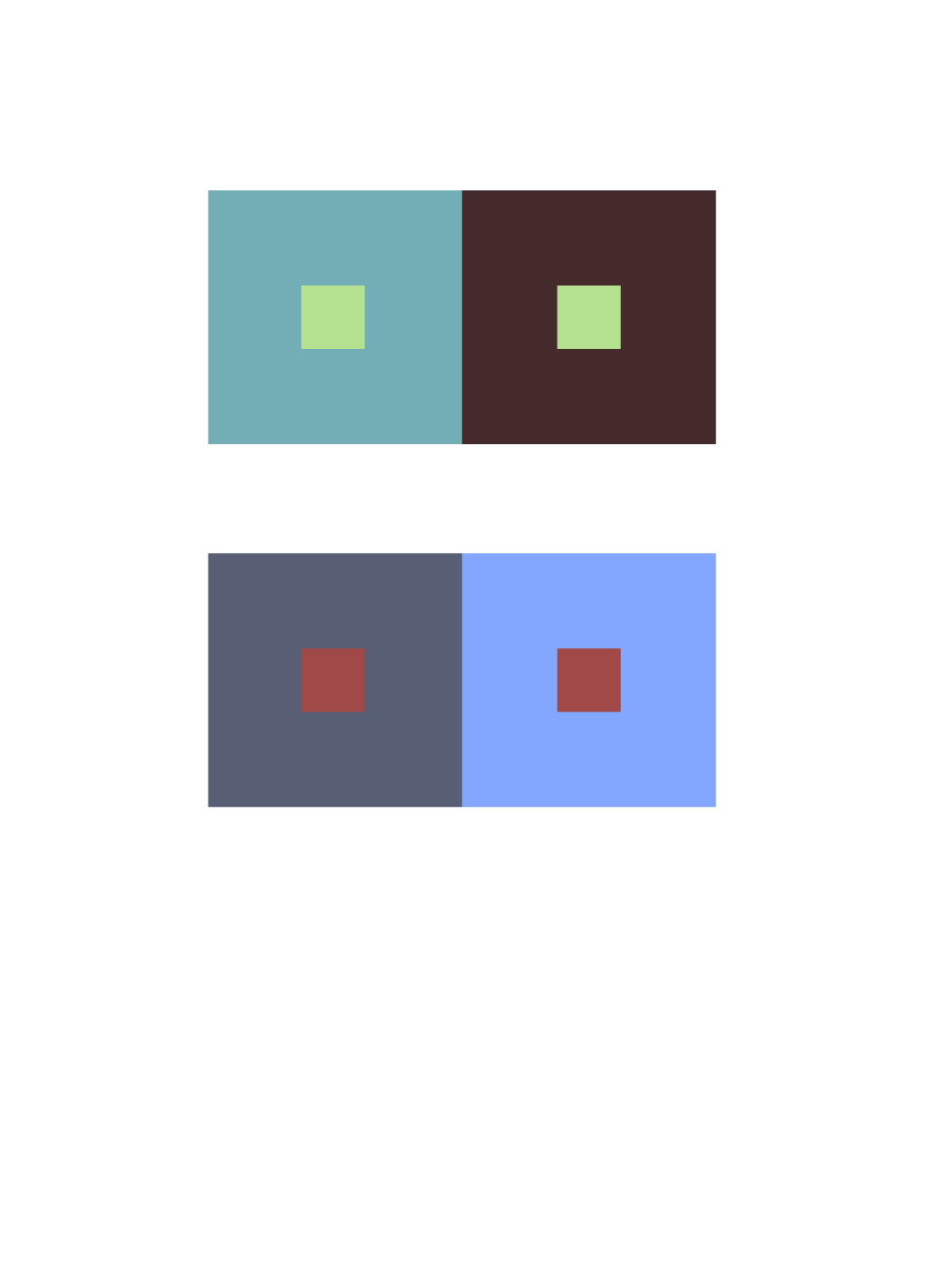
These Images were re-colored in Photoshop. The objective of this was to cause an illusion that the the middle square are the same color value. The bigger color is suppose to distract you from the smaller squares by using light and dark tone which causes the illusion. Number 1 is Color in Value. You can see that the larger squares are the same color but didn’t values. The bottom two square one Blue is more pure and the the other one has a mix of white. Number two is Shifting Hue as the green and baby blue are hue leading towards the cool colors. Number 3 is Shift in Value with gray coloring. You can see the different values of grey like white and black. And Number 4 is Shift in Hue and Value. As you see the Value of the colors are very mutend. Mixed with black.
Color Interaction Parings: Phase 1
Base on the article “Color Psychology: How Color Meanings Affect Your Brand by Nicole Martins Ferreira” it states “Color plays an important role in how your brand is perceived. Whether you’re a fashion brand trying to connect to a youthful audience or a medical supplies store trying to strengthen customer trust, you can study color meanings to help you better attract and connect to your ideal customer. Color psychology can be used to help build a strong, relatable brand. In this article, we’ll explain what color psychology is and educate you on the color meanings for the most popular colors used.”
This quote shows that color plays a big role in life. If you want to do anything like making games ,dancing ,make up etc. People must like what there looking at. It must draw people in to be interested in your work.
Color Harmony:Phase 1


The first photo is analogous because it’s showing colors that are very close to each other on the color wheel. The second photo is monochromatic because they are mostly the same color but have different tones. The last photo is complementary because it shows red and green which are complementary colors.
Urban artifacts phase 4

Color Harmony: Phase 2
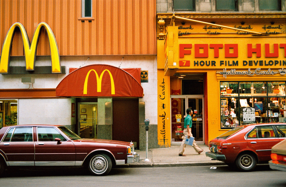
This image is a vintage photograph of my mother, and the type of colors that are in this image really drew me because they also reminded me of one of my favorite movies from Wes Anderson “Fantastic Mr. Fox”. These to me are different tones of orange. The title of the book is “The Book of Me,” so I felt like these were things that had to do with me.
Color Harmony Phase 2
For this part of the project, I used an image created by Taylor Walker that centered around an ocean theme using different tones and shades of blues. Color references can be used in future design works by taking into consideration into the amount of color, and the different shades and tones of a color that will affect where the focus of the image would be, in the image you see a monochromes of blues and near the top you see Orange, a complementary color that gains the attention from all of the blues surrounding the rest of the page. This can help me to consider the different ways to use these colors in different ways and most likely make an image less chaotic with different colors.
Worked in 1 hour
Color Harmony: Phase 1