

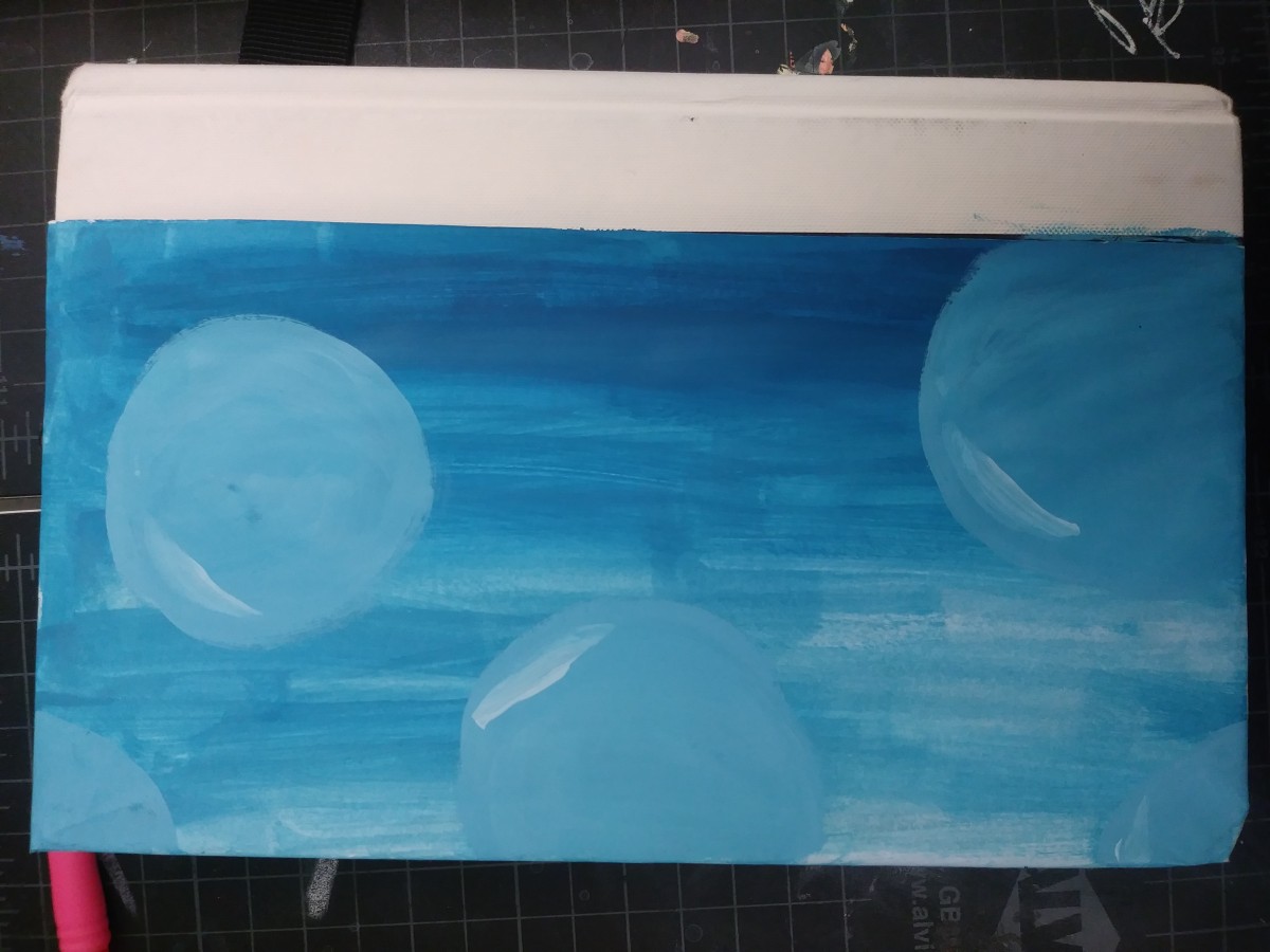
The glossument cover was influenced by the proportional color inventory due to the colors it had. My glossument already has a theme of blue which the image already has a different range of, along with it the title of the glossument is “voice in the ocean” so even the context of the ocean relates. The dominant color in the image was white however when working into the cover it turned out that the dominant color wasn’t white but rather between the tint ranges of blue, and I also used more orange for the words than what I had expected. I wanted my cover to have an image ranging with blue and relating to the ocean so the image I selected helped, and while it isn’t the same I did use forms of waves for the front and then paint the back part with ranges of blues and then adding bubbles. Although the final result did take a while to think of since at first painting the ocean didn’t come to mind at all until I found the image.
Worked on for 1 hour 30 minutes.

