
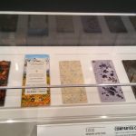
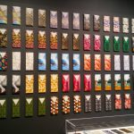
The one work I found compelling is “1001, COMPARTÉS CHOCOLATIER” because the chocolate was so beautifully packaged and had colors one wouldn’t normally see when purchasing a bar of chocolate. Description: A wall of chocolate all packaged differently every 4 to 3 chocolate bars. They are very colorful with green, blue, and mostly red patterns. Some of them have images such as a grizzly bear riding a wave or two legs with red heels. On the bottom of the case, there is chocolate with nuts, white and brown chocolate with a diamond design, pastel purple chocolate with a black splatter, and two more at the end which I’m not exactly sure what they are. Source: (Jonathan Grahm, Courtesy of Jonathan Grahm)
The medium used for this was handmade chocolate bars and packaging


The work I think classmates may have missed is “1203, ORGANOID ORGANIC ROSE BLOSSOMS WALLCOVERING, 2016” Because it looks like a regular wall but it is actually petals, herbs, and flowers pasted on the wall with slight texture. The scent is faint but it smells like rose tea. Description: A wall divided in three that reach almost the ceiling in pure red that you need to go closer to notice that it is created from multiple petals. It feels rough almost like dried paint but mostly is quite smoothed out like a normal wall with patterns on it. It almost looks like wallpaper if it wasn’t for it being divided. Also, it was at the farther end of the room where there were rocking chairs which almost seemed like just an info center about layouts and blueprints. Source: (Martin Jehart, Organoid Technologies Gmbh)
The medium used for this was “Alpine hay, rose petals and buds, self-adhesive foil backing” (Description)

