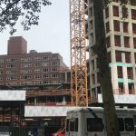
The building in the foreground, made possibly in the 1920’s, is forced to assimilate to modern day, plastered with signs and made into a retail store, while a building currently in construction, sits in the background, waiting to be completed. The juxtaposition is time, old against new
This building was constructed during the architectural period known as Art Deco or simply Deco, and is described as “influenced by the bold geometric forms of Cubism; the bright colors of Fauvism and of the Ballets Russes.” ( this is from wikipedia, so i need to change the source). This older building, and the period in which the building was constructed, was known for it’s exterior design, and every building made during that time period are easily visible, yet here we see it’s design partially blocked by signs, hiding the other decorative sculpture like carving behind it, leaving only one visible. To add onto this, just below our Art Deco building, we can see that the first floor was renovated and transformed from a time capsule into an Ann Taylor. (old building with ann taylor and the signs, why not do the whole building? are different floors owned by different people?)(elaborate n stuff) ( and add a quotation, maybe from that ny guy) It appears as though, that instead of modernizing the second floor, they did what they thought would be just as good, and plastered signs outside. But all this does is make its presence more known, it stands out even more( add on ) ( only talk about the tiny building here, compare everything there then move onto the other building) ( maybe you could even compare the art deco to Ann Taylor? for a different section. since it is the bottom half that got updated.) (so it would be building to signs. then building to Ann Taylor. then whole building to new building)
construction: which brings me to my next point, the new (yet unfinished) building in the background, looming over our older building. As i had said earlier, what reason was it that they renovated the first floor, but kept the original design on the upper level, and why not just demolish the entire things, and start over? what did this art deco building have that the newly made building didnt have, or the building that was there prior. It seems as though our shorter building, against it’s signs and first level, in addition to the new building under construction, has been left behind. Left to remain as old as it is, forced to assimilate into modern times by adding in signs, but these attempts are in vain. ( quote in here)( because its still old and i ran out of ideas ) (maybe talk about the skyscraper race, when they really wanted tall buildings, that was when the empire state building was made, and thats when art deco was around in the US, now that skyscrapers are more common the building in the background is taller just cuz)(also separate some points, like the height)
conclusion: (basically the intro, wrap it up)( i have no more ideas)


