Throughout this project i enjoyed making the cover the most. I wanted to keep my book plain and simple with the colors black and white. I was inspired by my phase 2 painting, splatter paint art. When making it, splatting the painting the paper was the best. I tried using the colors that was given and noticed i used too much tan. I learn about monocromatics, complementary and analogous. I learned a lot about colors, before these lessons i would think a color is just color but theres more to colors than i thought.
Color Harmony: Phase 3
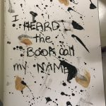
This is my book cover. The book name is I Heard the Book Call My Name. The original book title was called I Heard the Owl Call My Name. I written out the name instead of painting because the original book had a handwriting style. I used a bristol paper and taped and glued the cover to the book. I used the photo from phase 2 as the idea of splatting paint as my book cover. I chose this type because my pages consist of paint and its paint messy and also colors are black and white so the painting i chose was perfect and matches what was inside the book.
Duration: 45 mins
Project#5:Color interaction pairings: Phase 4
Project#5 taught me a lot about hue and value changes and how you can use them to create an illusion making it as though color can be seen as two different colors. I also learned how color can represent different sets of emotions and personality. Trying to figure out the color that could represent my partner for this project was challenging, but also quite fun, I was able to learn a lot about my fellow student. I found this project to be very interesting and useful for when I create any future work of my own. It allowed me to learn a new way to communicate using color.
Project#5:Color interaction pairings: Phase 3
Time:3 hours
Step 1: Color Research Process
Sam’s favorite color:
Red, Yellow, and Blue
Fav food: Mac and Cheese
Likes space and collecting rocks
Likes to Draw
Likes alternative music
Most active during the night likes the night time.
He is very funny and is comfortable to be around.
Step 2: Color Mockup
Orange Yellow is the color I chose to represent Sam.
This color represents the warmness that surrounds Sam
Step 3: Icon research
Sam’s interest for space and the night sky gave me the idea of making his icon be a little happy alien.
Step 4: Icon Mockup
I chose an alien to represent Sam to show his love of space and the night time. I chose the colors orange-yellow to represent the warmth Sam’s presence and personality brings when you get to know his. At first, Her energy starts off as a yellow and then gradually becomes a strong hot orange. This is because at first, it might be a little awkward but, he still is inviting and over time you begin to become more comfortable.
Color Harmony: Phase 2
Color Harmony: Phase 2
By: ContempoGallery
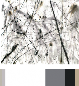
I used this painting because it relates to my theme. I found this painting on google when i was looking at splatter artwork. In my book majority of my pages were painted black similar to blackout poetry and has a white paper with the drawings inside. I want to make my book cover with white with a bit of splatter paint on it. I also chose these colors because in my book majority of the color is black and white with some muted colors. I spent around 30 minutes.
COMD Reminder!
What’s DUE?
- Project #6: Phase 1: Discover
- Project #6: Phase 2: Define (You must have this complete in order to work on your Glossument Cover in class.)
Materials Needed IN CLASS!
- Your Glossument.
- Art and craft materials to use IN CLASS on your Glossument Cover
- We will work to finish Project #6: Phase 3 (your Glossument Cover) in class.
Color Harmony: Phase 1
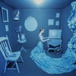
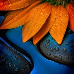
The first photo is monochromatic because it’s using only one color, blue and you can also see different shades of blue. The second photo is complementary because blue is complement to orange. The last one is Analogous because there is red, orange and yellow. These three colors are next to each other on the color wheel.
Color Interaction Pairings: Phase 4
This project was a fun project about colors. I learnt a lot about colors and you cannot see them how they really are. There’s more to colors than what you can see. In phase 2, i learned that complementary colors affect the way we see other colors when put together. Overall this was a nice project to learn about colors and how our eyes see different colors.
Color Interaction Studies: Phase 3
My partner was Saalik and i chose a lion for him. Lions are calm and laid back animals but when they’re hungry they’ll go for it, I believe Saalik is calm and laid back but when it comes to music, he strives for it similar to a lion getting what their prey. As for the color it was his favorite color and it also is a calm color. As for the middle blue, it was a shared color.

