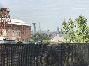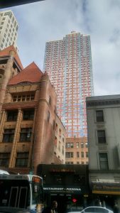
nature (plants, mist and clouds)
erosion
old buildings
new buildings
skyscrapers
human-made
textures
pattern
light
colors: color rich in the foreground, greyscale in the background
juxtaposition of: fence and bridge; buildings in foreground and background
Where is the viewer’s focus? what is the viewer’s vantage point?
what frames the image?
How do we organize Project #3?
introductory paragraph with the thesis statement–that claim or argument you’re making. Start with your topic and narrow down to the juxtaposition and what you want to say about it. [this might not be the first paragraph you write!]
Berko’s main idea, which is the proposal of the researchers working on building the app: “Small interventions in your everyday routine can generate a more comprehensive urban experience.” This comes at the end of her article, but our claims will be presented initially in the introduction. In the conclusion, we’ll be able to answer “so what” about our claim–why does it matter, or to whom, or what’s interesting about it, etc.
Do you use I or not? first-person vs third-person response
comparisons: block format or point-by-point
in point-by point, you highlight different points of comparison and address them individually for each element in the comparison. Sometimes you need to do some of each.
What are different aspects of the juxtaposition? aim to have perhaps 3-5 points of comparison

juxtaposing residential and commercial: building height; materials (and the effects of those materials), architectural and decorative style
What are the 3-5 elements you will use to compare the two parts of your juxtaposition?
how can you find these 3-5 elements? Brainstorm! Write down everything you see–be detailed–and start to see the points of intersection.


