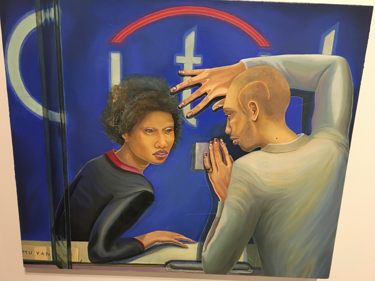
First Year Learning Community

Category: COMD1100 (Page 7 of 15)

Field Trip to BRIC Biennial: CitiBank


By Aaron Gilbert Medium: Oil on Canvas

CitiBank
By Aaron Gilbert
Medium: Oil on Canvas

I feel that I can relate the most to this piece of artwork because of the different messages that it can send depending on the person viewing the image. It has a trait where it can give a very different first impression from person to person, almost like how people do. For some people, they might see him and think that he is holding up a ransom note like what can happen in some cases around the world today. This may also lead a connection to the scar on his head due to being in a gang-related fight which ties together with how he looks like he might be trying to rob a bank.

However, there is also the first impression of him making a desperate plea to the bank for money. As is shown by the state of his health, he seems to need to money just to help him live a life where he can still nourish himself. There is also the signs that his body language gives out in the painting. He seems to have both hands stretched out and leaning on the glass because of whatever kind of situation he may be in. It’s the different possible backgrounds like these and how this painting plays into either of them that I take a liking to this specific art piece.

Field Trip to BRIC Biennial

img_6394

“Strong Medicine” by William Villalongo

Medium: cut velour on matte board

This piece of artwork caught my attention because I thought was a pine tree when I first saw it. But when I look up closer I saw the snake show up in the pile of tree branches(?) when the bird pick up one of them. It symbolizes whenever you do something, someone might be watching you in the dark.  The raised hand might show surrender because you never know  how many of them is in the dark since you can’t see them.The feeling that I have after I took a closer look on it was when you are in a dangerous situation,the  only way to be safer is to surrender.

Field Trip to BRIC Biennial

img_3816

“Citi Bank” by Aaron Gilbert

Medium: Oil on canvas

Out of all different pieces of art, this one stood out to me. I’ve experienced people begging for help because they were in need, and this makes you grateful for everything that you do have. Tons of people aren’t fortunate with things that most people have in their possession, and this piece of art shows/proves that. The feeling I automatically get from this piece is a sense of hopelessness and desperation, which can be very overwhelming when you’re in a situation like this.


Field Trip to BRIC Biennial

“I Knew you Before I was Born” by Kambui Olujimi

Medium: Wood, Brass, Glass Walking Cane, Canes, Foot Stool, and Faux Pearls

If there is one thing I can relate to about this art is the feeling of being homesick while at home. Just because you are at a place called home, it doesn’t mean you’re in a place where you feel comfortable. This piece was something I was drawn to the moment I saw it. One think that made me feel different about this piece was that I felt it was more about disassociation. I got this feeling from viewing the large doors off the ground and slightly parted with the pearls draped down, almost as if it were floating.


COMD Class 21 | Field Trip

Field Trip!

What’s Due?

ALL Saturation Studies! 

Post to the class blog. See Project #4: Phase 2 Define.

  • Chromatic Gray Studies #1 & #2
  • Muted Color Studies #1 & #2
  • Prismatic Color Studies #1 & #2

If you haven’t posted your color wheel freestudy (Phase 1 Discover), do that as well.

Comment and give feedback on your peer’s hard work and effort.

Grades and Feedback

  • Project #2 grades have been posted. If you didn’t receive a grade comment on your Phase 4 post, see me.
  • Project #3 grades will be posted shortly. Please make sure you have created a Phase 4 post so I can give you a grade and feedback on your work.

Student Show

  • The Student Show opens on Thursday and will be up for a week.
  • Be sure to stop by the Grace Gallery to view work from first and second year COMD students – including your own!

Download PDF

Value-Added Portraits: Phase 1

The first image was took in the class room and edited in Photoshop to give more of dark look. The darkness gives a very mysterious feeling, maybe it just me but I feel almost afraid to walk in to it. The highlight is the small paper cup on the right, and the darkest part is the deepest part of the counter top. As you move from the paper cup further in towards the center, the items on the counter top get harder to see.

The second image was also taken in the classroom. It was just cropped to have more white in the composition. The strong contrast created by the white mouse and the black pad make a closed value composition. The little marks and dust gives the mouse a ton of character. The white specks give the black pad texture.   The highlights are the reflected light coming from the open windows on the left.

Time Worked : 1 hour.

Value added portraits: Phase 4

Phase 1:

Phase 2:

Phase 3:

This third project made my head hurt. I must admit painting with gouache and a brush is not easy at all. I did all i could to follow all the instructions i was given. In the end i did make a couple of mistakes but managed to fix them in my final product. I now have experience in using this particular type of paint and will try to do better in my next project. Showing narrow and broad range values was pretty hard when cutting out the original picture, but when it came to the painting it was just easier to blend the black and white and create shades of gray instead of looking for the shades in the pieces.

« Older posts Newer posts »