For our final project, Color Harmony, I used all my knowledge of our past projects to help me with this one. Finding out pallets was a challenge for because there was such a wide variety of color in one image, it was a bit difficult to make a proportional color pallet and to figure out which were the accents. What I did enjoy about this project was how it made me pay more attention to amounts of color in a photo and/or piece and what colors really accent them, or what colors give the piece dynamic in tint and shadings to really bring it to life. Color harmony really helped me to better understand how colors can go together in varying amounts and how tints and accents, plus the amount of color used is really important when thinking about making a piece.
Author: Gabriela (Page 1 of 3)
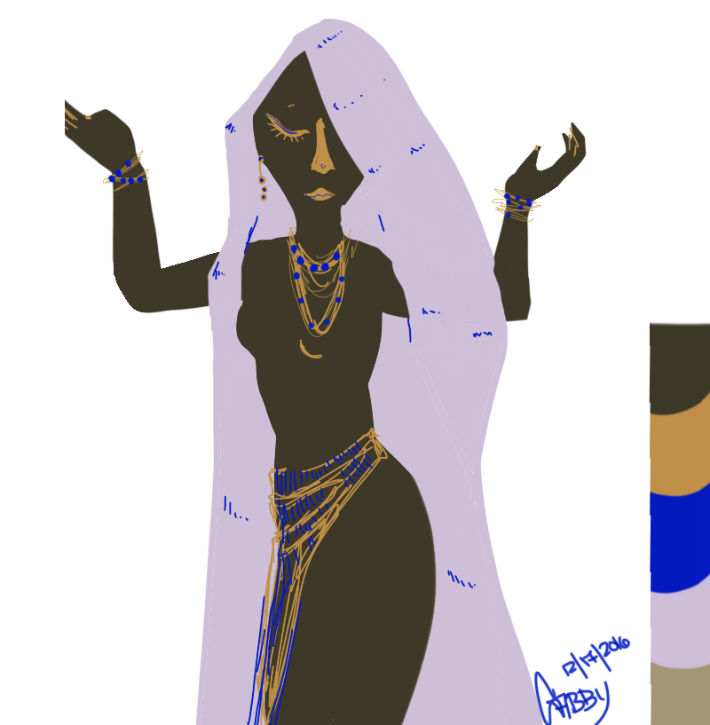
For phase 3 of this color harmony project I wanted to use the pallet I got from my phase 2 at the museum. For my free study I decided to draw a woman, the program used was Autodesk Sketchbook and a Cintiq tablet. I made the off-white color my dominant color and the muddy brown my subdominant. The blue was my accent and the muddy yellow is my shade since it isn’t a pure yellow. There was some difficulty in making this since the accent color was such a pure blue, but otherwise it was fairly enjoyable due to a majority of the colors not being so pure, I was able to find a way to make them go together.
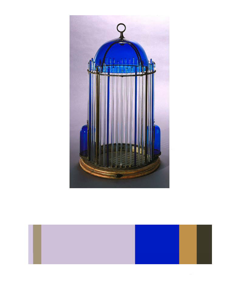
While on the museum trip, I happened upon a set of bird cages. The blue and gold one caught my eye in particular. What caught my eye with this piece was the glass dome and rods. Its amazing how such fine and pigmented glass work can last so long, especially since it came from Italy during the earlier part of the 19th century. The blue was especially vibrant compared to the faded gilt base.
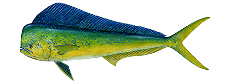
This Dolphin fish is a good example of color to color progression because of the way it starts off as blue, makes its way towards green in the middle and finishes off at yellow. The blue to yellow progression is smooth all the way through, and blends well in the middle of the fish, proving this as a good example.

This Blue Macaw is a good example of tint progression because the feathers that start at the beak are a grayish blue which fades out of the birds head into a more solid blue. Depending on how the light hits the birds feathers is how blue they will look, hence the feathers towards the bead are a faded grayish blue, and the birds body is more of a vibrant blue.

This photo of a Wolverine is a good example of shade progression because the light brown of its furn fades into dark brown fur and then darkens into back near its face. Showing a shade progressing that goes from color to black.
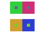
These color interactions studies have taught me a lot about the ways colors interact with each other and how they can influence what we perceive them as. Phase 2 in this project helped to really open my eyes to how placing two colors together can create the illusion of darkening, lightening, tinting, and even giving a different color an outline. I definitely enjoyed phase 3 of this project, especially with choosing the colors with my partner and making their logo. What interests me the most is how the logo looks like two completely different colors on their respective backgrounds; I really feel like I learned a lot about colors and the way they interact with each other through this project.
![]()
Left: Logo I made for Aaron
Right: Logo Aaron made for me
Time Taken: 1Hrs
-

- Shifting Value With Color
-
- Shifting Hue, Not Value
-
- Shifting Hue and Value
-
- Chromatic Grays
Time Taken: 2Hrs
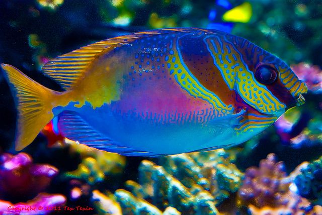
Tropical Fish
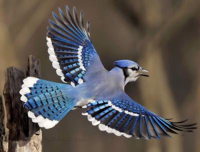
While learning about color perception I learned that there are many different ways our eyes perceive color. We all see color color differently and we also perceive color differently because of the way they are placed together,mixed, their saturation, and even the amount of light that reflects off of it. I chose a tropical fish and a bluejay to show different and beautiful ways color can interact with each other in nature because how unique it can be.
Saturations studies was hard for me, but I did learn a lot. I learned that there is a lot more to know about color. IT was difficult mixing to get the right shades and colors because some paints were more pigmented that others. This was very new to me because I am more accustomed to using painting digitally. Saturations studies did help me improve coloring my work. With new ways to blend and make color, I can make more dynamic pieces.
Time Taken: 2hrs


Recent Comments