PLAY WITH YOUR PROBLEMS - FYLC Fall 2016

First Year Learning Community

Page 11 of 47

Color Interactions: Phase 4

Phase 1

Phase 2

Phase 3


These color interactions studies have taught me a lot about the ways colors interact with each other and how they can influence what we perceive them as. Phase 2 in this project helped to really open my eyes to how placing two colors together can create the illusion of darkening, lightening, tinting, and even giving a different color an outline. I definitely enjoyed phase 3 of this project, especially with choosing the colors with my partner and making their logo. What interests me the most is how the logo looks like two completely different colors on their respective backgrounds; I really feel like I learned a lot about colors and the way they interact with each other through this project.

Color Interaction:Phase 2

Time Taken: 2Hrs

Saturation Studies: Phase 4

Although painting isn’t my cup of tea, I actually had some fun completing this project. It allowed me to test out different colors throughout the color wheel, in which it also helped me learn several new concepts. Some of the key terms I learned were complementary, which means the color across from another color on the wheel. An example of this would be blue, the complementary of blue is orange. Some other terms I learned about are called muted, saturation, and chromatic. This project helped to expand my definition of art, it sure is something that I would do again sometime.

https://openlab.citytech.cuny.edu/schmerlerspevackfylcfa16/2016/12/08/saturation-studies-phase-1-9/

https://openlab.citytech.cuny.edu/schmerlerspevackfylcfa16/2016/12/13/saturation-studies-phase-2-14/

https://openlab.citytech.cuny.edu/schmerlerspevackfylcfa16/2016/12/08/saturation-studies-phase-3-13/


Color Harmony: Phase 1

img_3535

Two-Color Progression

581bc18a-3064-4c0a-ae83-876cc018d1f9

Tint Progression

img_3539

Shadow Progression

The first image shows two-color progression because of the green has different tones that turn into black.  The tint progression shows the sunset, the tint shows the yellow orange colors, they are analogous. The shade progression shows the clouds white then turning darker, to medium black.

Color Interaction Pairings: Phase 4

What I learned in this project is the color value and saturation. For instance, the color is the same in a composition but it appears different because of its influence color and the saturation. What I would like to retry again would be Group 4 Shifting Hue and Value, it was very challenging for me to see and make the hue different from one another. For our next project, I would use the color wheel and know the complimentary of each color.

Phase 1: Discover / Phase 2: Define / Phase 3: Develop

Color Harmony: Phase 1

img_4495

Two Color Progression

This picture had two color progression because the flower had changed its color from magenta to pink.

img_5213

Tint Progression

The orange had made a tint progression as it gets closer to the bottom. The orange had become more desaturated with white.

img_5218

Shade Progression

This picture had a shade progression because the blue had become more desaturated toward  black as it get closer to the upper left corner.

Work Time: 1hr

COMD Class 29 | Field Trip + Color Inventory

December 14, 2016

FIELD TRIP!

WHERE: Cooper Hewitt Design Museum
2 East 91st Street
(between 5th and Madison Avenues)
New York, New York 10128

HOW: Take the 4, 5, 6 to 86th Street and walk 4 blocks North and West, toward the park.

WHEN: Meet outside the Musuem entrance at 10:30am SHARP.

  • PLAN AHEAD: Check Google map directions for transportation times
  • You will be back at school by 2pm.

What’s DUE?

Lab/Field Trip

COOPER HEWITT DESIGN MUSUEM FIELD TRIP

At the Museum:

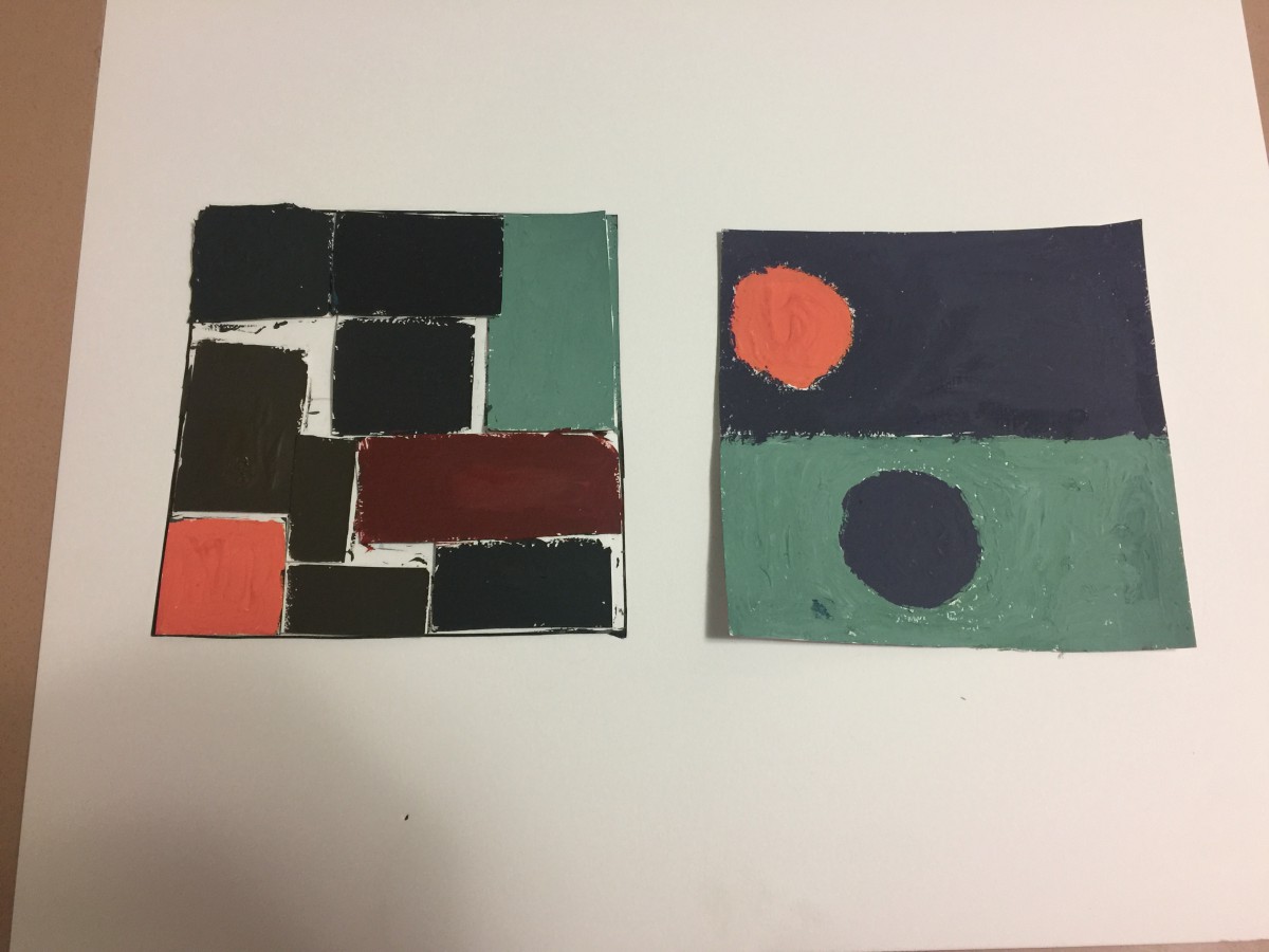
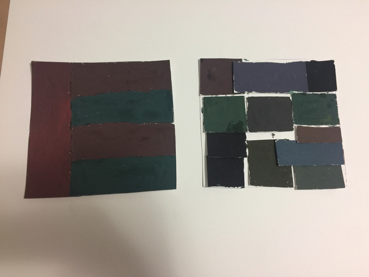
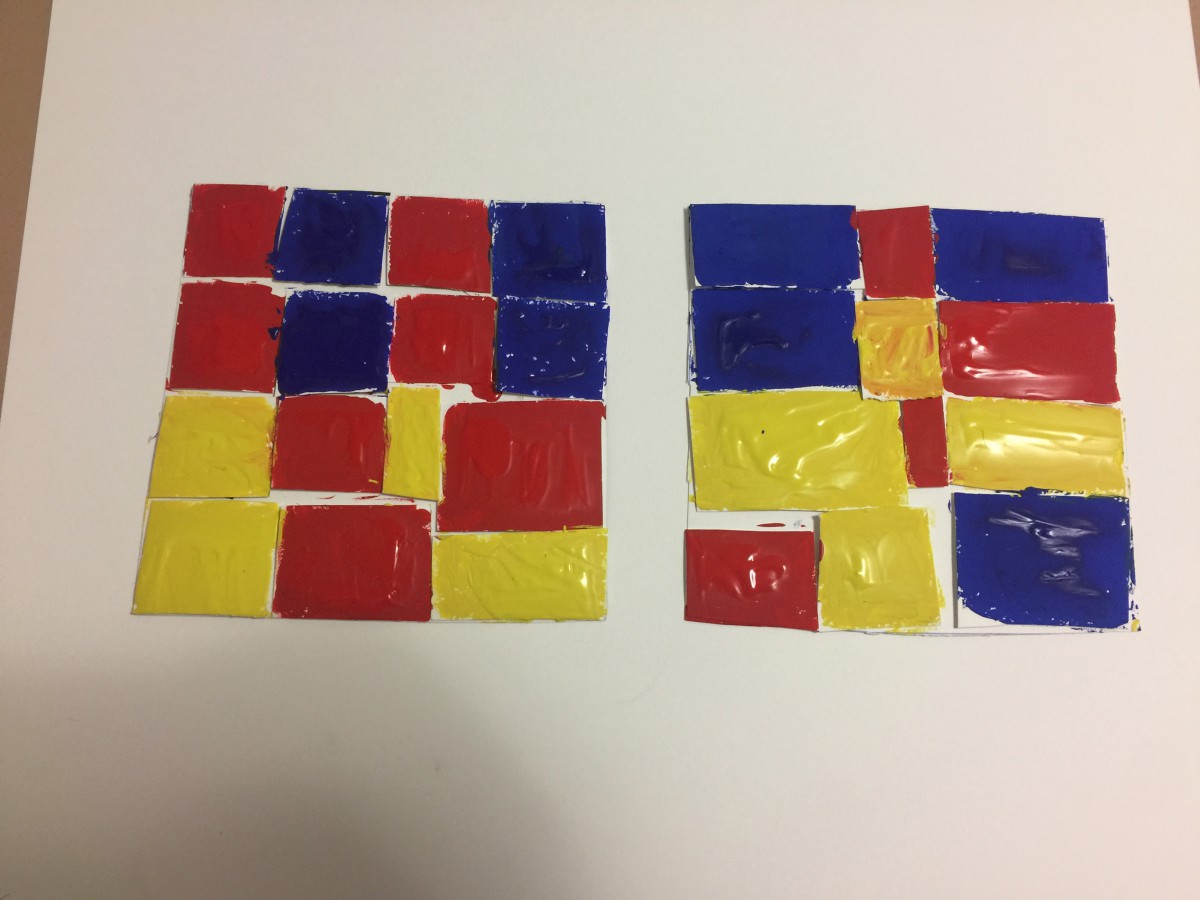
  • Using the interactive pen, “collect” objects from the museum collection and save them as sources for your Proportional Color Inventory.
  • Find a reference that has the following elements:
    1. Dominant color, Sub-Dominant color, and Accent color.
    2. A tint or shade

After the Museum:

  • Visit your custom Museum collection page (as described by the Museum postcard)
    At home or on your mobile device visit cooperhewitt.org/you and enter the code printed on your ticket—everything you collected and created will be waiting for you!
  • OR… Find your objects in the online collection
  • OR.. Try searching by color
  • Right/Control-click on the image to save it for placement in your Proportional Color Inventory.

IMPORTANT: Review PROJECT #6 guidelines very closely and complete:

  1. Phase 2: Proportional Color Inventory
  2. Phase 3: Final Freestudy (directly based on the Proportional Color Inventory)

Questions?

Homework

LAST DAY! All work is due!

  1. PROJECT #6
    • Phase 1-4 (posted to the Class Blog)
    • Bring Proportional Color Inventory and Final Freestudy (to turn in)
  2. Review the class outlines for Class 1-29, Vocabulary, all six Project guidelines, and Understanding Your Grade.
  3. This is your last chance to complete or rework your projects to improve your grade. You will not have time in class.
  4. Materials Needed:
    • a portfolio to take your work home.

Download PDF

« Older posts Newer posts »