Category: Student Posts (Page 15 of 40)
Saturations studies was hard for me, but I did learn a lot. I learned that there is a lot more to know about color. IT was difficult mixing to get the right shades and colors because some paints were more pigmented that others. This was very new to me because I am more accustomed to using painting digitally. Saturations studies did help me improve coloring my work. With new ways to blend and make color, I can make more dynamic pieces.
I honestly really enjoyed this project, even though i stressed a little while making it. I finally learned the difference between the saturation of colors and the value of colors. In this project i felt more prepared and less insecure about getting the color on paper. I tried keeping the theme of a pretty clean and neat overlapping design throughout all phases. This was one of my favorite projects.
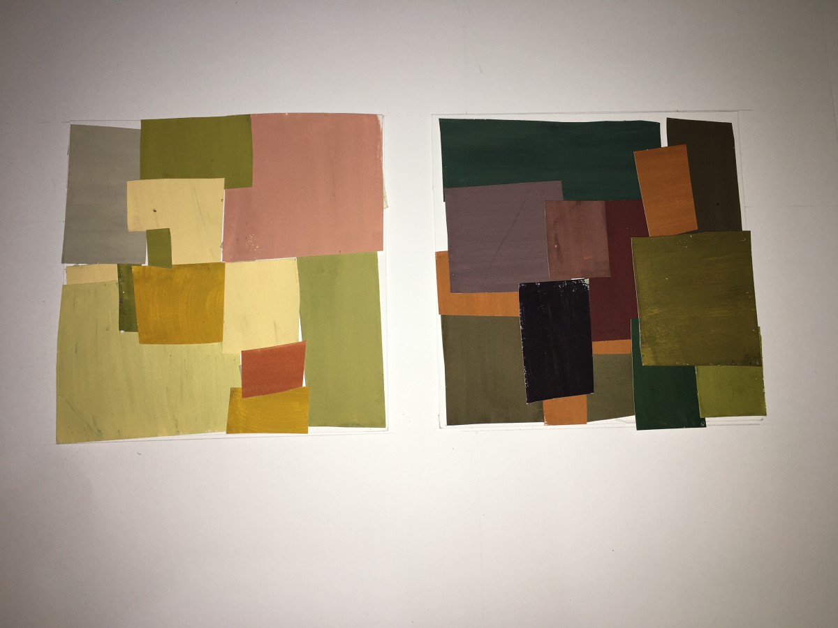
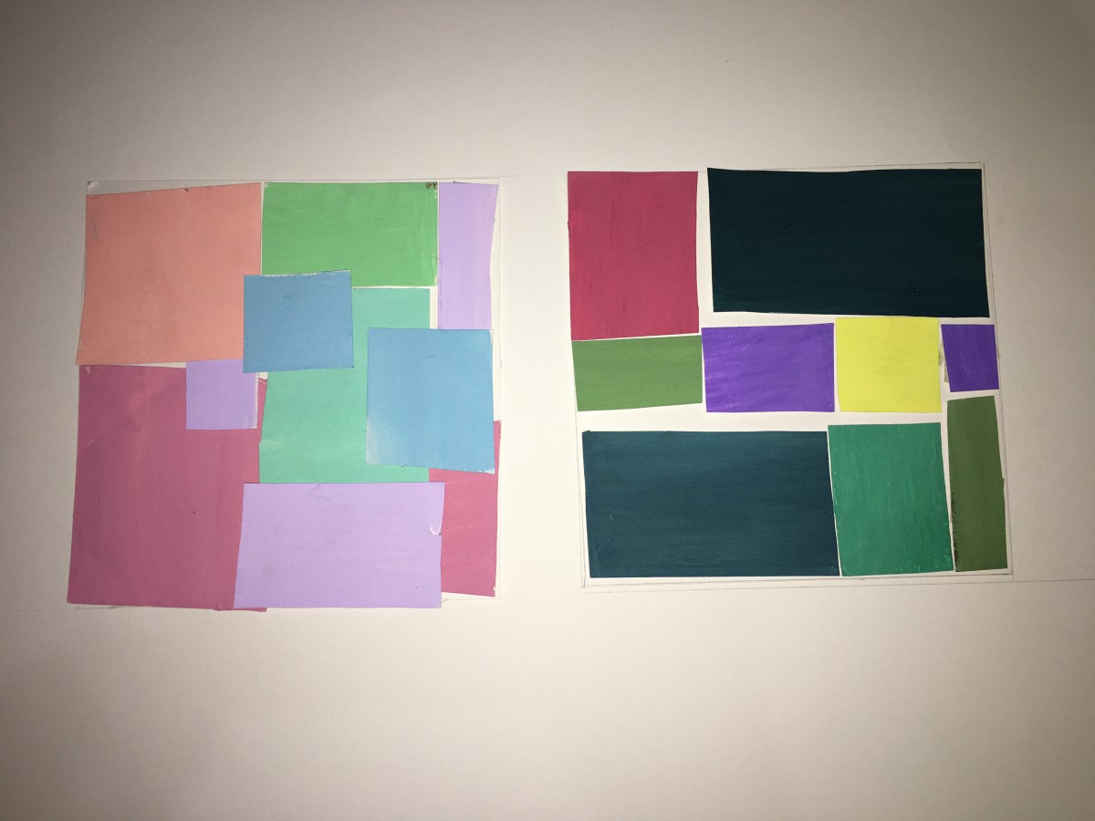
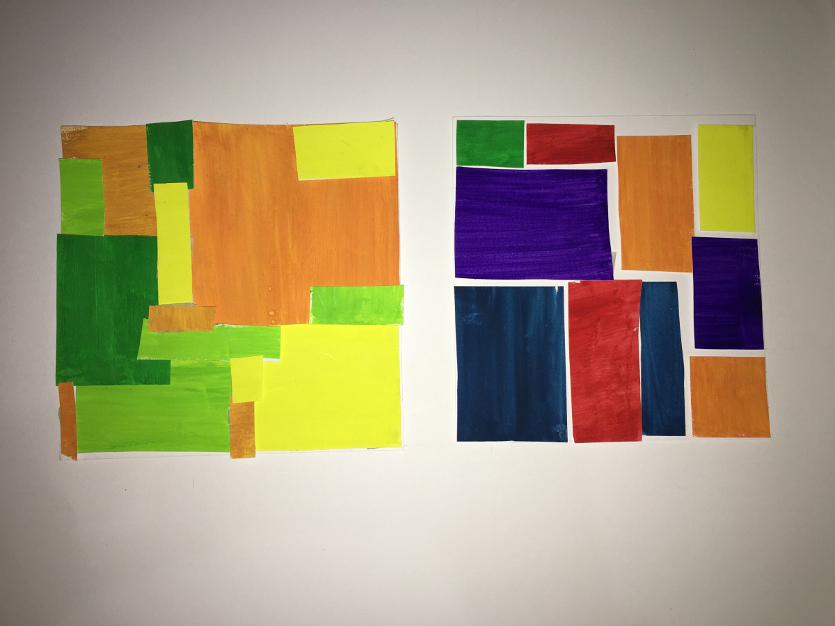
In this project, we learn about saturation,the difference between prismatic color, muted color and chromatic gray. First, we began with a color wheel freestudy. Second, we did the saturation studies, mix and match with little pieces of painted bristols. Lastly, we did a band poster by following the swiss style. We had choose warm or cool colors, a composition card, and come up with a band name that include two sensory meanings. What can I do better next time might be to make the flowers for the color wheel larger for easy visualization, and spend a little more time with the paint. I feel like I still cannot control the color of the paint because when it dry, the color came out different when I first painted.
Throughout completing this project it was a bit difficult to differentiate between saturation and value. My favorite assignment in this project was phase 1; I was able to bring in my own art style to the free study. Overall, I was able to understand the concept of these two terms. In the future , I won’t shy away from new concepts and have a better understanding it .
This project was one of the hardest ones we have worked on. At first all the vocabulary that was introduced was driving my brain crazy and the words value and hue were mistaken by each other. However, this project was also fun because we got to work with so many colors and it felt challenging. It was satisfying to see all the phases completed and it all flows together. My favorite one is phase 3 which was the swiss style poster, I really, really like simplistic things and this project was totally simple. I believe I have a better understanding of hue, saturation ad value.
In this project I learned the complimentary colors of each color in the color wheel and know how to change a color more lighter by adding white, and making it darker by adding black. What I believe I could have done better is work more on my chromatic grey exercise, it was difficult for me to get the right color and make it look muddy. I learned the colors of chromatic grey, muted, and pure colors and how are they seen differently. For the next project, I will apply this by knowing what area are the colors are and its saturation.
It was definetly confusing on every single vocabulary word that relates to this project. It was so far the most annoying project to do, but honestly the best one as the end approached.
Doing this project made me see color in a different way, color gives meaning to a painting or poster and picking the right colors can make its visual perception more effective. Although it may sound like a simple topic, it’s not, reason why I say this is because it was quite difficult trying to pick the right colors and saturation to express each projects purpose. Like for example, muted colors give a sense of warmth/cool feeling and chromatic colors set a more serious tone. Stuff like that is important to know when designing, a designer must use the right colors in order to grab the attention of the viewer.

Hrs spent- 1


Recent Comments