PLAY WITH YOUR PROBLEMS - FYLC Fall 2016

First Year Learning Community

Page 7 of 47

Color Harmony: Phase 1

colortocolor

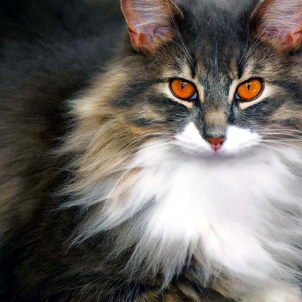
This picture of a cat does a good job of color to color progression because of the different colors of its fur. It starts off with a dark-ish brown tint, to gradually getting lighter to a natural light.

shade

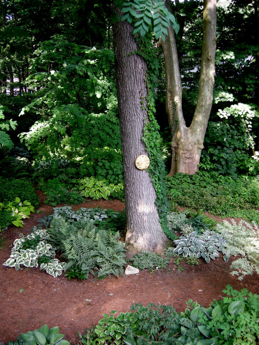
Because of the shadows, the leaves in the background; as well as the top areas of the tree, become darker and blends in with each other showing off Shade progression.

tint

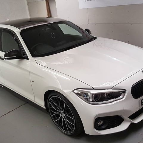
This displays tint progression since the hood of the car goes from black to a white tint.

Color Harmony: Phase 3

%e6%9c%aa%e6%a0%87%e9%a2%98-3

After the trip to the museum, I felt I want to work with muted colors, thus, I drew this monster. I decided that muted blue will be my dominant color, and made the head and torso of the monster mostly blue and for the subdominant color I choose muted violet which can be seen on the abdomen of the monster.

Color Harmony: Phase 3

For this stage of the project, I decided to create a poster with a similar style. The reason why I chose a fox was because of the previous project we did, I thought the idea of an arctic fox would be nice. I also included the message Save Foxes  because global warming continues to affect wildlife, and the arctic foxes are one of the affected species. The dominant, sub-dominant, and accent colors are the same and I decided to portray the accent color through the scarf and rose. This part of the project was very fun in my opinion, I learned a lot and thoroughly enjoyed it.

Color Harmony: Phase 2

While exploring on the interactive table at the museum, I encountered this poster. I really loved the color scheme and thought I could create something decent with these colors. I learned what a dominant and sub-dominant color was. I was a little confused with the accent colors but now I think I understand. The dominant color is the pale blue, the sub-dominant would be the white, and the accent color would be the orange.

Poster Link

Time worked: 30 minutes

Color Harmony: Phase 1

I chose the fish for the two color progression because you can clearly see the change of color in the fish’s body and fin. It goes from blue to red, as well as in the tail it has bits of red. I chose the ferret for the shade progression because you can notice in it’s chest and arms, it gradually goes from brown to black. I chose the sunset because in my opinion, it was the best example for tint progression since sunsets always have many different tints of many colors. There you can see light oranges, vivid oranges, etc.

Color Harmony: Phase 2

chriswarecolorinventory

While on the Cooper Hewitt trip, I happen to stopped at this painting because of its distinct positive and negative space, and also the gray scale is presented in here.

Color Harmony: Phase 1

Sunrise and Sunset can be a perfect example of color progression, as sun appear and vanish in the horizon, it creates this fading color on the sky as the picture above demonstrates, the color of the sky is gradually turning into dark violet to blue.

Color Harmony: Phase 4

For this project, we have a chance to make a composition of whatever we want by using the colors for the color inventory of the composition in the museum.  It was fun to create our own composition, but the work spends a bit more time than what I had thought. I have to make change for few times while I was trying to post phase 3, I look back on my composition, the color inventory on the bottom was different placement on the top. So I have to make switch them a little bit and added more color to separate the dominant color and sub-dominant color. What I can do better next time will be spending a little more time to experiment  with the different tools in photoshop and illustrator to make a better composition that match my imagination.

Phase 1

Phase 2

Phase 3

« Older posts Newer posts »