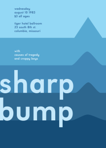
In this Project, I learned the colors used in a composition and the dominant, sub-dominant, accent, and tint colors would be. What I believe I could have done better is create the waves more realistic and show more black. From what I learned in this project that I could apply in anything project would be knowing what colors are common and be able to make them fit together.
Page 6 of 47
https://openlab.citytech.cuny.edu/schmerlerspevackfylcfa16/2016/12/15/color-interaction-phase-3-5/
Group project with Donasia and Ely
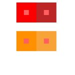
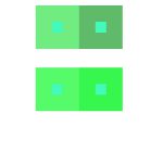
- value with color
- shifting hue and value
- chromatic greys
- shifting hue
Hours taken: 1 hour
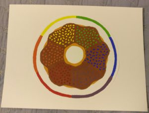
I really enjoyed this project because it was fun to work with color and I got a better understanding of how colors should be used. I enjoyed learning about complementary colors. I didn’t enjoy the gouache phase of the project even though I did like the way my color wheel turned out. The most fun I had was working in photoshop to create my poster. I really enjoyed the cold color scheme and style of the poster and overall learned a lot with this project.
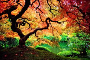
During this project, I was able to better understand value, broad-range, and narrow-range terms. It was somewhat challenging to work with gouache paint since it was a bit of a hassle. I enjoyed recreating one of the portraits in photoshop since I have a lot of experience with that program. I was also able to recognize what images had a broad range and which ones had a narrow range, that was something I had difficulty with at the beginning of this project.





Recent Comments