PLAY WITH YOUR PROBLEMS - FYLC Fall 2016

First Year Learning Community

Page 5 of 47

Color Harmony: Phase 3

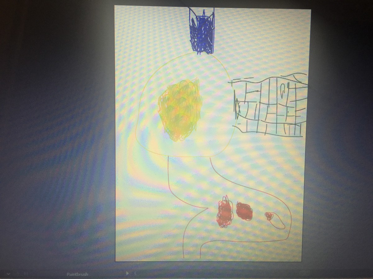
I always enjoy drawing different versions of the city. So for my freestyle i decided to use this color palate to create a piece of the city in another media, illustrator. The dominant color is the light blue, the accent color is the light turquise, and the medium colors are thr darker toned turquises and the dark gray and black.
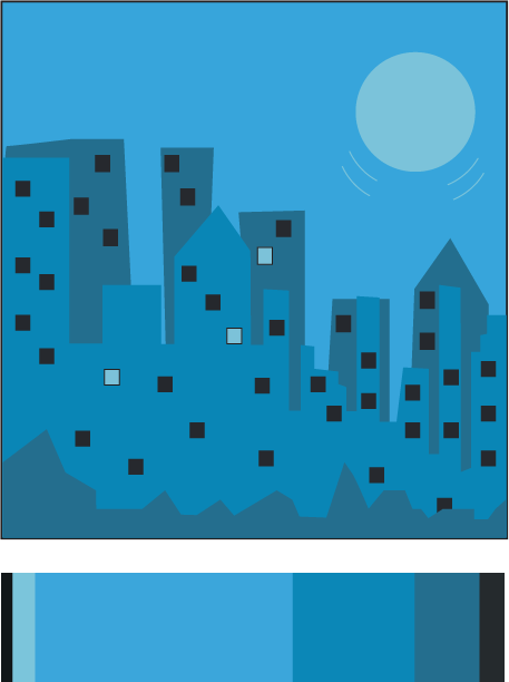
Freestyle

Freestyle

Color Harmony: Phase 2

chriswarecolorinventory

I found this image of this vase in one of the digital tables at the Cooper Hewitt Museum. It was given to Christopher Dresser and manufactured by Minton’s Art Pottery Studio. There are different shades of blue from this point of view, and that is what caught my attention. It is dated 1870s and was acquired in 1998. It is a medium glazed porcelain, and part of the  Product Design and Decorative Arts department.

Color Harmony: Phase 4

In this final project it was a really interesting. This project was very fun because we had to design and take pictures. The trip to the museum was also very fun. The attractiveness was very fun. I learned how to properly set up the colors of a picture and how to properly export a picture to have the most high resolution. This project overall was fun yet not so much difficult. This was class was very fun and interesting and i hope to see everyone again.

phase 3 

phase 2

phase 1

Color Interaction: Phase 4

This project was very cool to me, I like how we were in groups and were able to communicate with one another about our personalities. This was one of the best projects I have to admit, because of how we had to come up with a theme. I’m satisfied with how the logos came out, because we actually sat and had a discussion about it. Overall I’m happy with how everything worked out and I’m also glad that I understand the terms more clearly now.

https://openlab.citytech.cuny.edu/schmerlerspevackfylcfa16/2016/12/08/color-interaction-phase-1-4/

https://openlab.citytech.cuny.edu/schmerlerspevackfylcfa16/2016/12/19/color-interaction-phase-2-5/

https://openlab.citytech.cuny.edu/schmerlerspevackfylcfa16/2016/12/15/color-interaction-phase-3-5/

Color Harmony: Phase 4

This project in all honesty, was extremely hard for me. Although I enjoyed learning new concepts and attending the museum, I need to increase my time when using apps like Photoshop and illustrator.  The trip was really fun for me I was able to go to a new place, and learn about many other artists that were skilled greatly. Next time I would like to come up with a neater free study, and make an even better composition. Practice is what I need, and I’m happy that I actually attempted to complete this project to the best of my ability.

https://openlab.citytech.cuny.edu/schmerlerspevackfylcfa16/2016/12/19/color-harmony-phase-1-12/

https://openlab.citytech.cuny.edu/schmerlerspevackfylcfa16/2016/12/19/color-harmony-phase-2-12/

https://openlab.citytech.cuny.edu/schmerlerspevackfylcfa16/2016/12/19/color-harmony-phase-3-9/

Color Harmony: Phase 1

color-progression   marguerite-daisy-beautiful-beauty       sunset_in_zadar_2

Two-Color Progression                                                                     Shade Progression                                                               Tint Progression

All of the three images above define the given key terms. Learning those terms were essential because now I can actually tell the difference between all of them which is important.

Color Harmony: Phase 3

img_3979-1

This part of the project was extremely difficult for me to complete, but I attempted to create something. My niece wanted me to draw what she drew for me, so I used Illustrator for the first time and tried it out. I’m not too proud of the outcome, but she actually liked it .

Color Harmony: Phase 2

cooper-hewitt           img_3977

The trip to Cooper Hewitt was very fun for me, a lot of the different pieces caught my attention. This one was my favorite, at first it looked like pills I don’t know why I thought of that. To me this piece symbolizes balance because of how the colors are filled up, and then the white fits into it. The museum was occupied with pieces that had a great amount of detail, as well as culture.

« Older posts Newer posts »