In this final project it was a really interesting. This project was very fun because we had to design and take pictures. The trip to the museum was also very fun. The attractiveness was very fun. I learned how to properly set up the colors of a picture and how to properly export a picture to have the most high resolution. This project overall was fun yet not so much difficult. This was class was very fun and interesting and i hope to see everyone again.
Author: Ely (Page 1 of 3)

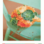
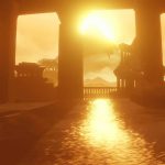
I found this picture in the museum and i though it was really cool. I worked 2 hours on this.
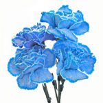
I worked on this 4 hours on these. The design on the left is my logo.
I have learned many things in this project. In phase 2 I learned that colors can have illusions due to the shades of the color and shifting color. This project was difficult because it was difficult to see the color interactions. It was difficult, but after a while I started to see the differences. I enjoyed the this project and I thought it was really fun to see how colors go together. I feel like this project didn’t need to post it on Bristol paper because it is all online and where I had to print the paper it costed money.


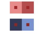

I have learned so many things in this part of the project. This part has shows me how colors look different even though hey can be the same. It is a type of illusion and I think its pretty cool.

This is our color interactions. We all have a different action going on in our color box. The theme is ginger bread people and we all put our personality’s as a ginger bred person. The one in the far left is a ginger bread person singing. The middle gingerbread person is lifting weights. The one in the far right is sleeping. I worked 2 hours on this project.
-
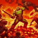
- Doom
-
- Journey
-
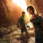
- The Last Of Us
These Images show a lot of color that complements each other. The Doom picture shows the red Yellowish background that goes very we” with the background what is happening. The Doom image is made by ID Software Inc. Journey is a beautiful game and this images shows it. The yellow and gold go well together. The Journey image is made by That game company Inc. The last picture is The last of us. The image has saturated colors and mute colors. Its a very dark game with a lot of emotions and the color of the game cover really shows that. The Last of us image is made by Naughty Dog Inc.
This Project Was very fun and different. In this Project it was fun to be creative on our color wheels and on the Swiss band poster. The only part of this project that was difficult was the color the 3 different color shades. It was difficult to understand and properly Paint it on Bristol paper. I didn’t understand the differences in the begging of the project and I did more paintings because I didn’t understand. I stared to understand and with the feedback that I got from my peers I improved my paintings and redid all of them. Overall I enjoyed this project and I wish we had more teacher demos of the color differences.
Saturation Studies: Phase 1, Saturation Studies: Phase 2, Saturation Studies: Phase 3
-

- Original Chemical People Swiss
-

- Soft Ice Chemical People
This is my band Soft Ice poster in Swiss.


Recent Comments