First Year Learning Community

Author: Gelek Sampehl (Page 1 of 3)

Color Harmony: Phase 4

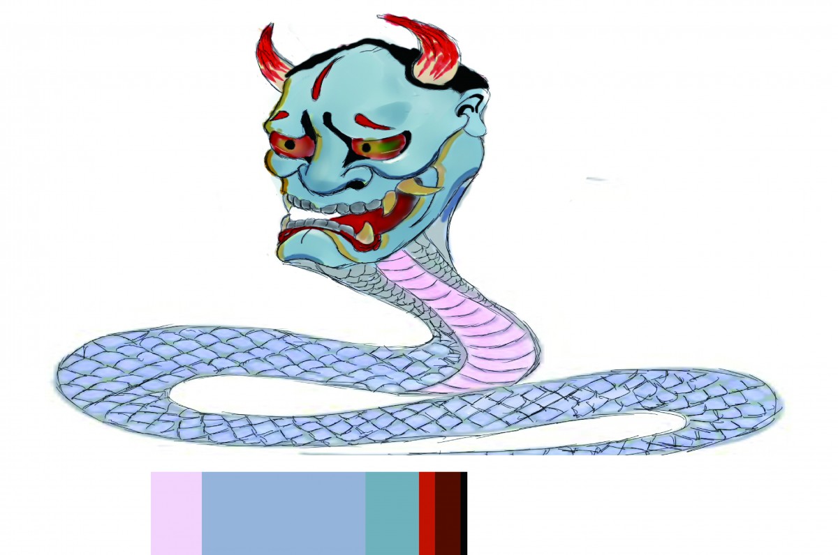
From this project, I learned how visual hierarchy can be present through the dominance and  proportion of the color, sometime, a small worm color can be on the top of the hierarchy when it is among a cold, like a drop of yellow on a violet paper. I learned a lot from this class, whether the step of the designs or the process of the design, I also Learned how every day object can be also used in to design. This class taught me design does not mean to create something unique, it means to create something meaningful.

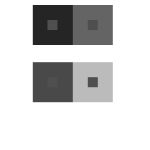
https://openlab.citytech.cuny.edu/schmerlerspevackfylcfa16/2016/12/18/color-harmony-phase-1-9/

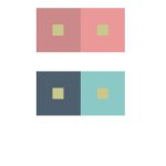
https://openlab.citytech.cuny.edu/schmerlerspevackfylcfa16/2016/12/18/color-harmony-phase-2-9/

https://openlab.citytech.cuny.edu/schmerlerspevackfylcfa16/2016/12/18/color-harmony-phase-3-8/

Color Harmony: Phase 3

%e6%9c%aa%e6%a0%87%e9%a2%98-3

After the trip to the museum, I felt I want to work with muted colors, thus, I drew this monster. I decided that muted blue will be my dominant color, and made the head and torso of the monster mostly blue and for the subdominant color I choose muted violet which can be seen on the abdomen of the monster.

Color Harmony: Phase 2

chriswarecolorinventory

While on the Cooper Hewitt trip, I happen to stopped at this painting because of its distinct positive and negative space, and also the gray scale is presented in here.

Color Harmony: Phase 1

Sunrise and Sunset can be a perfect example of color progression, as sun appear and vanish in the horizon, it creates this fading color on the sky as the picture above demonstrates, the color of the sky is gradually turning into dark violet to blue.

Color Interactions: Phase 4

Color interactions studies is a very useful and fun project indeed, this project made me  exercising my eyes to see the color and to differentiate colors.  I was very surprised when I was doing the phase one of the project, I learned how important color is to movie, games and all the media in general, as in the movie The Grand Budapest Hotel, colors were used to make the movie feels one whole piece, set of color scheme were used through out the film. All in all, this project inspired me for how to use color properly in future, because colors matters when it comes to delivering the mood to the audience.

https://openlab.citytech.cuny.edu/schmerlerspevackfylcfa16/2016/12/04/color-interaction-parings-phase-1-4/

https://openlab.citytech.cuny.edu/schmerlerspevackfylcfa16/2016/12/18/color-interactionphase-2-2/

https://openlab.citytech.cuny.edu/schmerlerspevackfylcfa16/2016/12/18/color-interactionphase-3/

Color Interaction:Phase 2

Color Interaction Parings: Phase 1

Journey is very unique game amount many games on in its genre, it is a  voyage plus exploring game, what makes it unique is its color, journey utilized wide range of color; mostly desaturated colors, and that made whole game play very relax.

The Grand Budapest Hotel used desaturated red on its color schemes, considering the setting takes time during winter, the pinkish color of the hotel really makes it feel that this hotel is very vibrant.  The second scenes of the movie is very different from the previous one, this scenes shows a small squad of soldier with saturated violet uniform against a desaturated red background; this draws audience’s eyes to the violet rather than the hotel itself.

Saturation Studies: Phase 4

I genuinely felt this project is complicated for me, as I don’t have an exquisite sense of color, thus, it is little hard for me to get the desired color; also it is pain in the neck to work with gouache, but, this project is fun and really  enjoyable experience  despite all the negativities. “Sense of color can be trained through practice.” this is what I believe after this project, I feel what I took away from this project can really help me on the future project whether is  using colors to deliver feeling  or ect.

https://openlab.citytech.cuny.edu/schmerlerspevackfylcfa16/2016/11/20/saturation-studies-phase-1-7/

https://openlab.citytech.cuny.edu/schmerlerspevackfylcfa16/2016/11/20/saturation-studies-phase-2-8/

https://openlab.citytech.cuny.edu/schmerlerspevackfylcfa16/2016/11/28/saturation-studies-phase-3-3/

Saturation Studies: Phase 3

Band Name: decaying vision

work time: 1 hour


« Older posts