I worked on this 4 hours on these. The design on the left is my logo.
Category: COMD1100 Project #6 (Page 4 of 5)
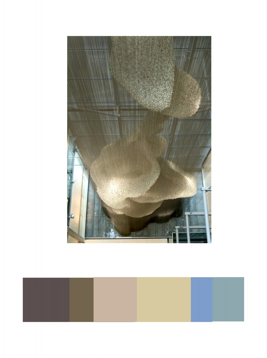
In the Cooper Hewitt Museum, I looked through the big table with the giant screen collection they have in the current and old exhibition. This has caught my eye because of different shades of light brown. IN the background you could see a little bit of light blue and medium blue. This was done by Heatherwick Studios and Thomas Heatherwick in 2003, called Bleigiessen.
My Copper Hewitt research page.
Hours Worked: 45 minutes
For our final project, Color Harmony, I used all my knowledge of our past projects to help me with this one. Finding out pallets was a challenge for because there was such a wide variety of color in one image, it was a bit difficult to make a proportional color pallet and to figure out which were the accents. What I did enjoy about this project was how it made me pay more attention to amounts of color in a photo and/or piece and what colors really accent them, or what colors give the piece dynamic in tint and shadings to really bring it to life. Color harmony really helped me to better understand how colors can go together in varying amounts and how tints and accents, plus the amount of color used is really important when thinking about making a piece.
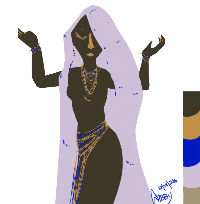
For phase 3 of this color harmony project I wanted to use the pallet I got from my phase 2 at the museum. For my free study I decided to draw a woman, the program used was Autodesk Sketchbook and a Cintiq tablet. I made the off-white color my dominant color and the muddy brown my subdominant. The blue was my accent and the muddy yellow is my shade since it isn’t a pure yellow. There was some difficulty in making this since the accent color was such a pure blue, but otherwise it was fairly enjoyable due to a majority of the colors not being so pure, I was able to find a way to make them go together.
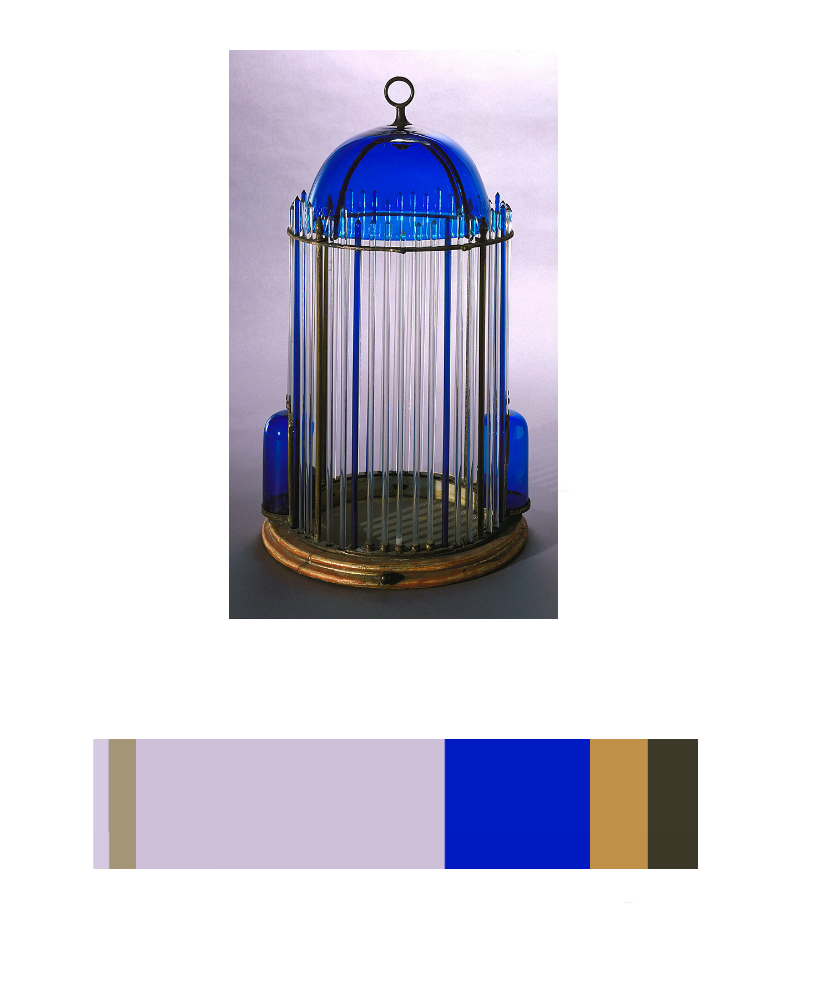
While on the museum trip, I happened upon a set of bird cages. The blue and gold one caught my eye in particular. What caught my eye with this piece was the glass dome and rods. Its amazing how such fine and pigmented glass work can last so long, especially since it came from Italy during the earlier part of the 19th century. The blue was especially vibrant compared to the faded gilt base.
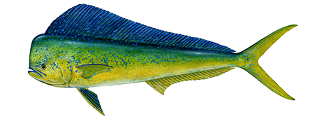
This Dolphin fish is a good example of color to color progression because of the way it starts off as blue, makes its way towards green in the middle and finishes off at yellow. The blue to yellow progression is smooth all the way through, and blends well in the middle of the fish, proving this as a good example.

This Blue Macaw is a good example of tint progression because the feathers that start at the beak are a grayish blue which fades out of the birds head into a more solid blue. Depending on how the light hits the birds feathers is how blue they will look, hence the feathers towards the bead are a faded grayish blue, and the birds body is more of a vibrant blue.
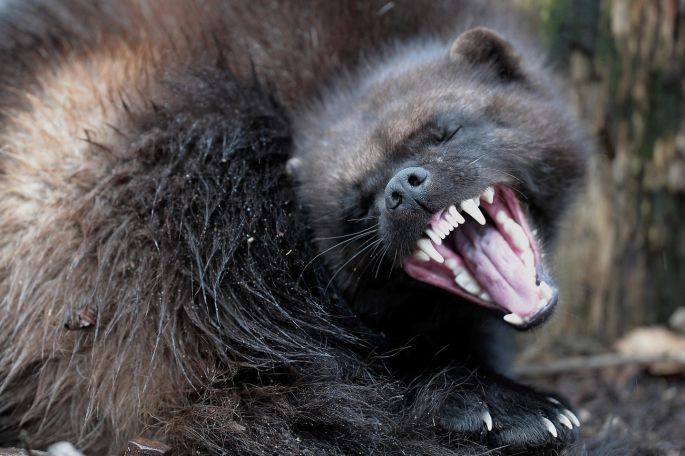
This photo of a Wolverine is a good example of shade progression because the light brown of its furn fades into dark brown fur and then darkens into back near its face. Showing a shade progressing that goes from color to black.
I decided to take this image because it has all the qualities that the image needed. It has color hierarchy although some are very close in amount like the sun red color and the dark gray on the roster.
Hours: 1

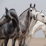
The best example of color harmony that I could find id something that has forever intrigued me. Space. There is just so many colors out there in outer space. One example which I also used on the previous project was a Nebula. Now this is just so extraordinary because is something found in nature, it’s not something that was carefully planned so that the colors could contrast each other. Is something that just happened by elements combining together to having chemical and physical reactions. As you can see in the picture, the red and green which are complementary colors make the nebula look super radiant and even with a feeling of an energy from a great magnitude. On the image with the horse we see shade progression as we move our eye to the left and tint progression as we move to the right
Hours: 1
-
- shade (on left) and tint (on right) progression
-

- color progression
During this project, I learned about the relationships between different colors and how these relationships can work to enhance or dull the presence of each color depending on their positioning. I believe that I maintained a good understanding of the progression of colors in tints, shades, and color transitions. The understanding of these three topics helped me to find a good example of color harmony during our trip to the Cooper Hewitt Design Museum and gave me the opportunity to use these color relationships to recreate them in my own fashion. So overall, I believe I encountered and digested a great amount of knowledge and potential from this project.
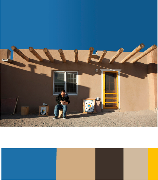
Owe’neh Bupingeh Preservation Project & Proportional Color Inventory

Summer
For this Free-Study composition, I decided to use my proportional color inventory to create a beach scene which I have named “Summer”. For this composition, I wanted my dominant color to be the blue hue I obtained from the sky in the original picture. I also decided to use the yellow accent to cause contrast in the composition and bring the viewers eye to the figure in the composition, which would be the man on the floating tube. After that, I wanted to use the sub-dominant shades of beige to be next to the water as a secondary figure. I also positioned it to be in the lower-right corner because I believe that this is where the eye is least likely to look first and thus leave the attention to the primary figure in the top-left. I also gave the beach coast a descending feeling by organizing the shades to grow darker as they approach the end of the composition and continue outside the page.
Hours worked: 3 hours


Recent Comments