First Year Learning Community

Category: COMD1100 Project #6 (Page 3 of 5)

Color Harmony: Phase 2

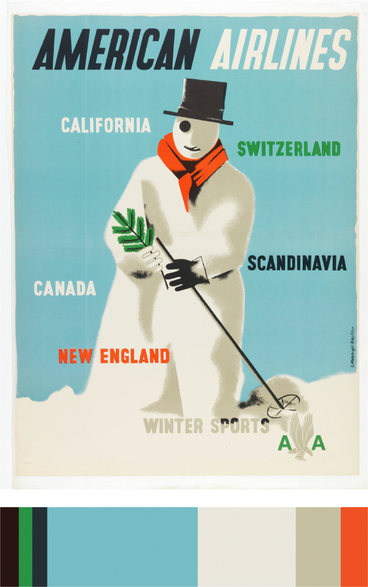
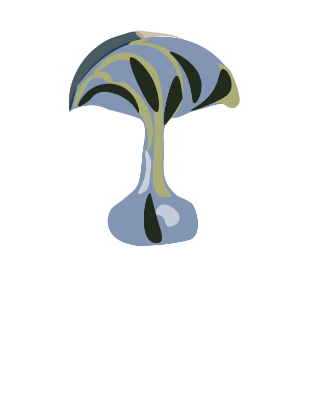
While exploring on the interactive table at the museum, I encountered this poster. I really loved the color scheme and thought I could create something decent with these colors. I learned what a dominant and sub-dominant color was. I was a little confused with the accent colors but now I think I understand. The dominant color is the pale blue, the sub-dominant would be the white, and the accent color would be the orange.

Poster Link

Time worked: 30 minutes

Color Harmony: Phase 1

I chose the fish for the two color progression because you can clearly see the change of color in the fish’s body and fin. It goes from blue to red, as well as in the tail it has bits of red. I chose the ferret for the shade progression because you can notice in it’s chest and arms, it gradually goes from brown to black. I chose the sunset because in my opinion, it was the best example for tint progression since sunsets always have many different tints of many colors. There you can see light oranges, vivid oranges, etc.

Color Harmony: Phase 2

chriswarecolorinventory

While on the Cooper Hewitt trip, I happen to stopped at this painting because of its distinct positive and negative space, and also the gray scale is presented in here.

Color Harmony: Phase 1

Sunrise and Sunset can be a perfect example of color progression, as sun appear and vanish in the horizon, it creates this fading color on the sky as the picture above demonstrates, the color of the sky is gradually turning into dark violet to blue.

Color Harmony: Phase 4

For this project, we have a chance to make a composition of whatever we want by using the colors for the color inventory of the composition in the museum.  It was fun to create our own composition, but the work spends a bit more time than what I had thought. I have to make change for few times while I was trying to post phase 3, I look back on my composition, the color inventory on the bottom was different placement on the top. So I have to make switch them a little bit and added more color to separate the dominant color and sub-dominant color. What I can do better next time will be spending a little more time to experiment  with the different tools in photoshop and illustrator to make a better composition that match my imagination.

Phase 1

Phase 2

Phase 3

Color Harmony: Phase 3

shan-phase3

For my freestudy composition, I decided to do a beach scene because I have different kind of blues. My dominant color was the light purple blue for the sky with the beige white as use in the original composition and switch the placement of the color for my sub dominant color as the the light blue for the water and the beige for the sand. The accent color will be the darker blue for the slipper to be a little focus point. Lastly will be the tree in the front, it had a little shade of the green to darker green. Or a little tint of the blue between the water and the sand on the left corner.


Work time: 1 hr 30 mins

Color Harmony: Phase 3

lmartinez_phase3pt2

For Phase 3, the colors I got inspired by making a scenario of the beach. From the original composition, it remained me of sand. I use light brown on top of the wood box and the sides dark brown to give it shade. Most of the composition has light brown. For the blues, I used the ocean and the sky as well. The dominant color is the light brown, the sub-dominant is the sea blue, the accent color is the white or the medium brown from the wood box.

Hours Worked: 1 Hour and a Half

Color Harmony: Phase 2

I found this picture in the museum and i though it was really cool. I worked 2 hours on this.

« Older posts Newer posts »