In this final project, i enjoyed learning about hierarchy and how to choose the accent, medium, and dominant colors. I found it really fun and interesting going to the cooper hewitt museum, to find our picture for our project. Being interactive makes everything more fun. All in all, this project was very exciting because we got to choose what it was that we wanted to create, and overall this was my favorite class of the semester. I learned a lot that had to do with the course and about myself.
Category: COMD1100 Project #6 (Page 2 of 5)
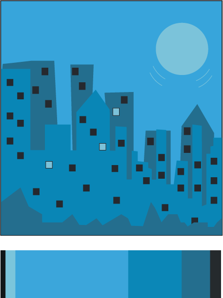
I always enjoy drawing different versions of the city. So for my freestyle i decided to use this color palate to create a piece of the city in another media, illustrator. The dominant color is the light blue, the accent color is the light turquise, and the medium colors are thr darker toned turquises and the dark gray and black.
Freestyle
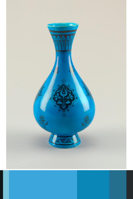
I found this image of this vase in one of the digital tables at the Cooper Hewitt Museum. It was given to Christopher Dresser and manufactured by Minton’s Art Pottery Studio. There are different shades of blue from this point of view, and that is what caught my attention. It is dated 1870s and was acquired in 1998. It is a medium glazed porcelain, and part of the Product Design and Decorative Arts department.
two-color progression
shade progression
In this final project it was a really interesting. This project was very fun because we had to design and take pictures. The trip to the museum was also very fun. The attractiveness was very fun. I learned how to properly set up the colors of a picture and how to properly export a picture to have the most high resolution. This project overall was fun yet not so much difficult. This was class was very fun and interesting and i hope to see everyone again.
In this Project, I learned the colors used in a composition and the dominant, sub-dominant, accent, and tint colors would be. What I believe I could have done better is create the waves more realistic and show more black. From what I learned in this project that I could apply in anything project would be knowing what colors are common and be able to make them fit together.
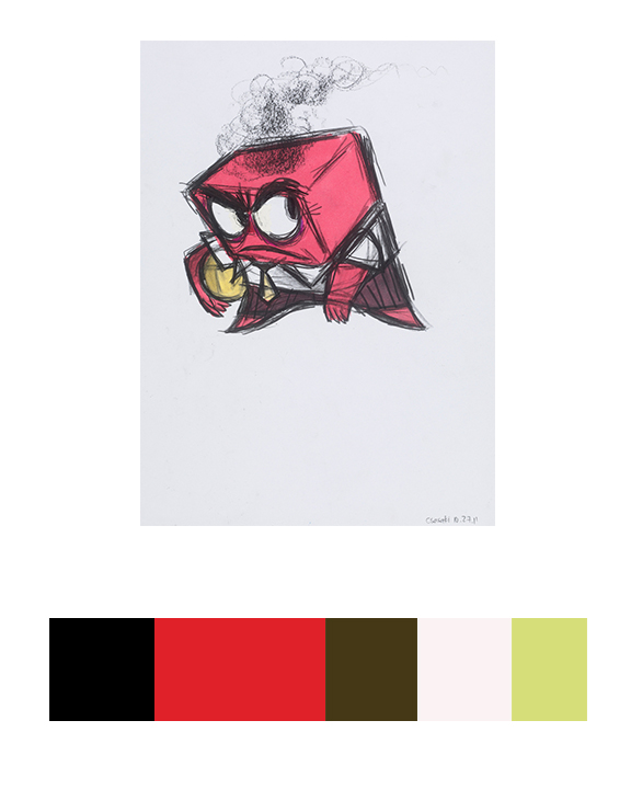
CONCEPT ART, ANGER, INSIDE OUT, 2015
Work time: 1 Hour
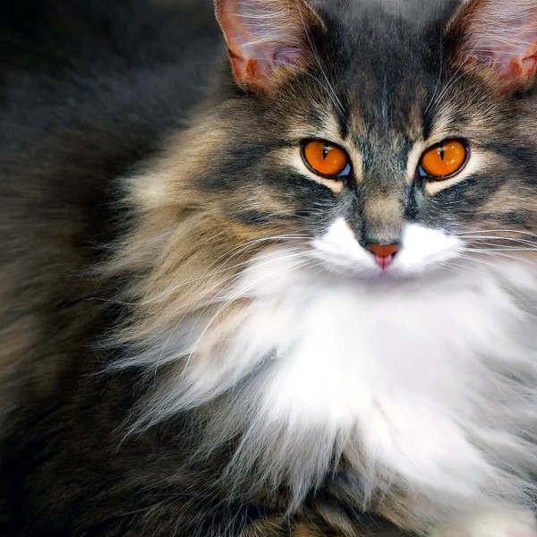
This picture of a cat does a good job of color to color progression because of the different colors of its fur. It starts off with a dark-ish brown tint, to gradually getting lighter to a natural light.
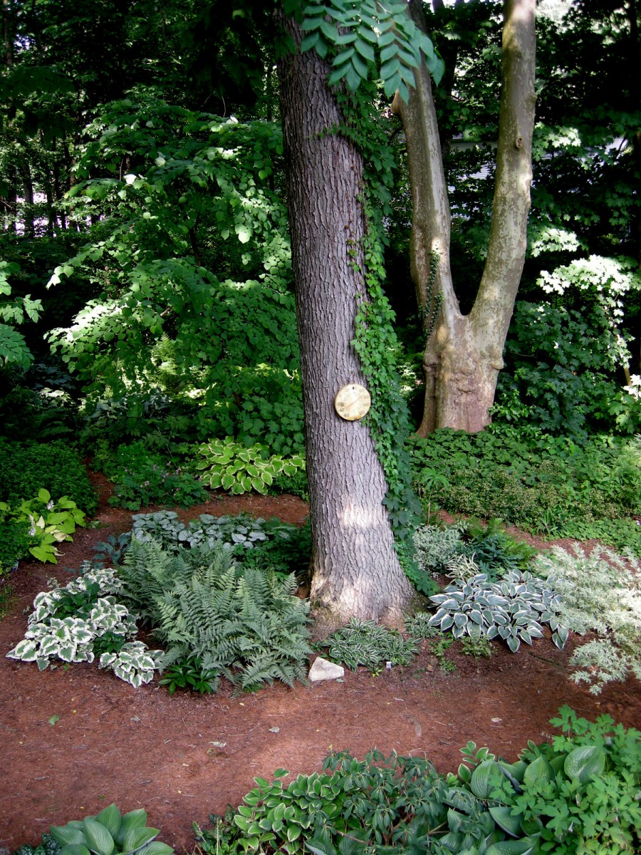
Because of the shadows, the leaves in the background; as well as the top areas of the tree, become darker and blends in with each other showing off Shade progression.
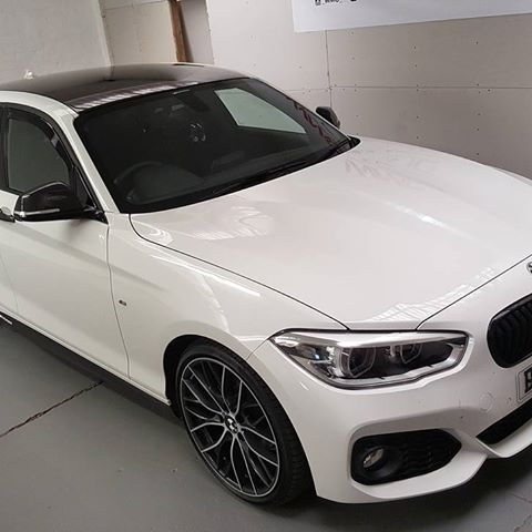
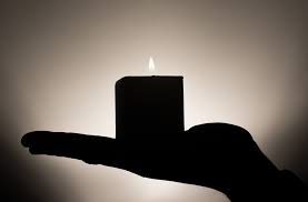
This displays tint progression since the hood of the car goes from black to a white tint.
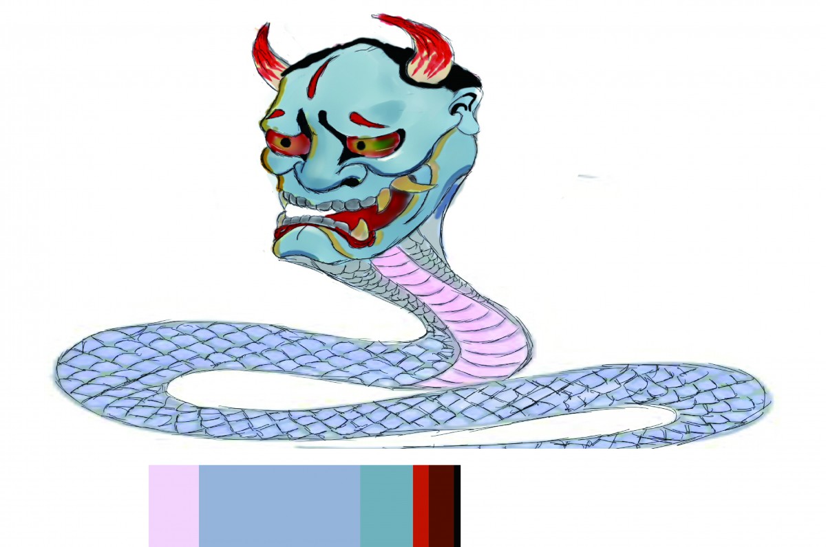
After the trip to the museum, I felt I want to work with muted colors, thus, I drew this monster. I decided that muted blue will be my dominant color, and made the head and torso of the monster mostly blue and for the subdominant color I choose muted violet which can be seen on the abdomen of the monster.
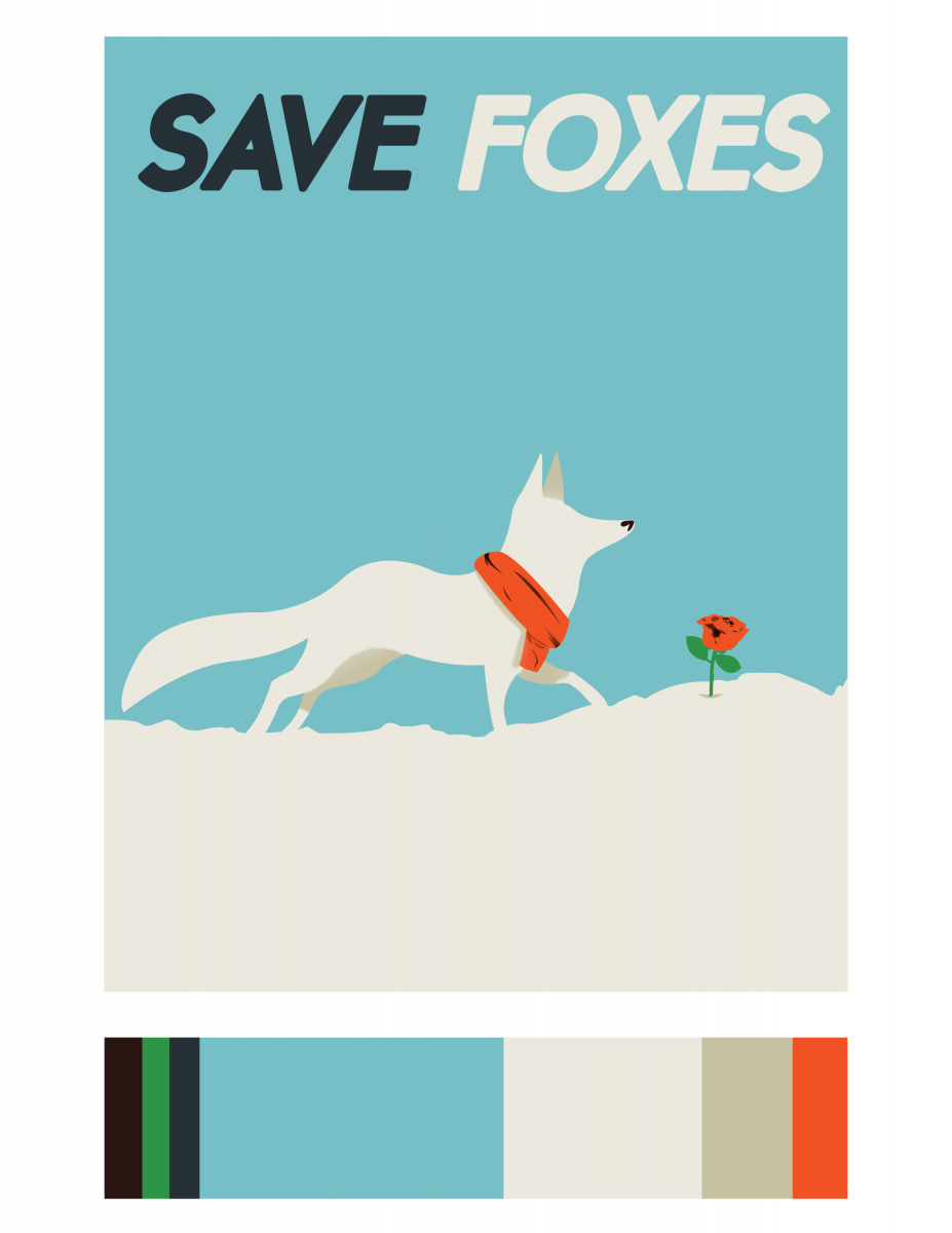
For this stage of the project, I decided to create a poster with a similar style. The reason why I chose a fox was because of the previous project we did, I thought the idea of an arctic fox would be nice. I also included the message Save Foxes because global warming continues to affect wildlife, and the arctic foxes are one of the affected species. The dominant, sub-dominant, and accent colors are the same and I decided to portray the accent color through the scarf and rose. This part of the project was very fun in my opinion, I learned a lot and thoroughly enjoyed it.


Recent Comments