PLAY WITH YOUR PROBLEMS - FYLC Fall 2016

First Year Learning Community

Page 8 of 47

Color Interaction: phase 1

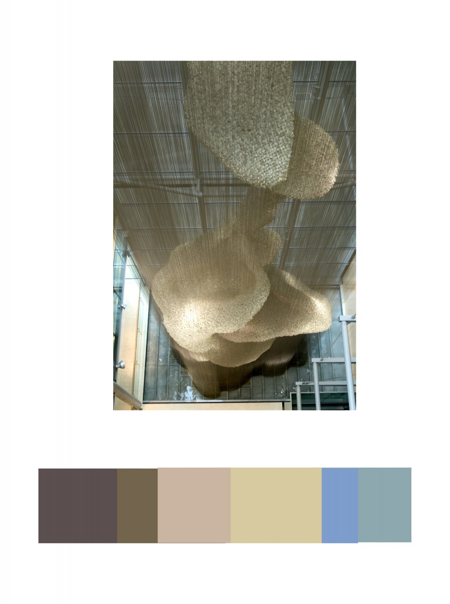
I choose this picture that I took around the high line. Because the whole picture is made up of color. I took it during the summer and the picture pretty much shows that it was taken around a warm sunny day. The contrast on the mural was edited a bit but in the original it express the same amount of contrast.

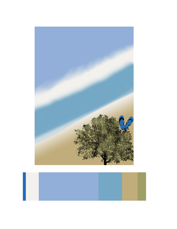
This picture I took around my block, the natural light in the sky during the sunset was very beautiful and eye attracting that I had to take it.

Color Harmony: Phase 3

shan-phase3

For my freestudy composition, I decided to do a beach scene because I have different kind of blues. My dominant color was the light purple blue for the sky with the beige white as use in the original composition and switch the placement of the color for my sub dominant color as the the light blue for the water and the beige for the sand. The accent color will be the darker blue for the slipper to be a little focus point. Lastly will be the tree in the front, it had a little shade of the green to darker green. Or a little tint of the blue between the water and the sand on the left corner.


Work time: 1 hr 30 mins

Color interaction: Phase 4

Phase 3

Phase 2

Phase 1

Doing this project help me understand why picking the color for a theme is important. Color gives meaning to a project. This something I never thought of because when I think of color all the pops in my head is green, red and blue, but after doing this project I see that color is much more than that. This project helped train my eyes to see the difference in color when I see a portrait or picture. As well by placing complementary colors next to each other makes one another visually appear different.

Color Harmony: Phase 3

lmartinez_phase3pt2

For Phase 3, the colors I got inspired by making a scenario of the beach. From the original composition, it remained me of sand. I use light brown on top of the wood box and the sides dark brown to give it shade. Most of the composition has light brown. For the blues, I used the ocean and the sky as well. The dominant color is the light brown, the sub-dominant is the sea blue, the accent color is the white or the medium brown from the wood box.

Hours Worked: 1 Hour and a Half

Color Harmony: Phase 2

I found this picture in the museum and i though it was really cool. I worked 2 hours on this.

Color Harmony: Phase 3

I worked on this 4 hours on these. The design on the left is my logo.

Color Harmony: Phase 2

lmartinez_colorharmony

In the Cooper Hewitt Museum, I looked through the big table with the giant screen collection they have in the current and old exhibition. This has caught  my eye because of different shades of light brown. IN the background you could see a little bit of light blue and medium blue. This was done by Heatherwick Studios and Thomas Heatherwick in 2003, called Bleigiessen.

My Copper Hewitt research page.

Hours Worked: 45  minutes

Color Interactions: Phase 4

Color interactions studies is a very useful and fun project indeed, this project made me  exercising my eyes to see the color and to differentiate colors.  I was very surprised when I was doing the phase one of the project, I learned how important color is to movie, games and all the media in general, as in the movie The Grand Budapest Hotel, colors were used to make the movie feels one whole piece, set of color scheme were used through out the film. All in all, this project inspired me for how to use color properly in future, because colors matters when it comes to delivering the mood to the audience.

https://openlab.citytech.cuny.edu/schmerlerspevackfylcfa16/2016/12/04/color-interaction-parings-phase-1-4/

https://openlab.citytech.cuny.edu/schmerlerspevackfylcfa16/2016/12/18/color-interactionphase-2-2/

https://openlab.citytech.cuny.edu/schmerlerspevackfylcfa16/2016/12/18/color-interactionphase-3/

Color Interaction:Phase 2

« Older posts Newer posts »