PLAY WITH YOUR PROBLEMS - FYLC Fall 2016

First Year Learning Community

Page 16 of 47

Color Interaction Pairings: Phase 1

Obtained fromĀ Wikipedia

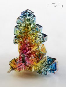
Bismuth

Bismuth Crystal

I find the color interactions on a Bismuth crystal to be fascinating becauseĀ of all of the different hues that appear on the surface of the crystal. The reason that Bismuth shines in so many different colors is because of the different levels of oxide that reside on its surface. This causes for light to reflect in different wavelengths off of the crystal and appear as different hues.

Obtained from Pinterest

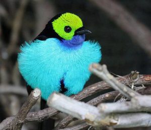
The Paradise Tanager

The Paradise Tanager

This image caught my eye because of the contrasting colors on this tropical bird. The reason for this was because of the different color contrast that appears on its feathers. I like how while all of these colors seem very vibrant, the change in value differentiates them from each other. This allows for the birds overall appearance to really stand out without clashing against itself.

Color Interaction: Phase 1

418231fe70a0e22d382eefdc5967c65f

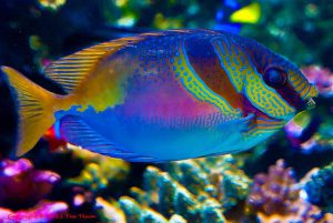
Tropical Fish

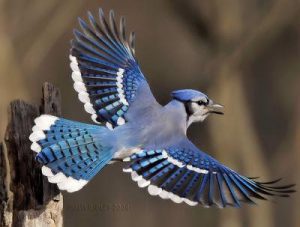
While learning about color perception I learned that there are many different ways our eyes perceive color. We all see color color differently and we also perceive color differently because of the way they are placed together,mixed, their saturation, and even the amount of light that reflects off of it. I chose a tropical fish and a bluejay to show different and beautiful ways color can interact with each other in nature because how unique it can be.

Male BlueJay

Color Interactions: Phase 1

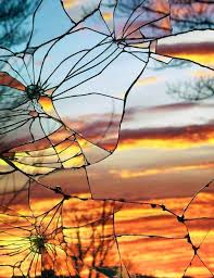
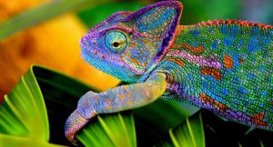
Learning about color and how our eyes perceive it, is really interesting. Playing around with the app helps you see how mixing different colors together in one piece can make your eyes perceive it as a different shade depending on how you choose your colors. The first thing that popped into my head that demonstrates a different interaction with colors is a sunset. Sunsets are always a mystery, because you never know how it is that the colors are going to be that evening. Then theres the Chameleon, a very interesting reptileĀ that changes color, which i find very intriguing… imagine if our skin changed colors.

chameleon-1


Color Interaction: Phase 1

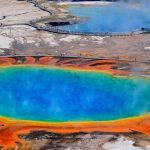
While watching the video and playing around with the app, I was thinking what things in nature have an interesting arrangements of color and three things came up. The Sunburst which is a hot spring in Yellowstone National Park ( a place that is in my bucket list), the Cat Eye Nebula, and the Carina Nebula. All these three things have an amazing interesting use of color, but what is the most amazing is that it just happened. Nobody arranged the colors in these three natural objects . For example, the colors in the hot springs is just different colonies of bacteria as well as decaying enzymes. The nebulas areĀ interstellar clouds of dust, hydrogen,Ā helium and other ionized gases. So as you can see sometimes beautiful things are not made, they just happen.


Saturation Studies: Phase 4

Phase 1

Phase 2

Phase 3


Saturations studies was hard for me, but I did learn a lot. I learned that there is a lot more to know about color. IT was difficult mixing to get the right shades and colors because some paints were more pigmented that others. This was very new to me because I am more accustomed to using painting digitally. Saturations studies did help me improve coloring my work. With new ways to blend and make color, I can make more dynamic pieces.

Saturation Studies: Phase 4

Phase 1:

Phase2:

Phase3:Ā 

I honestly really enjoyed this project, even though i stressed a little while making it. I finally learned the difference between the saturation of colors and the value of colors. In this project i felt more prepared and less insecure about getting the color on paper. I tried keeping the theme of a pretty clean and neat overlapping design throughout all phases. This was one of my favorite projects.

Saturation Studies: Phase 4

In this project, we learn about saturation,the difference between prismatic color, muted color and chromatic gray. Ā First, we began with a color wheel freestudy. Second, we did the saturation studies, mix and match with little pieces of painted bristols. Lastly, we did a band poster by following the swiss style. We had choose warm or cool colors, a composition card, and come up with a band name that include two sensory meanings. Ā What can I do better next time might be to make the flowers for the color wheel larger for easy visualization, and spend a little more time with the paint. I feel like I still cannot control the color of the paintĀ because when it dry, the color came out different when I first painted.

Phase 1

Phase 2

Phase 3
Saturation Studies :Phase 4

Phase 3

Phase 2

Phase 1Ā 

Throughout completing this project it was a bit difficult to differentiate between saturation and value. My favorite assignment in this project was phase 1; I was able to bring Ā in my own art style to the free study. Overall, I was able to understand the concept of these two terms. In the future , I won’t shy away from new concepts and have a better understanding it .

« Older posts Newer posts »