
First Year Learning Community
Work Spent: 1hour
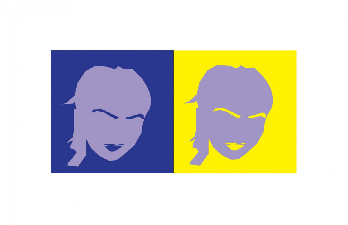
This was also one of favorites. I think i finally got the hang between the difference of hue and value. I also finally learned how to use the pen tool! I took my time and tried my best to remake gege’s profile. Gege chose the color yellow for me because she says im a very energetic and athletic person, and i chose the color blue for her because gg is very deep and passionate about the things that catch her attention and she’s also very smart. We both decided that the color purple, represented the both of us because we are both very artistic in our own way.


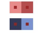

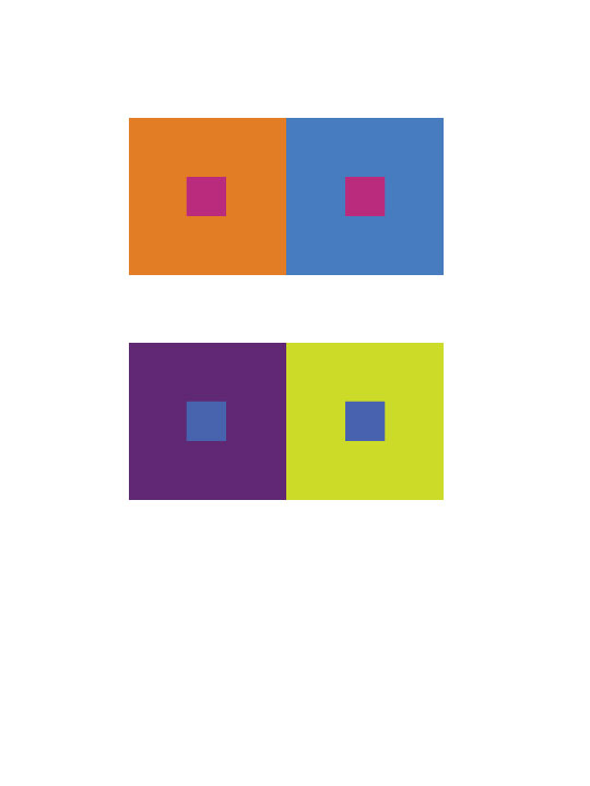
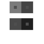
I have learned so many things in this part of the project. This part has shows me how colors look different even though hey can be the same. It is a type of illusion and I think its pretty cool.
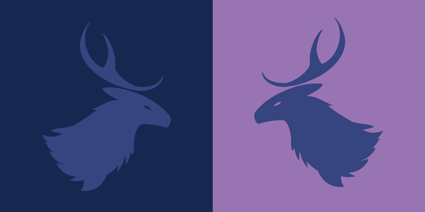
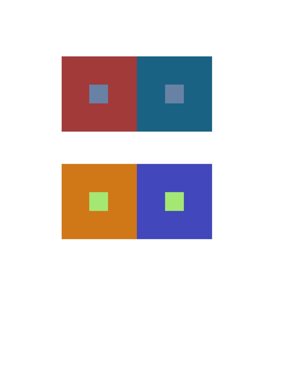
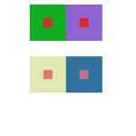
The color I chose for my partner, Gabriela, would be a muted purple with a bit of blue because I see her as a well-organized person. I also see her as being more reserved, calm and cool-headed. The symbol I used for her would be a deer to show that while she is gentle, she can be strong when she needs to be.
Hours Taken: 2 hours
By Aaron Hollingsworth
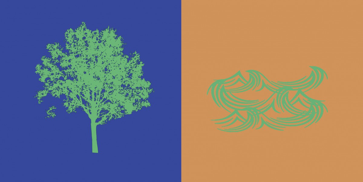
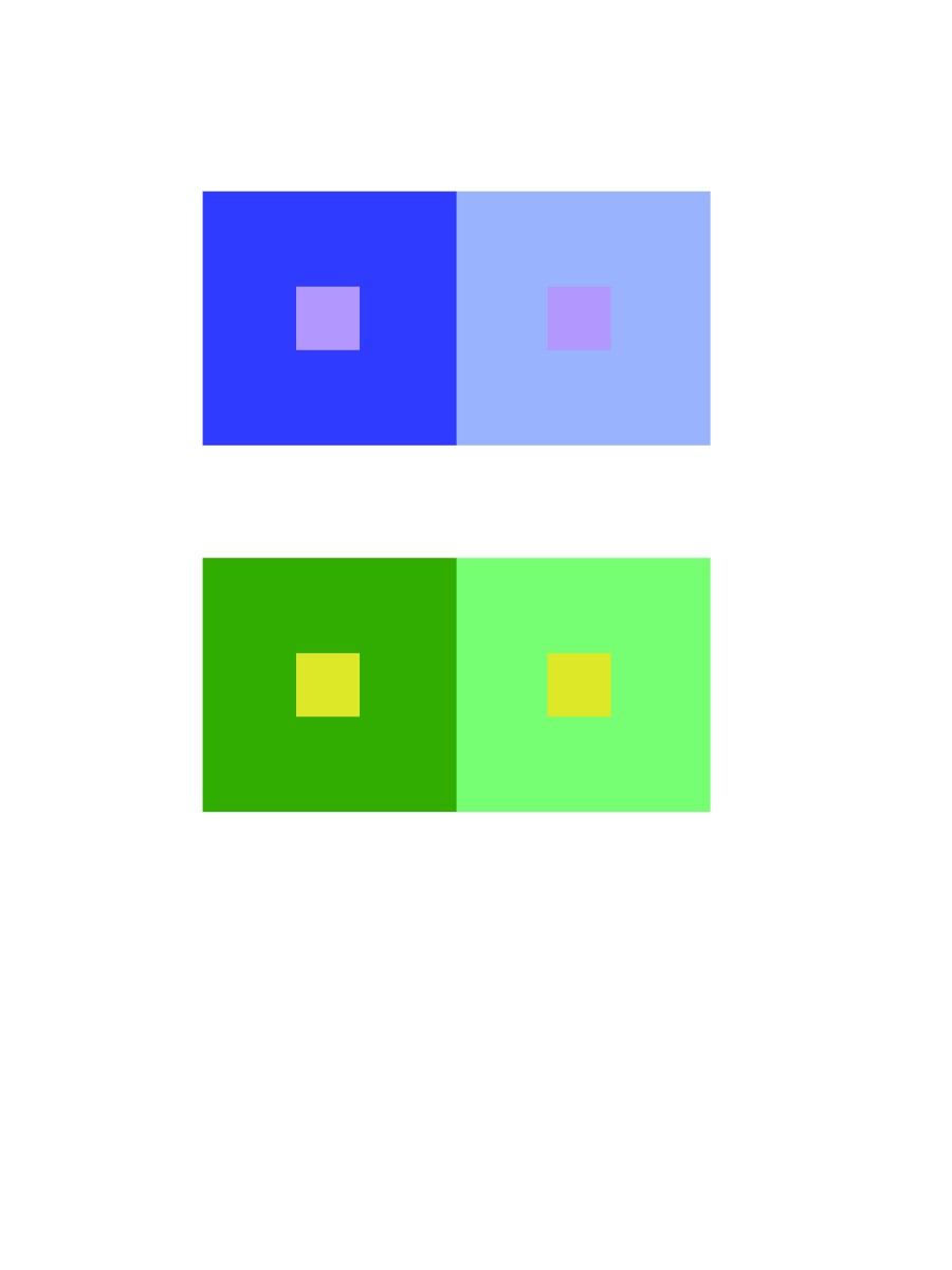
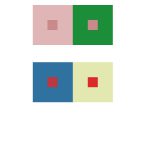
ShanShan and I created a paired color identities with simultaneous constrast. I chose the color blue for ShanShan because she is shy, intelligent and relax. We chose the color green as our influence color because we wanted to make the theme about nature. A symbol representing her is a tree, because when I think of a tree, I imagine a person laying back on the tree reading a book and relax.
Hours Worked: 2 Hours
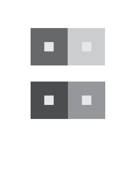
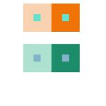
Chromatic Gray Studies
Shifting Value with Color
Shifting Hue, Not Value

Shifting Hue and Value
Hours Worked: 3 Hours
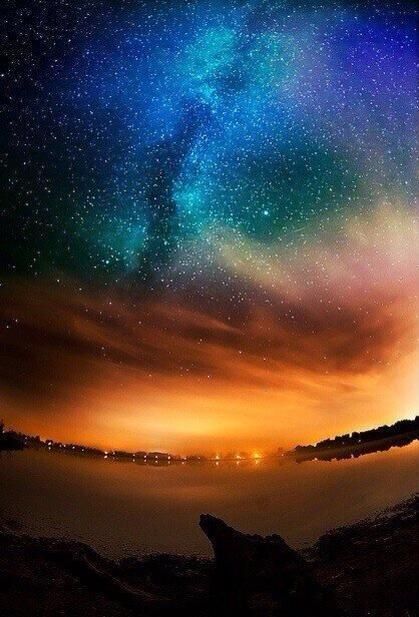
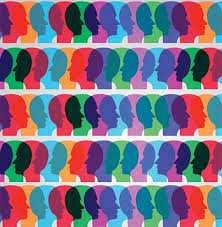
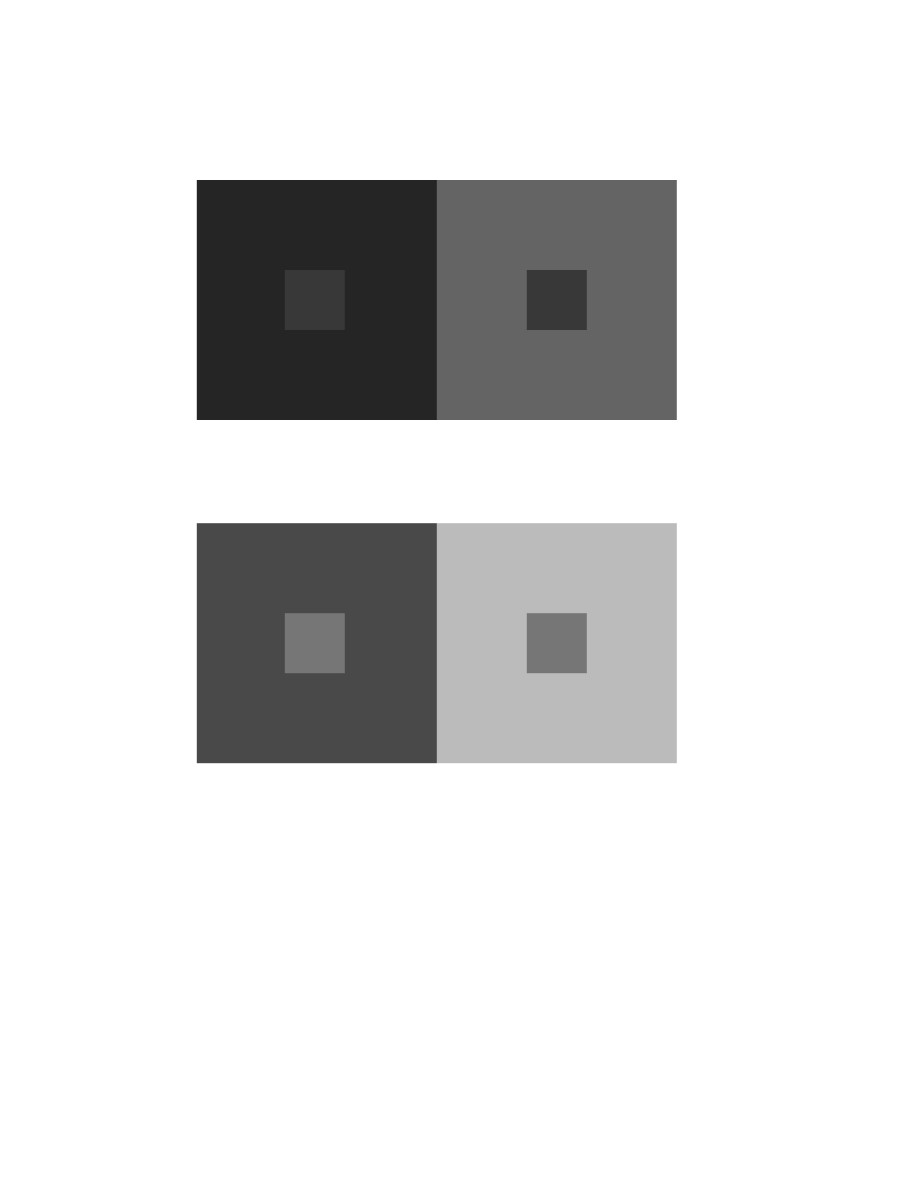
The left picture is the atmospheric perspective of the sky in Alaska. I see these colors combining together and different shades of blue and orange. I see tint of purple and greenish color and I think that no color is being center of attention. It catches the person interest towards above then slowly down in the composition. In the second picture it shows a person head with different colors. There are colors and different shades of it because of the background color surrounding it. For instance, the blue looks light on the orange but not in the red.
Total Hours: 2

This is our color interactions. We all have a different action going on in our color box. The theme is ginger bread people and we all put our personality’s as a ginger bred person. The one in the far left is a ginger bread person singing. The middle gingerbread person is lifting weights. The one in the far right is sleeping. I worked 2 hours on this project.
© 2024 PLAY WITH YOUR PROBLEMS – FYLC Fall 2016
Theme by Anders Noren — Up ↑
The OpenLab is an open-source, digital platform designed to support teaching and learning at City Tech (New York City College of Technology), and to promote student and faculty engagement in the intellectual and social life of the college community.


Recent Comments