Category: Student Posts (Page 13 of 40)
-

- Shifting hue and value
-

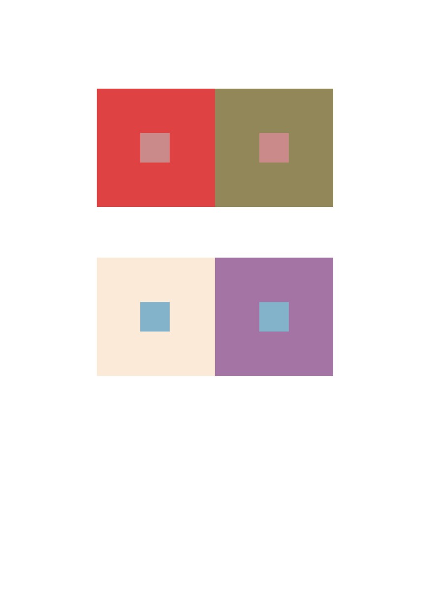
- 2 Pairs of chromatic colors
-
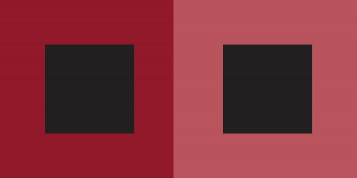
- Value
-
- Hue not Value
-

- Hue and Value
-

- Hue
Hours Worked: 1.5 hours


Val&Gege
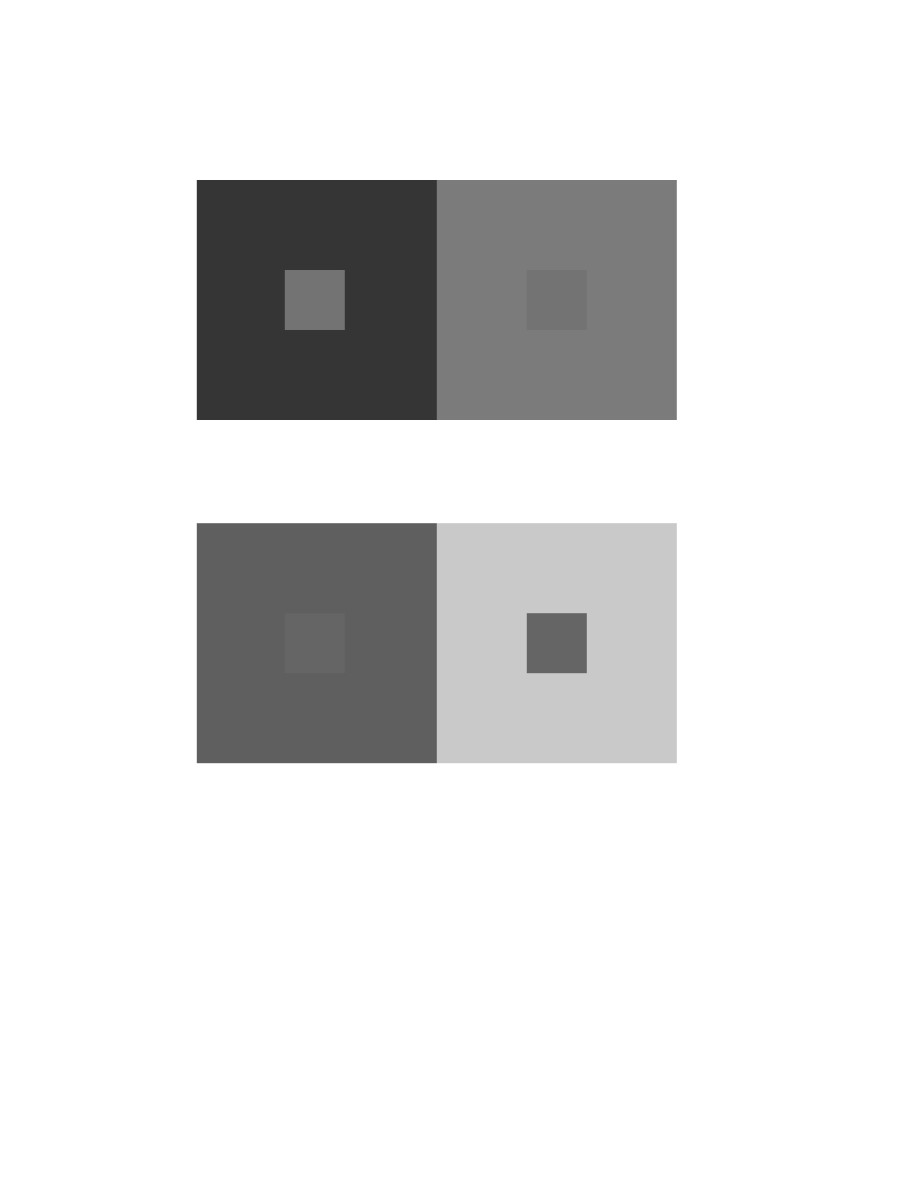
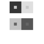
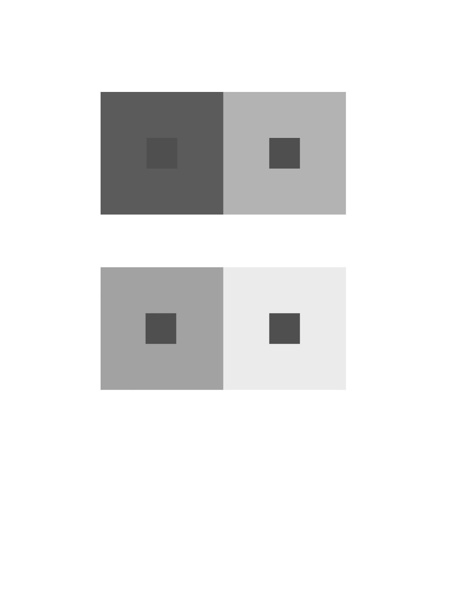
2 pairs of achromatic gray studies interactions by shifting values

2 pairs of color studies interactions by shifting value (with color)
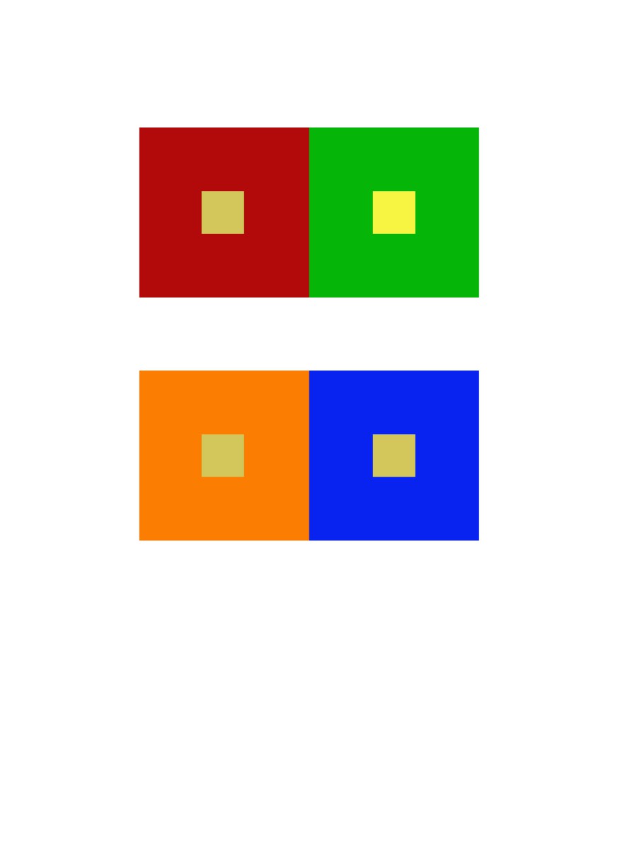
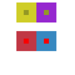
shifting hue not value
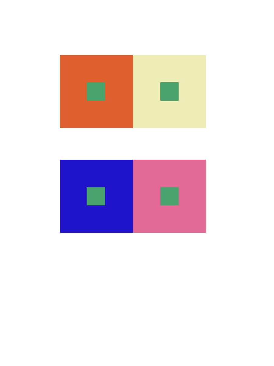
shifting hue and value
-

- Doom
-
- Journey
-

- The Last Of Us
These Images show a lot of color that complements each other. The Doom picture shows the red Yellowish background that goes very we” with the background what is happening. The Doom image is made by ID Software Inc. Journey is a beautiful game and this images shows it. The yellow and gold go well together. The Journey image is made by That game company Inc. The last picture is The last of us. The image has saturated colors and mute colors. Its a very dark game with a lot of emotions and the color of the game cover really shows that. The Last of us image is made by Naughty Dog Inc.
Me and Kofi worked on this together.
Took about 2 hours
-

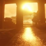
- A screen shot from journey
-

- A poster of journey
-

- A scenes for movie The Grand Budapest Hotel
-

- A scenes for movie The Grand Budapest Hotel
Journey is very unique game amount many games on in its genre, it is a voyage plus exploring game, what makes it unique is its color, journey utilized wide range of color; mostly desaturated colors, and that made whole game play very relax.
The Grand Budapest Hotel used desaturated red on its color schemes, considering the setting takes time during winter, the pinkish color of the hotel really makes it feel that this hotel is very vibrant. The second scenes of the movie is very different from the previous one, this scenes shows a small squad of soldier with saturated violet uniform against a desaturated red background; this draws audience’s eyes to the violet rather than the hotel itself.


Recent Comments