First Year Learning Community

Category: Student Posts (Page 10 of 40)

Color Harmony: Phase 2

shan-phase2

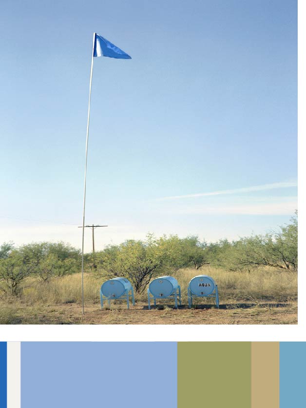
This is a project responding to migrant deaths along the Arizona-Mexico border due to dehydration, Humane Borders designed a system for placing water in the desert. More than 100 water stations, small tanks painted blue—the universal color of water—and tagged “AGUA” with a 30-foot-high pole and flag to increase visibility, have been deployed throughout southern Arizona, dispensing more than 100,000 gallons of water since 2001. A poster outlining the dangers of migrating on foot through the desert is distributed in shelters south of the border.

https://collection.cooperhewitt.org/objects/420777949/

Work Time: 30 mins

Color Interactions: Phase 4

Phase 1

Phase 2

Phase 3


These color interactions studies have taught me a lot about the ways colors interact with each other and how they can influence what we perceive them as. Phase 2 in this project helped to really open my eyes to how placing two colors together can create the illusion of darkening, lightening, tinting, and even giving a different color an outline. I definitely enjoyed phase 3 of this project, especially with choosing the colors with my partner and making their logo. What interests me the most is how the logo looks like two completely different colors on their respective backgrounds; I really feel like I learned a lot about colors and the way they interact with each other through this project.

Color Interaction:Phase 2

Time Taken: 2Hrs

Color Harmony: Phase 1

img_3535

Two-Color Progression

581bc18a-3064-4c0a-ae83-876cc018d1f9

Tint Progression

img_3539

Shadow Progression

The first image shows two-color progression because of the green has different tones that turn into black.  The tint progression shows the sunset, the tint shows the yellow orange colors, they are analogous. The shade progression shows the clouds white then turning darker, to medium black.

Color Interaction Pairings: Phase 4

What I learned in this project is the color value and saturation. For instance, the color is the same in a composition but it appears different because of its influence color and the saturation. What I would like to retry again would be Group 4 Shifting Hue and Value, it was very challenging for me to see and make the hue different from one another. For our next project, I would use the color wheel and know the complimentary of each color.

Phase 1: Discover / Phase 2: Define / Phase 3: Develop

Color Harmony: Phase 1

img_4495

Two Color Progression

This picture had two color progression because the flower had changed its color from magenta to pink.

img_5213

Tint Progression

The orange had made a tint progression as it gets closer to the bottom. The orange had become more desaturated with white.

img_5218

Shade Progression

This picture had a shade progression because the blue had become more desaturated toward  black as it get closer to the upper left corner.

Work Time: 1hr

Color Interaction Parings: Phase 4

I have learned many things in this project. In phase 2 I learned that colors can have illusions due to the shades of the color and shifting color. This project was difficult because it was difficult to see the color interactions. It was difficult, but after a while I started to see the differences. I enjoyed the this project and I thought it was really fun to see how colors go together. I feel like this project didn’t need to post it on Bristol paper because it is all online and where I had to print the paper it costed money.


phase 1

phase 2

phase 3

Color Harmony: Phase 1

« Older posts Newer posts »