First Year Learning Community

Category: COMD1100 Project #5 (Page 3 of 6)

Color Interaction Parings: Phase 4

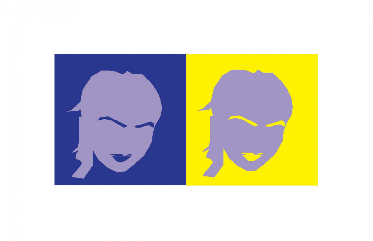
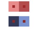
I have learned many things in this project. In phase 2 I learned that colors can have illusions due to the shades of the color and shifting color. This project was difficult because it was difficult to see the color interactions. It was difficult, but after a while I started to see the differences. I enjoyed the this project and I thought it was really fun to see how colors go together. I feel like this project didn’t need to post it on Bristol paper because it is all online and where I had to print the paper it costed money.


phase 1

phase 2

phase 3

Color interaction: 3 phase

Time spent:1 hr

Color Interaction: Phase 4

Phase:1

Phase:2

Phase:3

During this project I learned a lot about the color wheel I did not know. There are different colors and ways you can use them. That is very interesting to know that colors can be seen differently when looked at one or the other. When you combine and put two different colors beside each other as like the color wheel that compliment each other there is always a color that has both of those colors. However the difficult part was understanding and knowing all the different ways to use these colors.

Color Interaction Pairings: Phase 4

Phase 1

Phase 2

Phase 3

During this project, I learned about how how some colors can be perceived differently depending on whatever colors surround them. I also learned that a certain hue of a color can have a variating shade that helps them to stand out. While I was working on this project, I felt that it took a little bit of time to train my eyes to be able to see the changes in color, but I believe that my ability to see the difference in value was what helped me excel in this project.

Color interactions: Phase 4

While working on this project, we experiment with the app”Interaction with Color” by Josef Albers. Then we make our vision in photoshop. We try it with greyscale, switching hue not value, switching value not hue, and switching hue and value. Lastly we paired up with a classmate and choose a color and a icon that we represent each other. Thing that we learn from this project was that our eyes can  see color in different colors by the angle that we are looking at. What I can do better what to take more time to make a better icon because we are rushing to finish the project, I didn’t have enough time to fix up my icon.

phase 1

phase 2

phase 3

link to a pdf file

Color Interactions: Phase 4

Phase 1:

Phase2:

Phase 3 (first attempt):

Phase3:

This was also one of favorites. I think i finally got the hang between the difference of hue and value. I also finally learned how to use the pen tool! I took my time and tried my best to remake gege’s profile. Gege chose the color yellow for me because she says im a very energetic and athletic person, and i chose the color blue for her because gg is very deep and passionate about the things that catch her attention and she’s also very smart. We both decided that the color purple, represented the both of us because we are both very artistic in our own way.

Color Interaction pairings: Phase 2

I have learned so many things in this part of the project. This part has shows me how colors look different even though hey can be the same. It is a type of illusion and I think its pretty cool.

« Older posts Newer posts »