First Year Learning Community

Val&Gege
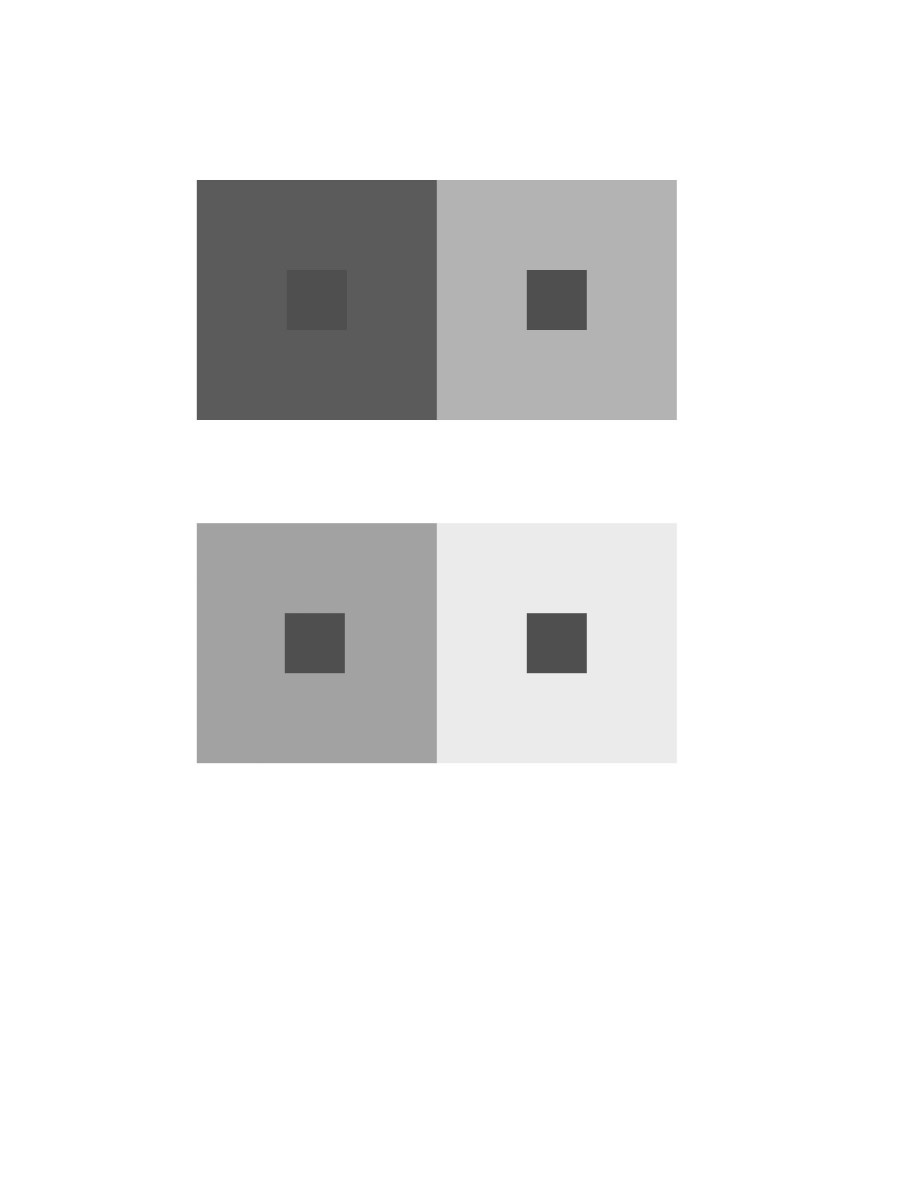
2 pairs of achromatic gray studies interactions by shifting values

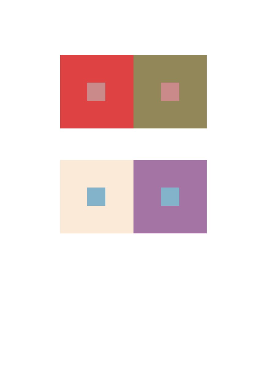
2 pairs of color studies interactions by shifting value (with color)
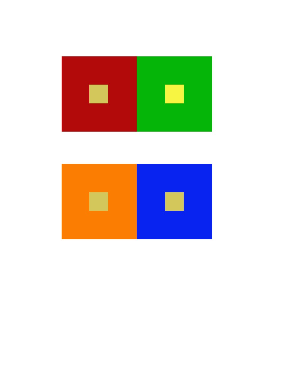
shifting hue not value
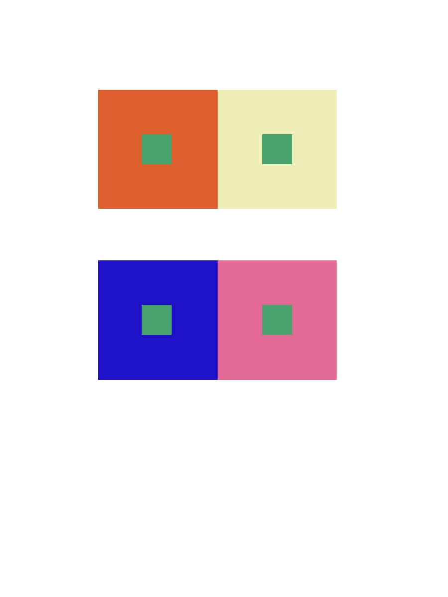
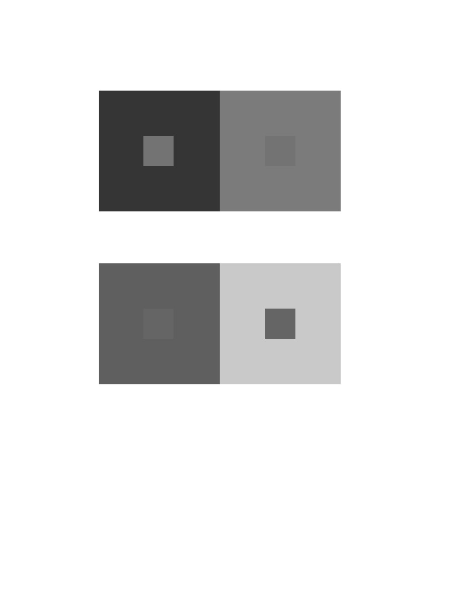
shifting hue and value


These Images show a lot of color that complements each other. The Doom picture shows the red Yellowish background that goes very we” with the background what is happening. The Doom image is made by ID Software Inc. Journey is a beautiful game and this images shows it. The yellow and gold go well together. The Journey image is made by That game company Inc. The last picture is The last of us. The image has saturated colors and mute colors. Its a very dark game with a lot of emotions and the color of the game cover really shows that. The Last of us image is made by Naughty Dog Inc.


Journey is very unique game amount many games on in its genre, it is a voyage plus exploring game, what makes it unique is its color, journey utilized wide range of color; mostly desaturated colors, and that made whole game play very relax.
The Grand Budapest Hotel used desaturated red on its color schemes, considering the setting takes time during winter, the pinkish color of the hotel really makes it feel that this hotel is very vibrant. The second scenes of the movie is very different from the previous one, this scenes shows a small squad of soldier with saturated violet uniform against a desaturated red background; this draws audience’s eyes to the violet rather than the hotel itself.

J.Cole Forest Hills Drive Live
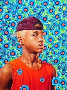
A New Republic by Kehinde Wiley
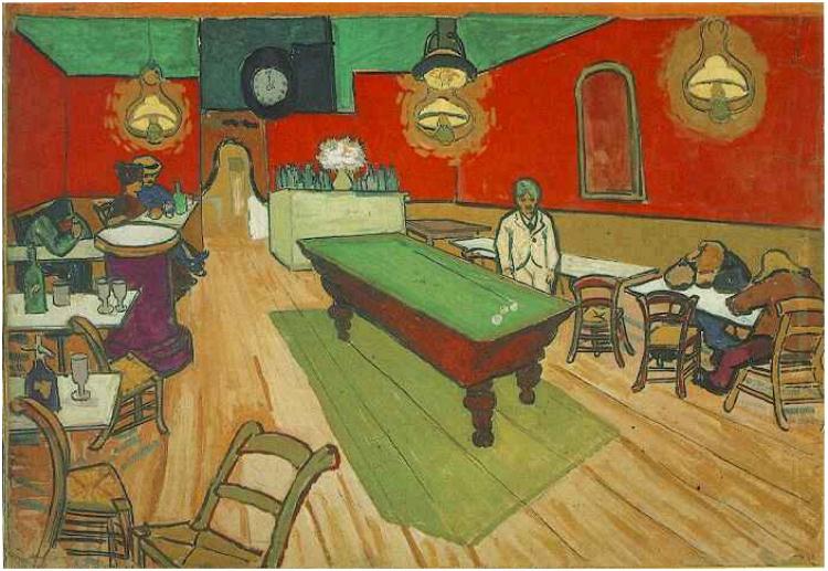
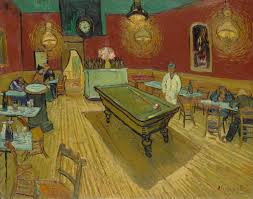
The Night Cafe By Van Gogh
After watching the videos and reading the biography on Josef Alber , I was able to find examples with color interactions. In the first photo, it shows the combinations of red yellow and white to show less saturated colors. In the second photo, shows the two complementary colors, orange and blue, pop out of the picture to create the illusion that it coming out of the painting. In the third , the red, yellow and orange work together very well in this painting.
Gogh’s Café Terrace on the Place du Forum, Arles, 1888
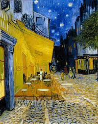
Gogh’s Café Terrace on the Place du Forum, Arles, 1888
For the first image I choose it because the red, and green goes well together. It’s also the first thing that pop’ed up when I looked up color interactions when I had no other idea what to look for just like the second image. The yellow lights in the image, as well as the purple also goes well with the red, and green. For the second image, the yellow resonates with the blue, and the green tree also goes well with what’s in the image. The mixed colors on the ground also do wonders with whats on the image.
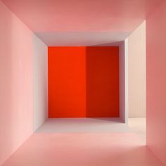
Empty – Erin O’Keefe
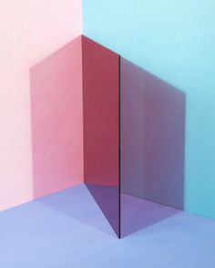
color/shadow/plane Erin O’Keefe
While playing with the app and search up pictures, I found out that when you put something in the middle of a color like a wall or a glass between the light and the wall, it reflected a different color as a shadow on the other side of the object in between. For example, red became a dark shade beside the wall compare to the original. The second picture was a glass in between two color wall and the reflection of it, creates other colors. Our eyes can see color in different colors by the angle that we are looking at.
This photo shows the color pink standing out, and then its white. I like it because its very simple and has a simple message to it.

This broken glass image being portrayed with a reflection of a sunrise is very nice. It shows a broken piece with a beautiful touch of nature to it.
Obtained from Wikipedia
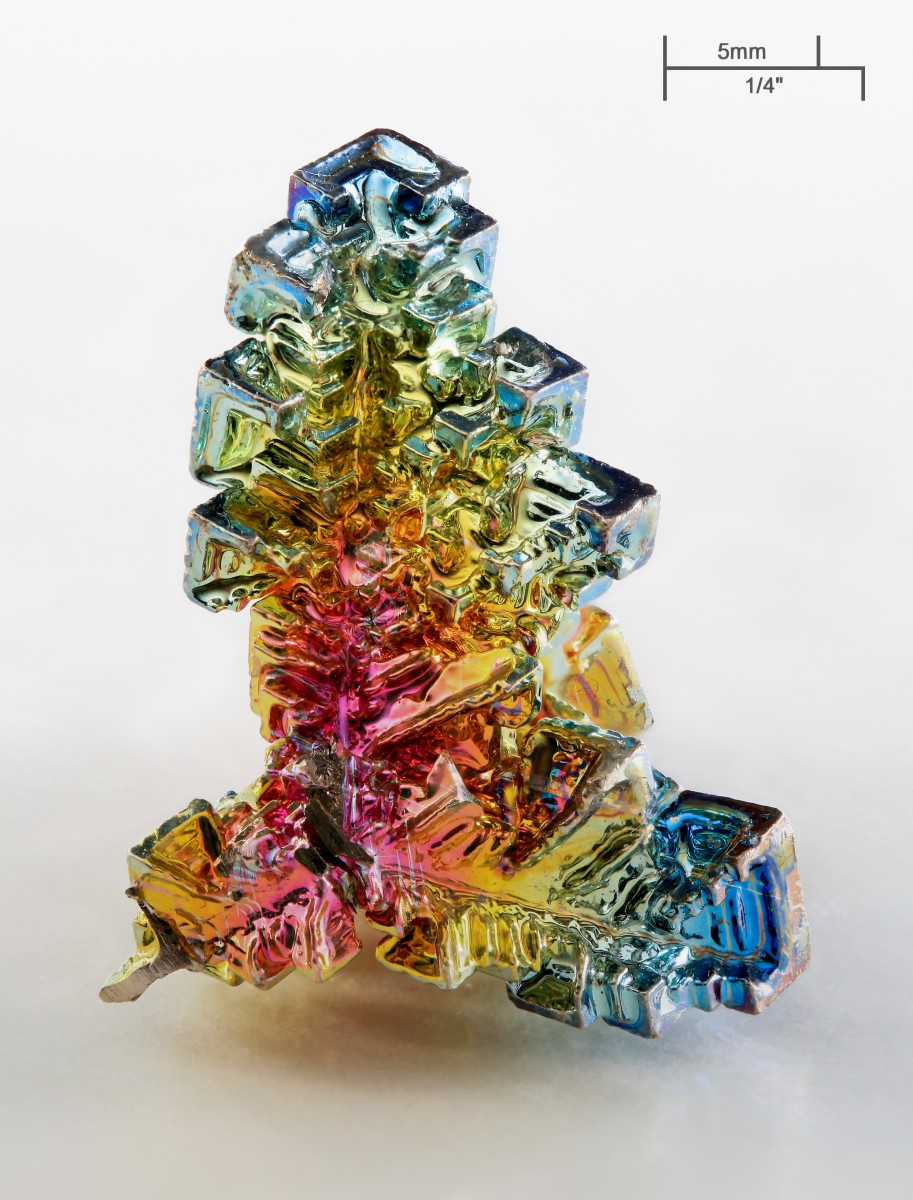
Bismuth Crystal
I find the color interactions on a Bismuth crystal to be fascinating because of all of the different hues that appear on the surface of the crystal. The reason that Bismuth shines in so many different colors is because of the different levels of oxide that reside on its surface. This causes for light to reflect in different wavelengths off of the crystal and appear as different hues.
Obtained from Pinterest
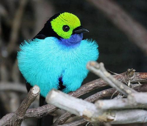
The Paradise Tanager
This image caught my eye because of the contrasting colors on this tropical bird. The reason for this was because of the different color contrast that appears on its feathers. I like how while all of these colors seem very vibrant, the change in value differentiates them from each other. This allows for the birds overall appearance to really stand out without clashing against itself.
© 2024 PLAY WITH YOUR PROBLEMS – FYLC Fall 2016
Theme by Anders Noren — Up ↑
The OpenLab is an open-source, digital platform designed to support teaching and learning at City Tech (New York City College of Technology), and to promote student and faculty engagement in the intellectual and social life of the college community.


Recent Comments