Category: COMD1100 (Page 6 of 15)

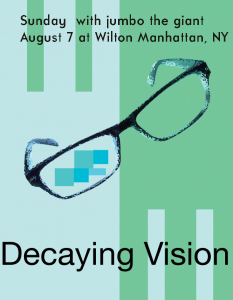
Me and Kofi worked on this together.
Took about 2 hours
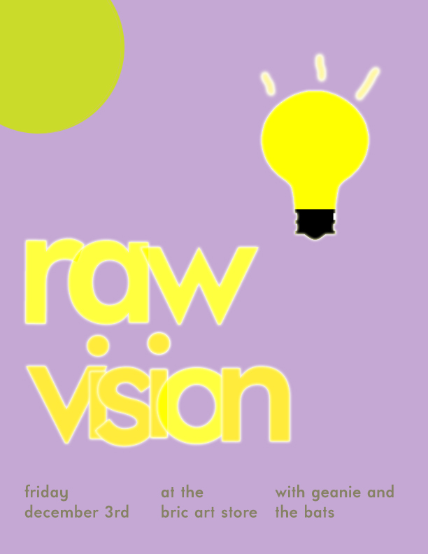
I honestly really enjoyed this project, even though i stressed a little while making it. I finally learned the difference between the saturation of colors and the value of colors. In this project i felt more prepared and less insecure about getting the color on paper. I tried keeping the theme of a pretty clean and neat overlapping design throughout all phases. This was one of my favorite projects.
In this project I learned the complimentary colors of each color in the color wheel and know how to change a color more lighter by adding white, and making it darker by adding black. What I believe I could have done better is work more on my chromatic grey exercise, it was difficult for me to get the right color and make it look muddy. I learned the colors of chromatic grey, muted, and pure colors and how are they seen differently. For the next project, I will apply this by knowing what area are the colors are and its saturation.
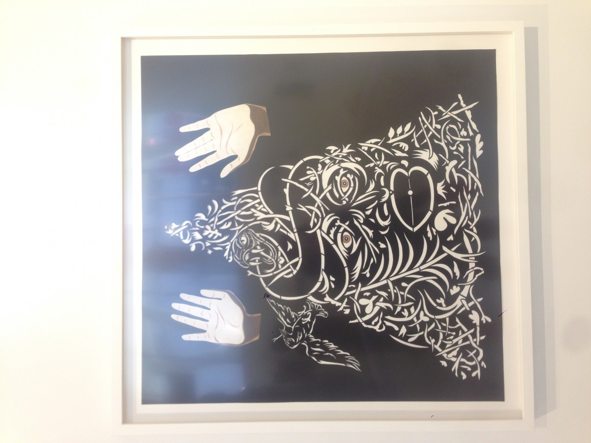
Title: Strong Medicine
Artist: William Villalongo
Medium: Cut velour paper on matte board
This particular work reminded me of the Value-Added Portraits Project we did in class. The artist, William Villalongo, used leaves, tree branches, and other material to create a face and a bird. Looking at the composition in person for a while it made me feel that there is movement because of the hands being above and waving them in the air. I thought it was a cartoonish figure making a silly face, however, the artist describes the figure’s raised hands evoking the Black Live Matter movement.
During my half of the semester in COMD1101 class I’ve learned to use Photoshop and techniques on it. And different brides of shapes and values being shown in color and around us in our daily lives.
Things I should work on would be doing and being on time with my work. I should be more organized as a designer and neat in how I hand in my work and present it.
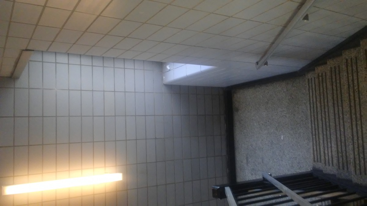
In this picture we can see the light coming straight to the object. Then you could also see the shadow of the object. In the back of the object the light seems to be dimming out. You can deffinetly see from what side the light is coming from.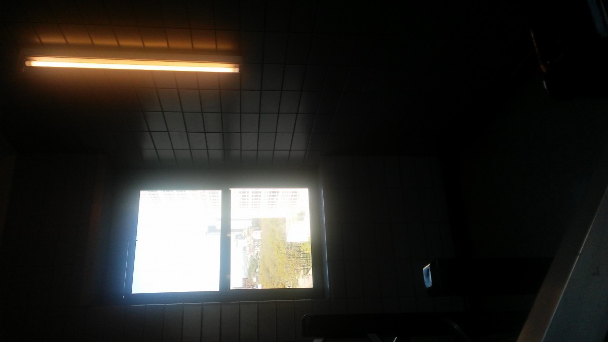
This picture shows the light standing out. Around the light although you can see the shadow and contrast of darkness. Towards the top and bottom there is a dark highlight of light. You can see where the light source is coming from. The light and the dark come together to make shadow appear most.


- the art that caught my eye was from Rachel ostrow her painting felt to me looking into space and the color or life , which she was trying to project . To show a cosmic felling . Continue reading


Recent Comments