First Year Learning Community

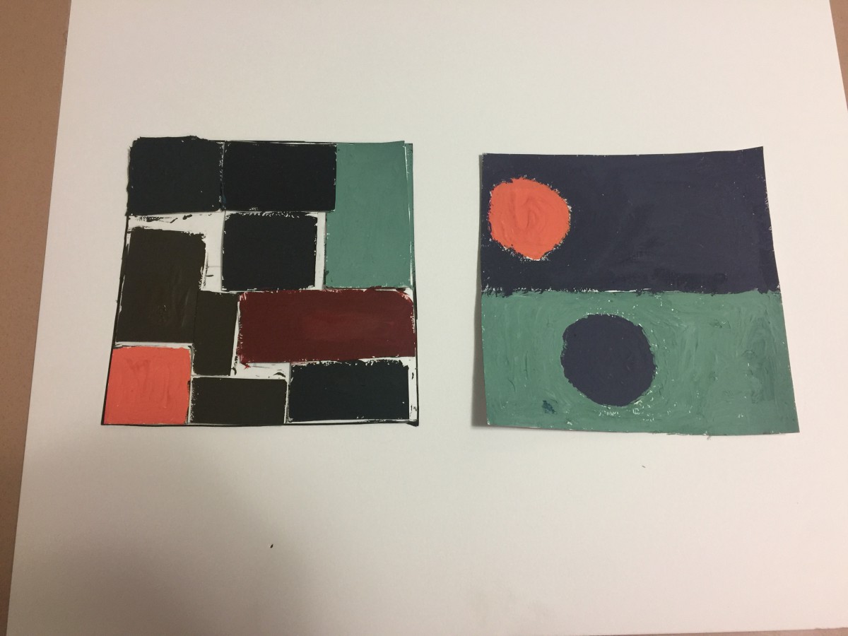
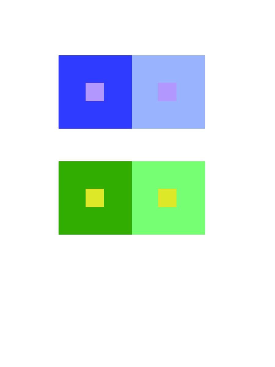
Two-Color Progression
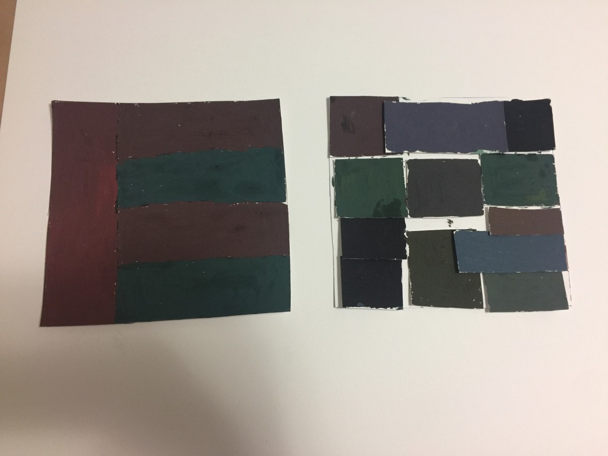
Tint Progression
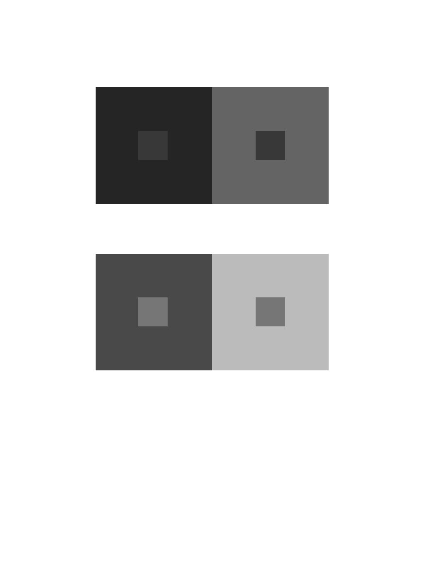
Shadow Progression
The first image shows two-color progression because of the green has different tones that turn into black. The tint progression shows the sunset, the tint shows the yellow orange colors, they are analogous. The shade progression shows the clouds white then turning darker, to medium black.
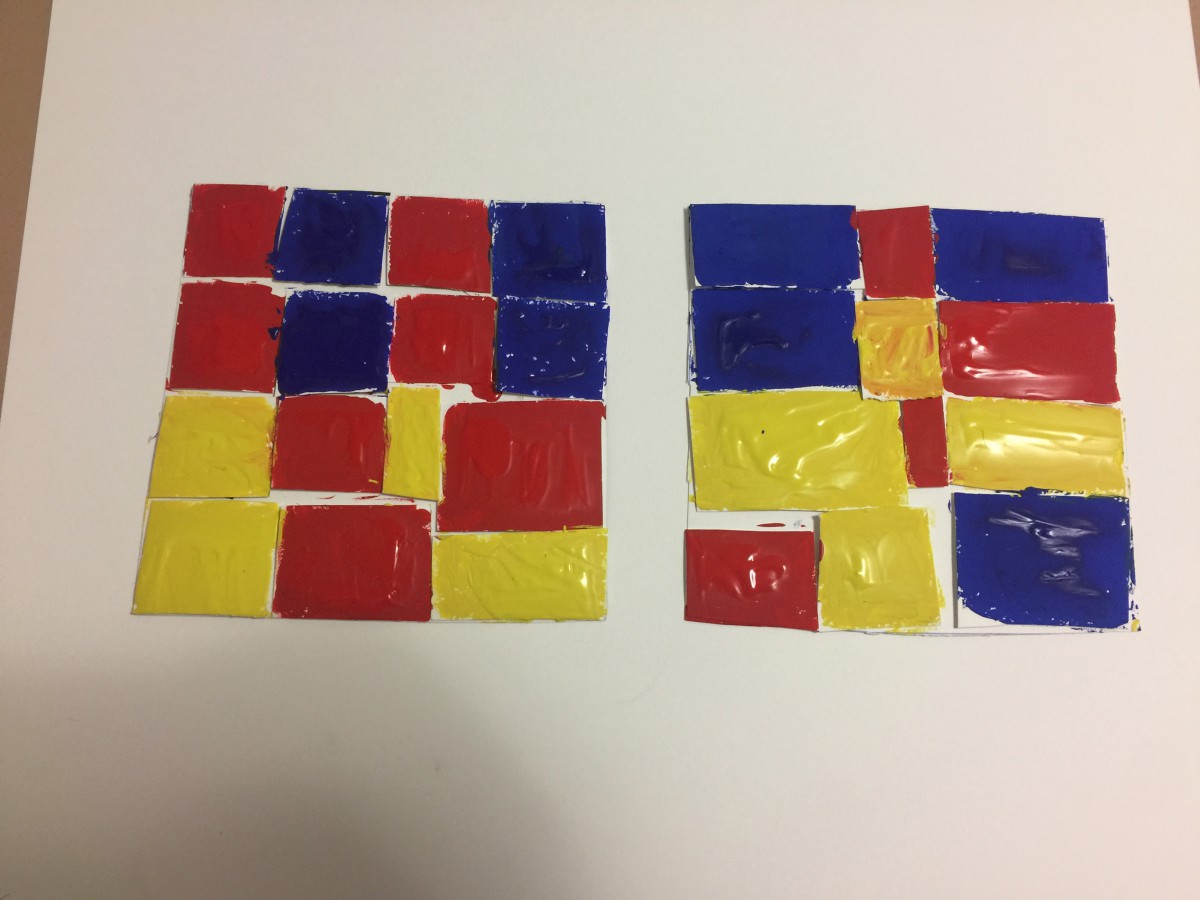
What I learned in this project is the color value and saturation. For instance, the color is the same in a composition but it appears different because of its influence color and the saturation. What I would like to retry again would be Group 4 Shifting Hue and Value, it was very challenging for me to see and make the hue different from one another. For our next project, I would use the color wheel and know the complimentary of each color.
December 14, 2016
WHERE: Cooper Hewitt Design Museum
2 East 91st Street
(between 5th and Madison Avenues)
New York, New York 10128
HOW: Take the 4, 5, 6 to 86th Street and walk 4 blocks North and West, toward the park.
WHEN: Meet outside the Musuem entrance at 10:30am SHARP.
COOPER HEWITT DESIGN MUSUEM FIELD TRIP
At the Museum:
After the Museum:
IMPORTANT: Review PROJECT #6 guidelines very closely and complete:
Questions?
LAST DAY! All work is due!

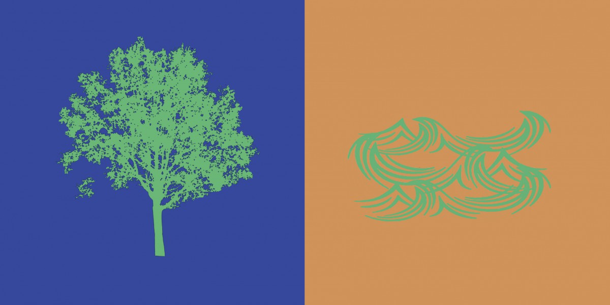
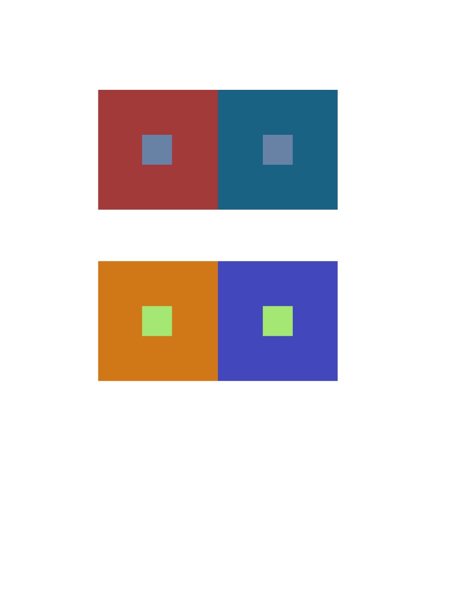
ShanShan and I created a paired color identities with simultaneous constrast. I chose the color blue for ShanShan because she is shy, intelligent and relax. We chose the color green as our influence color because we wanted to make the theme about nature. A symbol representing her is a tree, because when I think of a tree, I imagine a person laying back on the tree reading a book and relax.
Hours Worked: 2 Hours
Chromatic Gray Studies
Shifting Value with Color
Shifting Hue, Not Value

Shifting Hue and Value
Hours Worked: 3 Hours
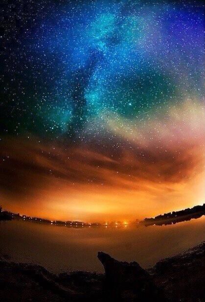
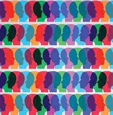
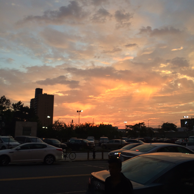
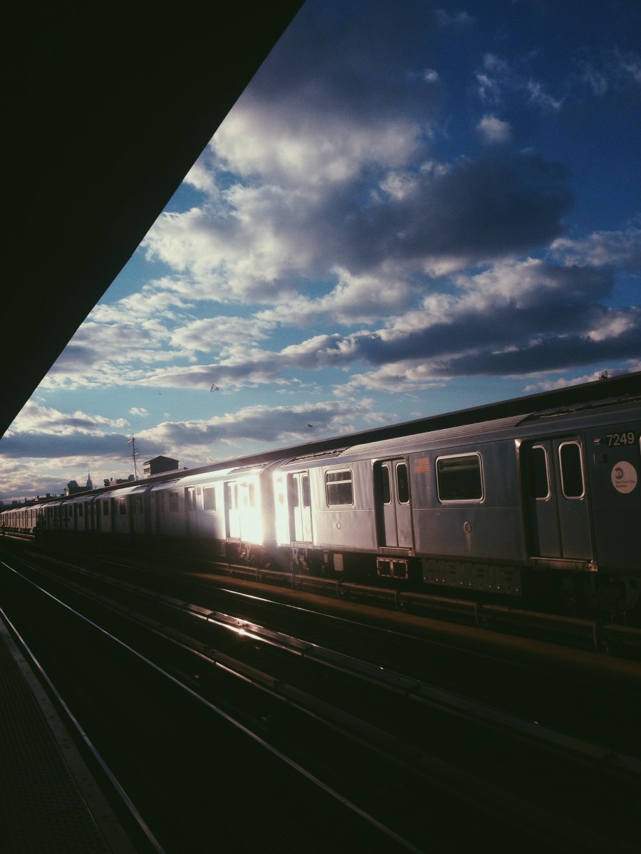
The left picture is the atmospheric perspective of the sky in Alaska. I see these colors combining together and different shades of blue and orange. I see tint of purple and greenish color and I think that no color is being center of attention. It catches the person interest towards above then slowly down in the composition. In the second picture it shows a person head with different colors. There are colors and different shades of it because of the background color surrounding it. For instance, the blue looks light on the orange but not in the red.

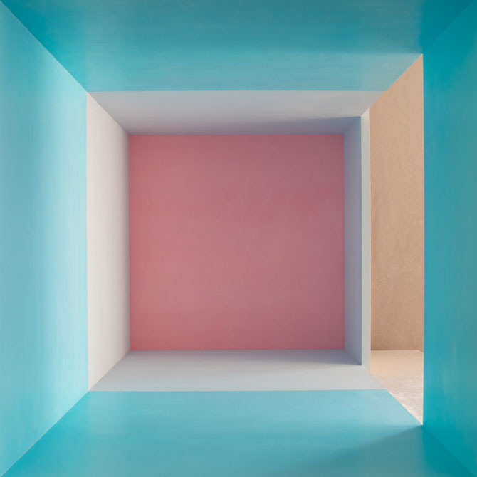
From my observation several different colors are interacting throughout both compositions. The colors in the first composition create an amazing visual of a person, this really caught my attention when I first spotted it. The purple and green really go together quite well, to where it makes the picture come alive in a way. The 2nd piece of art shows what looks like a room, divided into several different pieces. I personally like this image because the sky blue brings all the colors together, and everything else falls into place. The pink to me fades a little bit and the blue stands out, in which this shows a great amount of interaction between all the colors.
© 2025 PLAY WITH YOUR PROBLEMS – FYLC Fall 2016
Theme by Anders Noren — Up ↑
The OpenLab is an open-source, digital platform designed to support teaching and learning at City Tech (New York City College of Technology), and to promote student and faculty engagement in the intellectual and social life of the college community.


Recent Comments