First Year Learning Community

Category: COMD1100 (Page 4 of 15)

Color Harmony: Phase 4

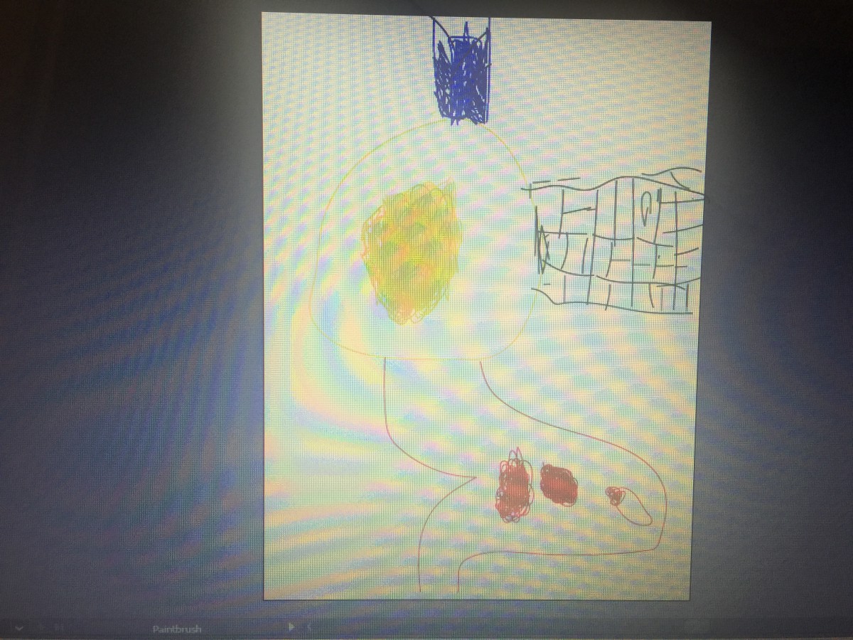
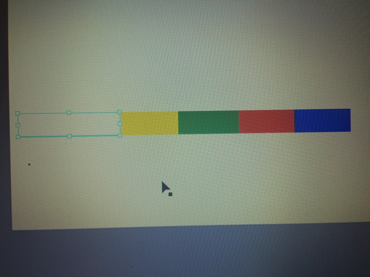
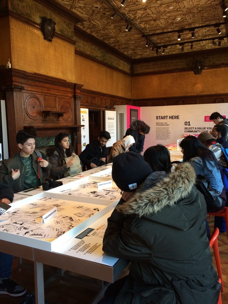
This project in all honesty, was extremely hard for me. Although I enjoyed learning new concepts and attending the museum, I need to increase my time when using apps like Photoshop and illustrator.  The trip was really fun for me I was able to go to a new place, and learn about many other artists that were skilled greatly. Next time I would like to come up with a neater free study, and make an even better composition. Practice is what I need, and I’m happy that I actually attempted to complete this project to the best of my ability.

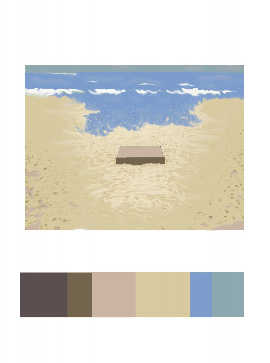
https://openlab.citytech.cuny.edu/schmerlerspevackfylcfa16/2016/12/19/color-harmony-phase-1-12/

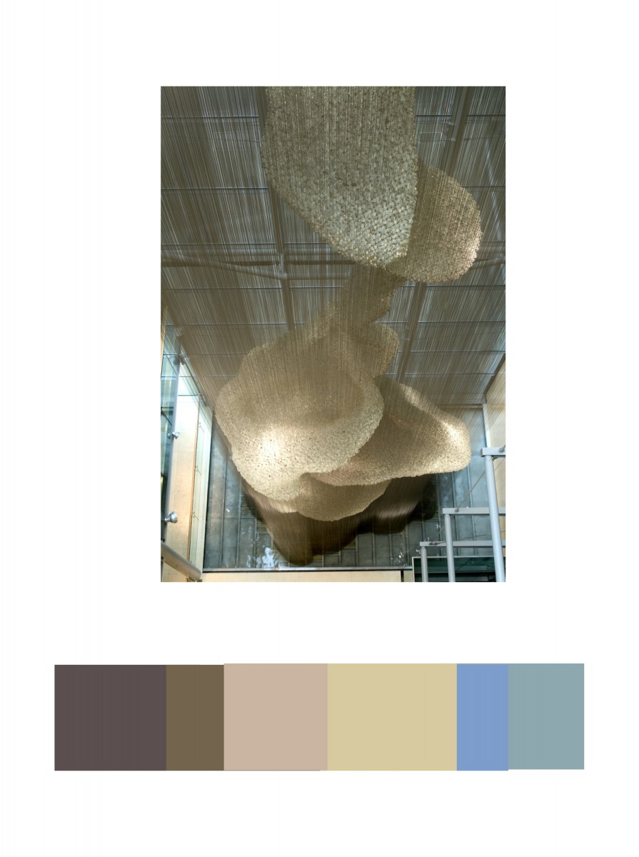
https://openlab.citytech.cuny.edu/schmerlerspevackfylcfa16/2016/12/19/color-harmony-phase-2-12/

https://openlab.citytech.cuny.edu/schmerlerspevackfylcfa16/2016/12/19/color-harmony-phase-3-9/

Color Harmony: Phase 1

color-progression   marguerite-daisy-beautiful-beauty       sunset_in_zadar_2

Two-Color Progression                                                                     Shade Progression                                                               Tint Progression

All of the three images above define the given key terms. Learning those terms were essential because now I can actually tell the difference between all of them which is important.

Color Harmony: Phase 3

img_3979-1

This part of the project was extremely difficult for me to complete, but I attempted to create something. My niece wanted me to draw what she drew for me, so I used Illustrator for the first time and tried it out. I’m not too proud of the outcome, but she actually liked it .

Color Harmony: Phase 2

cooper-hewitt           img_3977

The trip to Cooper Hewitt was very fun for me, a lot of the different pieces caught my attention. This one was my favorite, at first it looked like pills I don’t know why I thought of that. To me this piece symbolizes balance because of how the colors are filled up, and then the white fits into it. The museum was occupied with pieces that had a great amount of detail, as well as culture.

Color Harmony: Phase 3

lmartinez_phase3pt2

For Phase 3, the colors I got inspired by making a scenario of the beach. From the original composition, it remained me of sand. I use light brown on top of the wood box and the sides dark brown to give it shade. Most of the composition has light brown. For the blues, I used the ocean and the sky as well. The dominant color is the light brown, the sub-dominant is the sea blue, the accent color is the white or the medium brown from the wood box.

Hours Worked: 1 Hour and a Half

Color Harmony: Phase 2

lmartinez_colorharmony

In the Cooper Hewitt Museum, I looked through the big table with the giant screen collection they have in the current and old exhibition. This has caught  my eye because of different shades of light brown. IN the background you could see a little bit of light blue and medium blue. This was done by Heatherwick Studios and Thomas Heatherwick in 2003, called Bleigiessen.

My Copper Hewitt research page.

Hours Worked: 45  minutes

COMD Class 30 | Final Critique

December 19, 2016

Cooper Hewitt Field Trip

COMD1100 / ENG1101 at the Cooper Hewitt.

LAST DAY! All work is due!

  1. PROJECT #6
    • Phase 1-4 (posted to the Class Blog)
    • Bring Proportional Color Inventory and Final Freestudy (to turn in)
  2. Review the class outlines for Class 1-29, Vocabulary, all six Project guidelines, and Understanding Your Grade.
  3. Materials Needed:
    • a portfolio to take your work home.

Discussion / Critique

Grades

  • Turn in all work that has not been graded including all parts of Project #6 and any make up/reworked projects.
  • Make sure your blog posts have all required content from Projects 1-6.
  • Grades will be posted by December 28th.

Work Pickup

  • Collect your previously graded work today.
  • Check this website and your City Tech email to find out when to pickup Projects #5 and #6.

Homework

  • Take a field trip once a week and PLAY & CREATE everyday.
  • Please keep in touch!

Download PDF

Color Interaction: Phase 3

3color-with-picturepink

Jeremy, Ely, and Myself decided to create a composition along the lines of a Christmas theme. As you can see these are gingerbread people, who are all In action in some way. All of the colors match each of our personalities really well, that is what’s really cool about this whole thing. All of the symbols used were thought out, and these were the best ones that fit into what we wanted to create.

Saturation Studies: Phase 4

Although painting isn’t my cup of tea, I actually had some fun completing this project. It allowed me to test out different colors throughout the color wheel, in which it also helped me learn several new concepts. Some of the key terms I learned were complementary, which means the color across from another color on the wheel. An example of this would be blue, the complementary of blue is orange. Some other terms I learned about are called muted, saturation, and chromatic. This project helped to expand my definition of art, it sure is something that I would do again sometime.

https://openlab.citytech.cuny.edu/schmerlerspevackfylcfa16/2016/12/08/saturation-studies-phase-1-9/

https://openlab.citytech.cuny.edu/schmerlerspevackfylcfa16/2016/12/13/saturation-studies-phase-2-14/

https://openlab.citytech.cuny.edu/schmerlerspevackfylcfa16/2016/12/08/saturation-studies-phase-3-13/


« Older posts Newer posts »