Discover
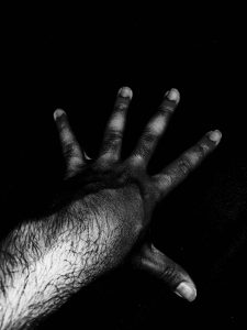
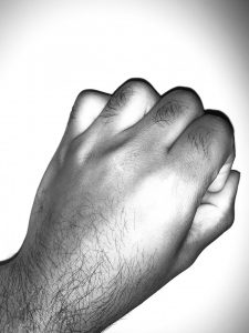
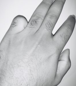
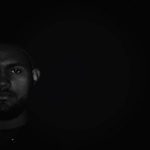
This was the first part of the project, where we explored the different types of value ranges. We started with hand portraits and then we moved on to self-portraits. At first, it was difficult for me because it was hard to tell the difference between Narrow Value(light) and broad; I took a lot of broad value hand portraits and I could not get the right Narrow(light) hand portrait but I ended up getting the right one.

Define
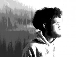
This was the second part of the project leading to the final project. This step was a lot harder than part one because it required me to take a dramatic self-portrait which was difficult at first, but then I ended up getting the right one in class. Then, I posterized the image on photoshop which was an easy step. After I posterized the image, I started tracing my portrait on a tracing paper which was very difficult for me because of the background of my self-portrait had a variety of patterns and shapes that were hard to trace and paint.

Develop
https://www.dropbox.com/s/ww0vmk41437xuvg/LennyCruz.PortraitTransformation.gif?dl=0
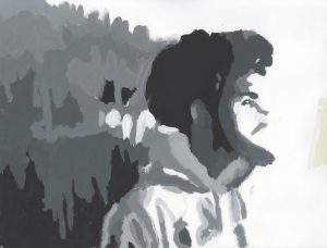
This is my final version of the project. I used my original seld-portrait and I combined it with my posterized portrait and my scanned painting and I created a gif on photoshop. Creating the gif for me was easier than the previous step because I have more experience when it comes to working with photoshop and illustrator unlike painting, which was the first time I ever painted since elementary school.
Deliver
This project was a hard project to do because it required me to push beyond the things that I usually do. This project required me to take a variety of portraits which is something I don’t normally do. It also required painting, which was hard for me because I don’t know a lot about painting. Overall, this project was fun, even though some of the steps where difficult. I had a lot of fun taking the portraits and playing around with the effects on photoshop for the final version. Something I did really well was the creating of the gif. I feel like I used the right effects to make the final version look dramatic enough. Something that I can improve is painting. I should have used a smaller brush to paint the patterns in the background. It would have made the final version look more dramatic.


Great progression between the actual picture, the posterized image and the actual painting. I feel like you perfectly replicated it and made it to how you felt it should be. And good job with explaining each step carefully and taking time to walk through your process
Great progression between the actual picture, the posterized image and the actual painting. I feel like you perfectly replicated it and made it to how you felt it should be. And good job with explaining each step carefully and taking time to walk through your process