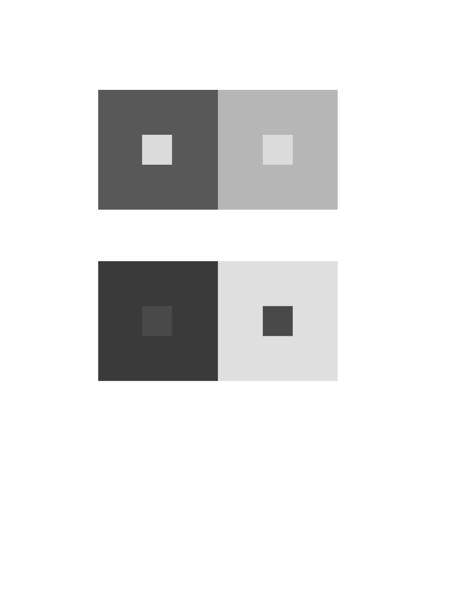
chromatic-grays
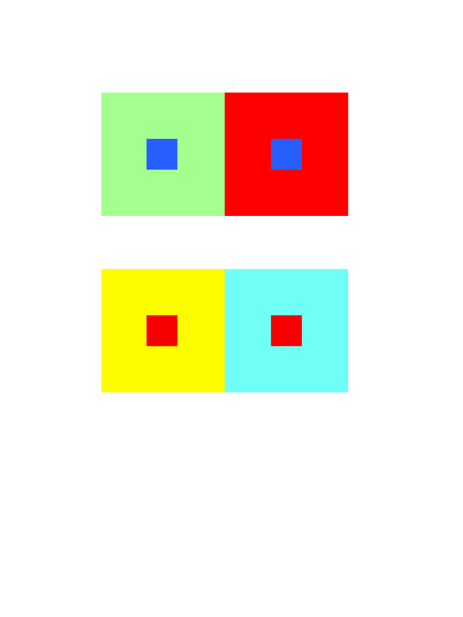
hue-and-value
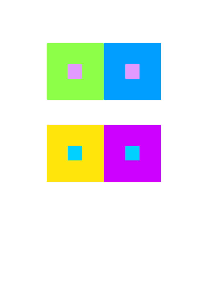
hue

value-with-color
First Year Learning Community
chromatic-grays
hue-and-value
hue
value-with-color
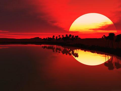
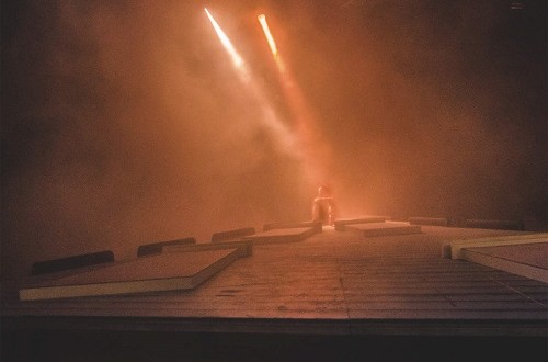
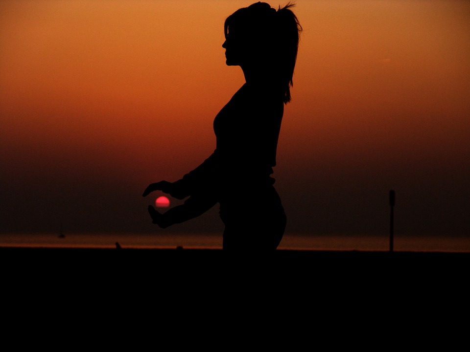
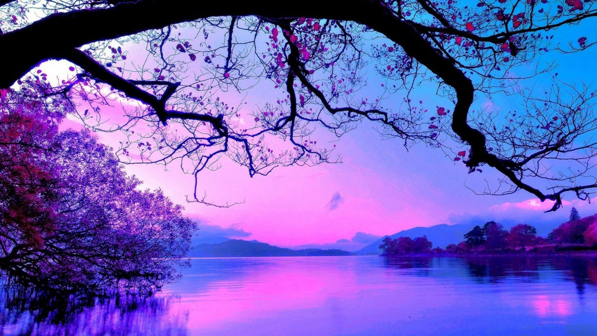
I chose this image because the contrast really stood out. I also really liked this image because of the reflection on the water, both the sky and water seem to combine to make one image, meanwhile the land and trees are really dark. I thought it was interesting how the sky and water’s colors slowly transformed from a really dark black to a vivid red.
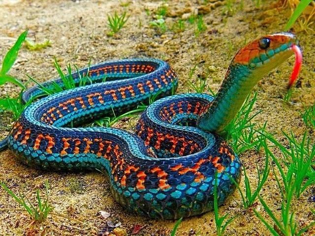
I chose this image because the snake’s colors really stood out to me. I thought it was very interesting how in nature, this snake has two shades of blue and one of orange. These are complementary colors on the snake itself. I also thought it was interesting the type of pattern this snake had.
During this project, I learned about the relationships between different colors and how these relationships can work to enhance or dull the presence of each color depending on their positioning. I believe that I maintained a good understanding of the progression of colors in tints, shades, and color transitions. The understanding of these three topics helped me to find a good example of color harmony during our trip to the Cooper Hewitt Design Museum and gave me the opportunity to use these color relationships to recreate them in my own fashion. So overall, I believe I encountered and digested a great amount of knowledge and potential from this project.
Owe’neh Bupingeh Preservation Project & Proportional Color Inventory

Summer
For this Free-Study composition, I decided to use my proportional color inventory to create a beach scene which I have named “Summer”. For this composition, I wanted my dominant color to be the blue hue I obtained from the sky in the original picture. I also decided to use the yellow accent to cause contrast in the composition and bring the viewers eye to the figure in the composition, which would be the man on the floating tube. After that, I wanted to use the sub-dominant shades of beige to be next to the water as a secondary figure. I also positioned it to be in the lower-right corner because I believe that this is where the eye is least likely to look first and thus leave the attention to the primary figure in the top-left. I also gave the beach coast a descending feeling by organizing the shades to grow darker as they approach the end of the composition and continue outside the page.
Hours worked: 3 hours
Owe’neh Bupingeh Preservation Project
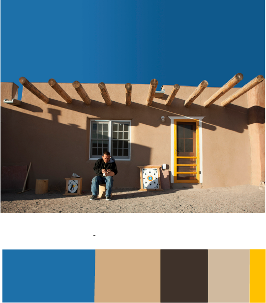
During my visit to the museum, I happened to have encountered this exhibit and found that image as a composition to be interesting. I liked how the sky in this picture makes a clear contrast with the pueblo and helps it to pop out at the viewer by sinking into the background with a darker value. I also like the value contrast between the pueblo walls and its shadows, which causes the eye to be drawn to it. Because of these details in the composition, I learned about how important the positioning of two different colors can be in a composition.
Aaron Hollingsworth’s Cooper Hewitt Page
Hours worked: 1 hour
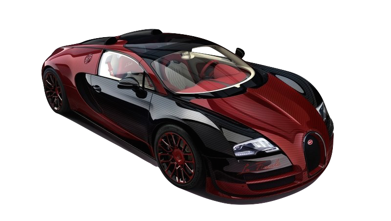
Shade Progression – Bugatti Veyron Grand
In this picture, a Bugatti Veyron Grand is displayed in black and crimson. I believe this serves as good shade progression because of the close relation of shade between the two colors. On the car, you can see some light tints where the light hits the car, but as you look at where the color meets the black parts of the car, the division of color is clean while the red is still turning darker as it gets closer up to a point.
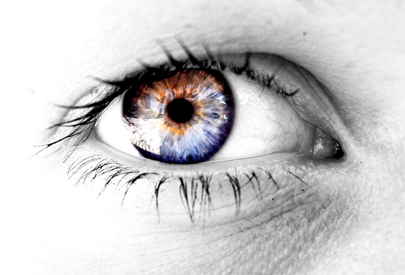
Color Progression – Eyeball
This picture uses the human eye as an example of good color-to-color progression. I believe that this is a worthy example becase of how the blue and orange segments of the iris are separate at opposite ends of the iris and begin to mix as they meet in the center line of the iris.
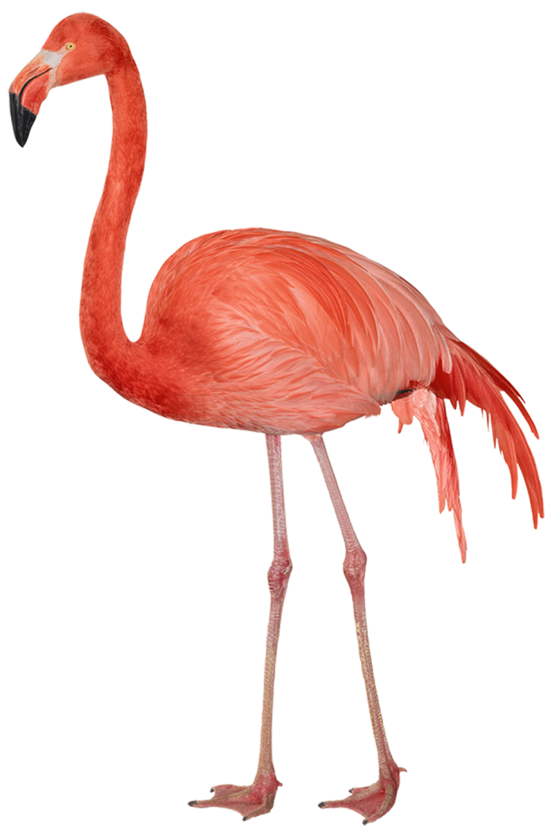
Tint Progression – Flamingo
This flamingo serves as a good example of tint progression because of how its feathers fade to a whiter tint as they progress towards the back of the bird. The reason a flamingo feather has any color is because of all of the shrimp that they eat as they grow up. The shrimp that they digest causes their feathers to absorb the pigment of the shrimp, gradually turning their feather from white to pink.
Hours worked: 1 hour
Work Spent: 30 mins
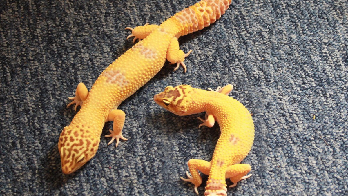
Two-Color Progression
Tint Progression
Shade Progression
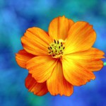
In the first picture, it demonstrates two-color because in the reptile you can see the orange and little bit of yellow. The second picture demonstrates Tint Progression, because you can an orange fog but it gradually turns to a white. In the last picture, it demonstrates Shade Progression, because the sunset goes from an orange and gradually turns to a black.
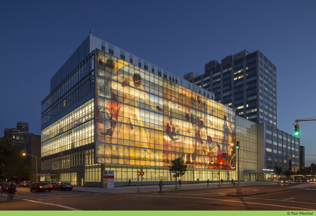
This project is about the Harlem hospital center, 192,000 squared foot, shows off its highly advanced technological building design. The high curtain performance wall known as a facade, replicates 3 panels from a Works Progress Administration mural that depicts scenes from the African diaspora story.
https://collection.cooperhewitt.org/objects/420777941/
work time-29 minutes
Two color progression
This picture is Two color progression because it’s going from Orange to a bit more yellowish
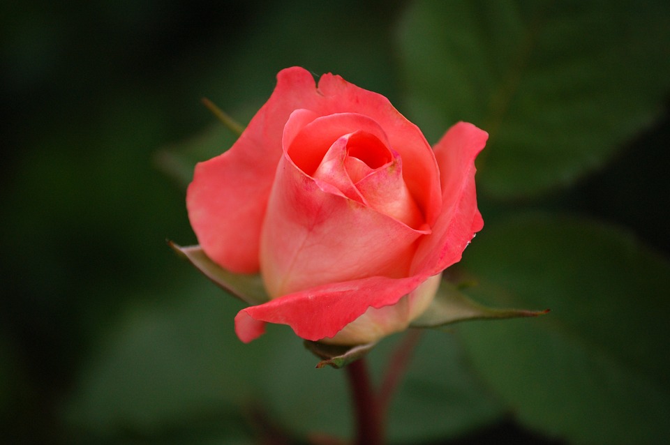
Tint progression
This picture is tint progression because the rose is going from Red to more white.
Shade progression
This picture has a Shade progression because it’s more purple but the blue is more darker, and more dominant.
Time took: 30 mins
© 2024 PLAY WITH YOUR PROBLEMS – FYLC Fall 2016
Theme by Anders Noren — Up ↑
The OpenLab is an open-source, digital platform designed to support teaching and learning at City Tech (New York City College of Technology), and to promote student and faculty engagement in the intellectual and social life of the college community.


Recent Comments