During this project, I learned that colors can appear differently than they really are when placed next to certain colors. I had some trouble at first with the vocabulary of this project. At times I didn’t notice the change in some colors so I really had to carefully inspect the changes in them. I really enjoyed Phase 3 of the project, I thought it was fun to create a logo for each other.
Author: Franco (Page 2 of 3)
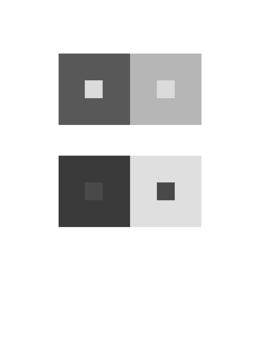
chromatic-grays
hue-and-value
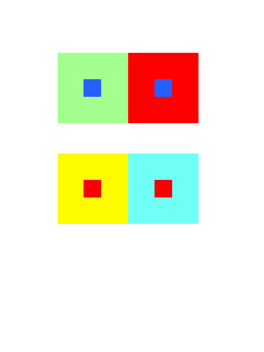
hue

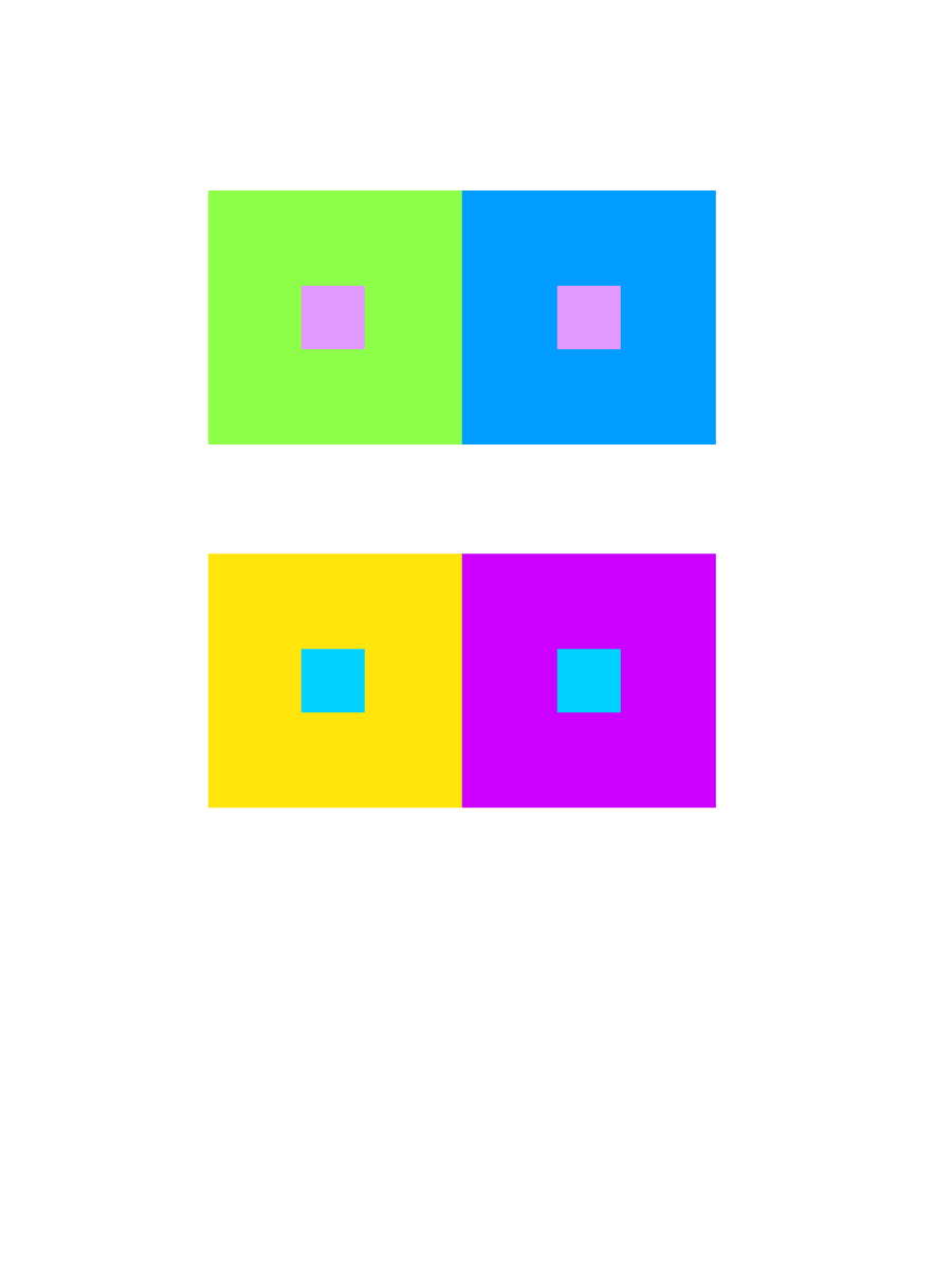
value-with-color
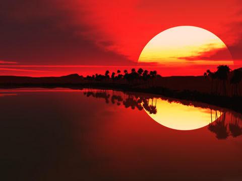
I chose this image because the contrast really stood out. I also really liked this image because of the reflection on the water, both the sky and water seem to combine to make one image, meanwhile the land and trees are really dark. I thought it was interesting how the sky and water’s colors slowly transformed from a really dark black to a vivid red.
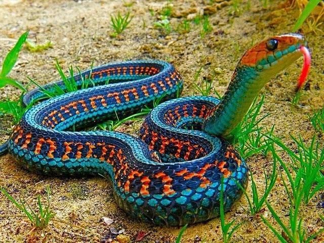
I chose this image because the snake’s colors really stood out to me. I thought it was very interesting how in nature, this snake has two shades of blue and one of orange. These are complementary colors on the snake itself. I also thought it was interesting the type of pattern this snake had.

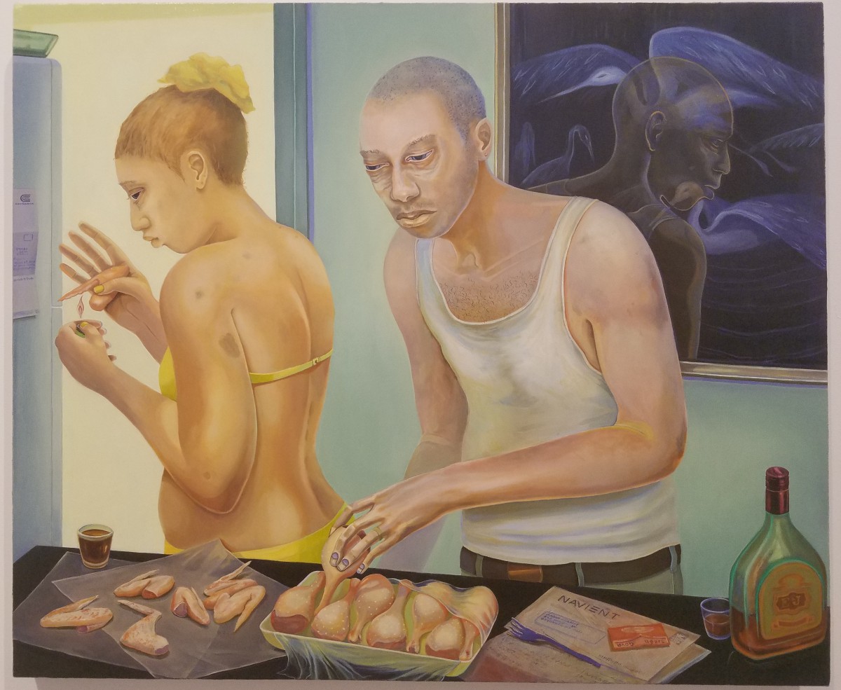
This piece of art stood out the most to me even though I cannot relate to it. I noticed there is abuse in this relationship due to the bruises on the woman’s body. You can also see the man is either extremely tired, ill, or has heavy drug use. I also noticed how there is an alcohol bottle while they are cooking, meaning they might be alcoholics. I also noticed how there are more object on the man’s side, than the woman’s side, showing how he has more control in the relationship. The woman appears to be using a lighter on a chicken leg, which would either represent her drug use or poverty since they might not have gas.

From the beginning of the semester to now, I have learned a lot working in class and on projects. I wasn’t sure about many of the topics when we were first introduced to them, but I usually managed to get a good understanding by the second class of each project. In my opinion I have good understanding of ambiguous and obvious work now. I can say the same about staccato and legato sounds and shapes. As for the current project, I feel like I have decent understanding too. Phase 2-3 of each project has been fun and very helpful to my understanding of each principle. I feel this is true because Phase 2-3 is usually the hands on parts of the project and it helps me learn more as I work on it. What I might have done differently next time is maybe spend more time on certain phases of the project. I would also try to make sure everything is handed in on time.
Lowkey

Broad
Time worked: 2 hours
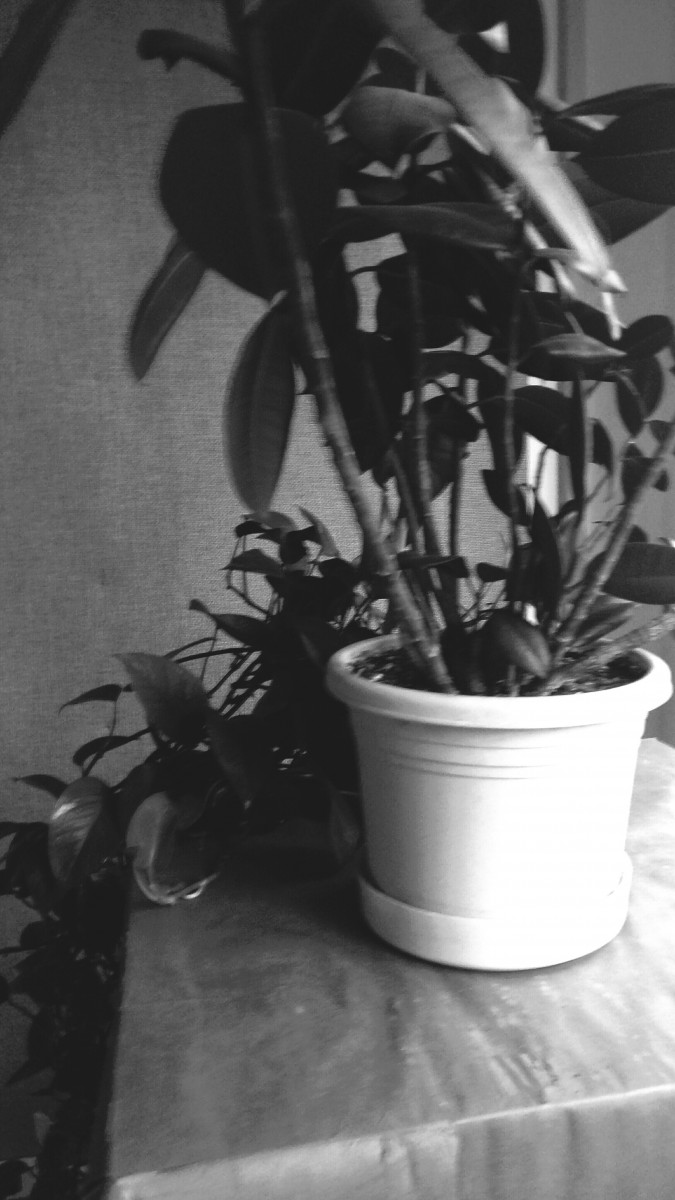
My high key image demonstrates a calm afternoon. The plant is next to the window. This gives it a strong glow which make the high tones. The high tones go from left to right getting darker. The focal point is the plant pot. The drama feel is calm.
My low key image demonstrates a dark type of feeling. The lone “EXIT” sign gives a sense of emergency as everything around it is dark and the most visible things are the words. All throughout the picture, the tones are very dark. The only exception is the sign letters. The drama feel is a sense of emergency.

Work time: 30 minutes


Recent Comments