Work Spent: 1 hour
Recent Comments
- ShanShan on Color interactions: Phase 4
- Franco on Color Harmony: Phase 3
- Franco on Color Harmony: Phase 3
- Franco on Color Interaction: Phase 3
- ShanShan on Color Harmony: Phase 3
Archives
Categories
Tags
#phase3
BRIC
Color Harmony
Color Harmony: Phase 1
Color Harmony: Phase 2
Color Harmony: Phase 3
Color Harmony: Phase 4
color interaction
Color Interaction: Phase 1
color interaction: Phase 2
color interaction: phase 3
Color Interaction Pairings: Phase 4
color interactions
gelek samphel
Midterm Grade
phase #2
phase 1
Phase 1: Discover
Phase 2: Define
phase 3
Phase 3: Develop
phase 4
Phase 4: Deliver
Project 2
Saturation Studies
Saturation Studies: phase 1
Saturation Studies: phase 2
saturation studies: phase 3
Saturation studies: phase 4
Saturatio studies: phase 3
Saturatio studies: phase 4
Sound Visualization Phase 1
sound visualization phase 2
Sound Visualization Phase 3
Sound Visualization Phase 4
Sound Visualizations: Phase 1
Urban Artifacts
Urban Artifacts: Phase#2
Urban Artifacts: Phase 2
Urban artifacts phase 3
Urban Artifacts Phase 4
value-added portraits: phase 2
Value Added Portraits: Phase 4
value added portraits phase :1
Value added portraits phase: 3


Genique,
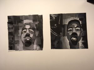
Kanye West should thank you for your efforts. Not only do you back light him, giving him a mysterious and powerful mood, you also play up African influences in your painted version of this assignment. His own work is not as starkly indebted to Mother Africa as you show him here; however, the linear details (on the left, which were once your own pants’ stitching) here take on a strong compositional roll. Pants become abstract energy. And Kanye looks power-ful and full of dark rythmic energy.;
(Apologies for the type-o’s and misspellings. I was in a hurry, as you know.) I would also add that you turned what could have been a handicap (you mentioned that working with that small brush was hard for you) into a plus; the simplicity of your efforts in paint made for a more high-contrast, graphic design. Did you know that The Cubists did what you did with those two, supposedly “crude” white lines? They used small details to stand in as shorthand for larger things. Check this out: https://itsartalicious.wordpress.com/2015/04/28/compotier-et-verre-fruit-dish-and-glass-by-georges-braque/