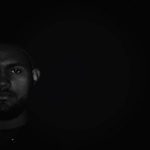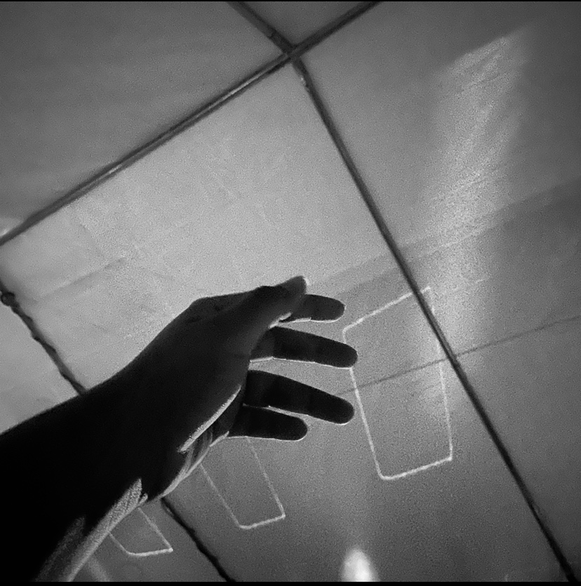
 Dark value
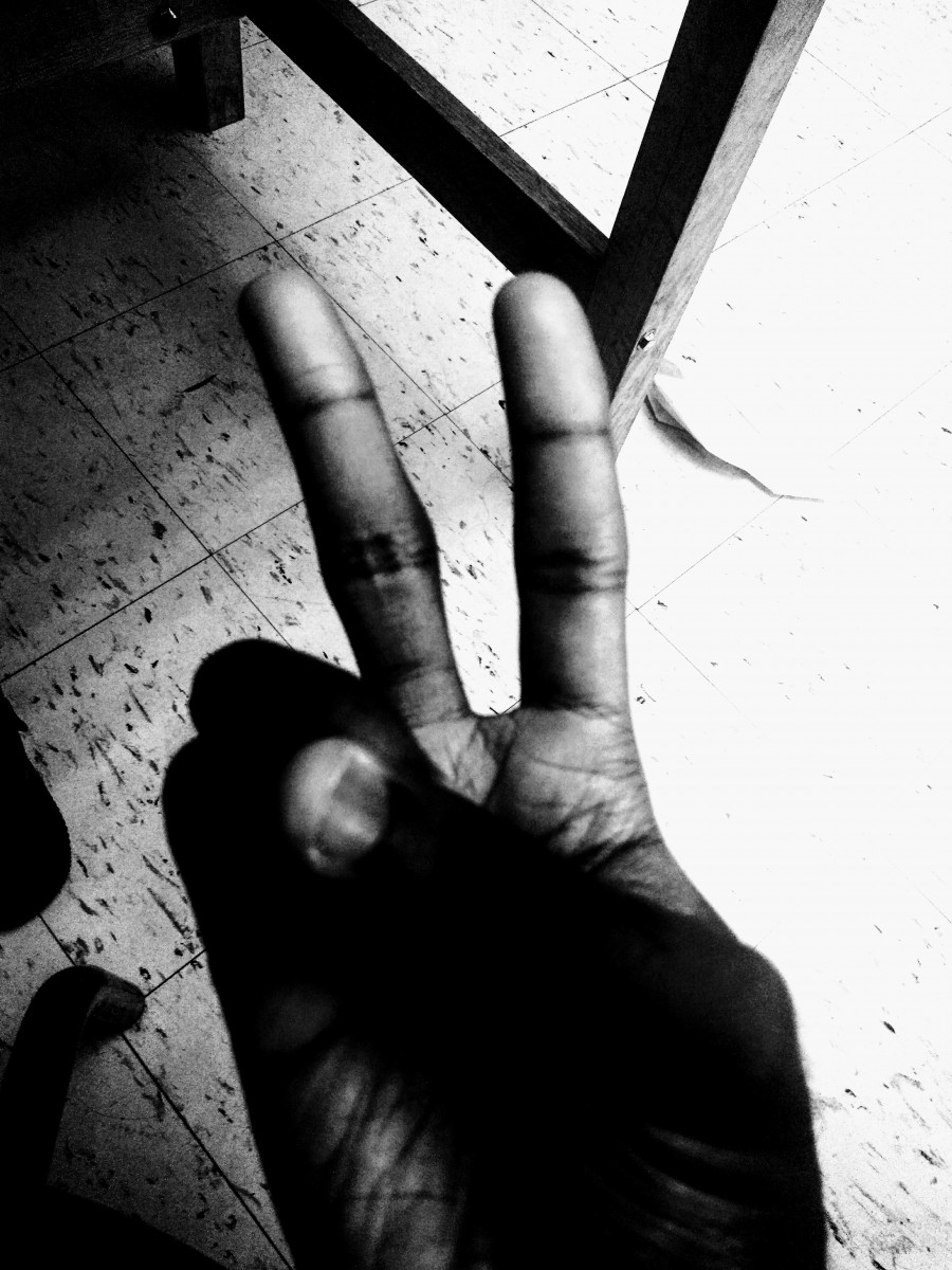
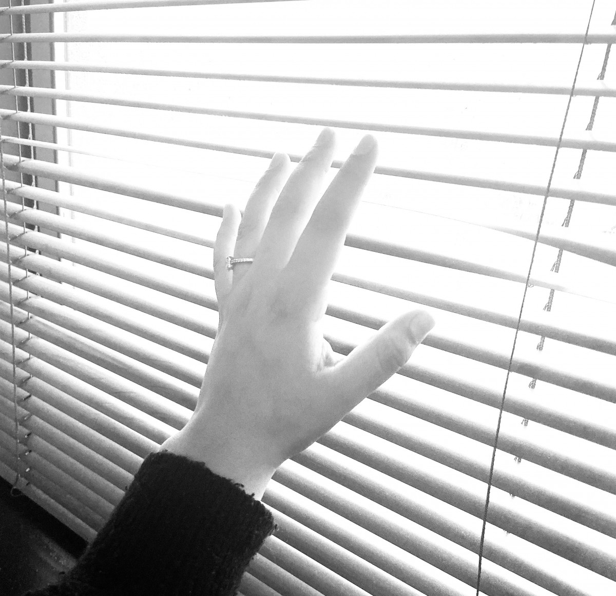
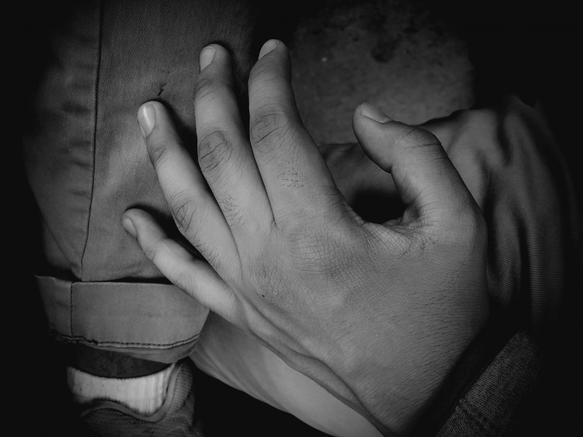
 Light value
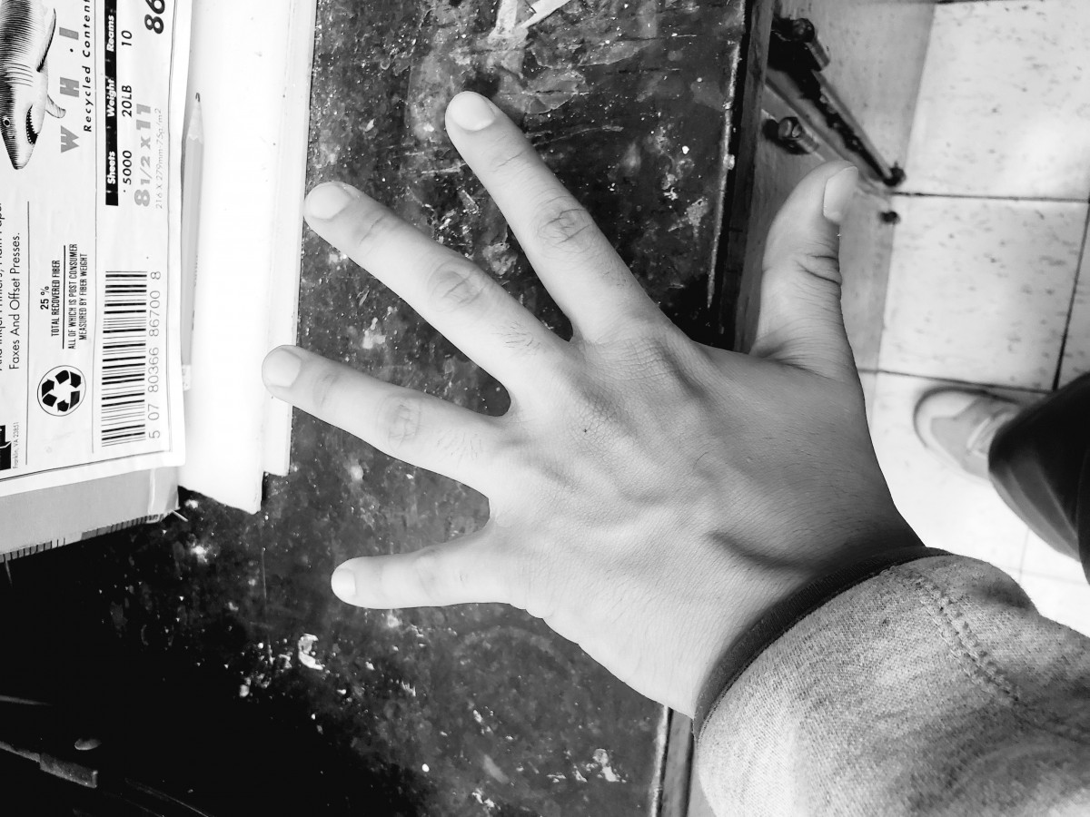 Broad value
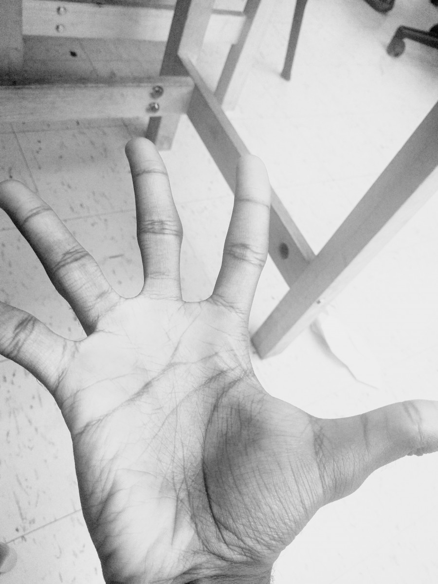
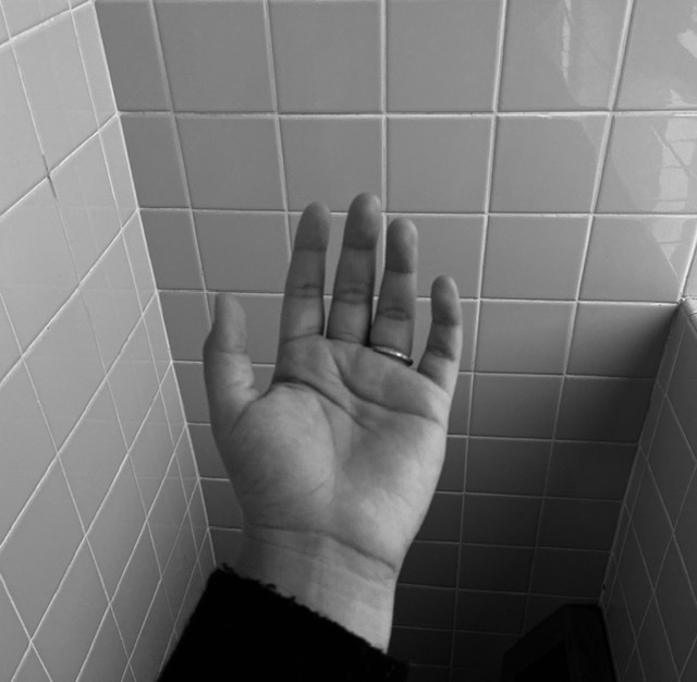
The different values set a tone played along with the way my hands are positioned. For the dark narrow one , it looks very dramatic because of how dark the shadows are surrounding the image and and some parts of my hand . Secondly the broad one has more of a neutral feel by the shadows dont overconsume my hand and my hand is straight out, lastly the light narrow one seems very calm because of how light it is setting that simple tone off.