Category Archives: Step 5 – Deliver

Step 5 – Deliver

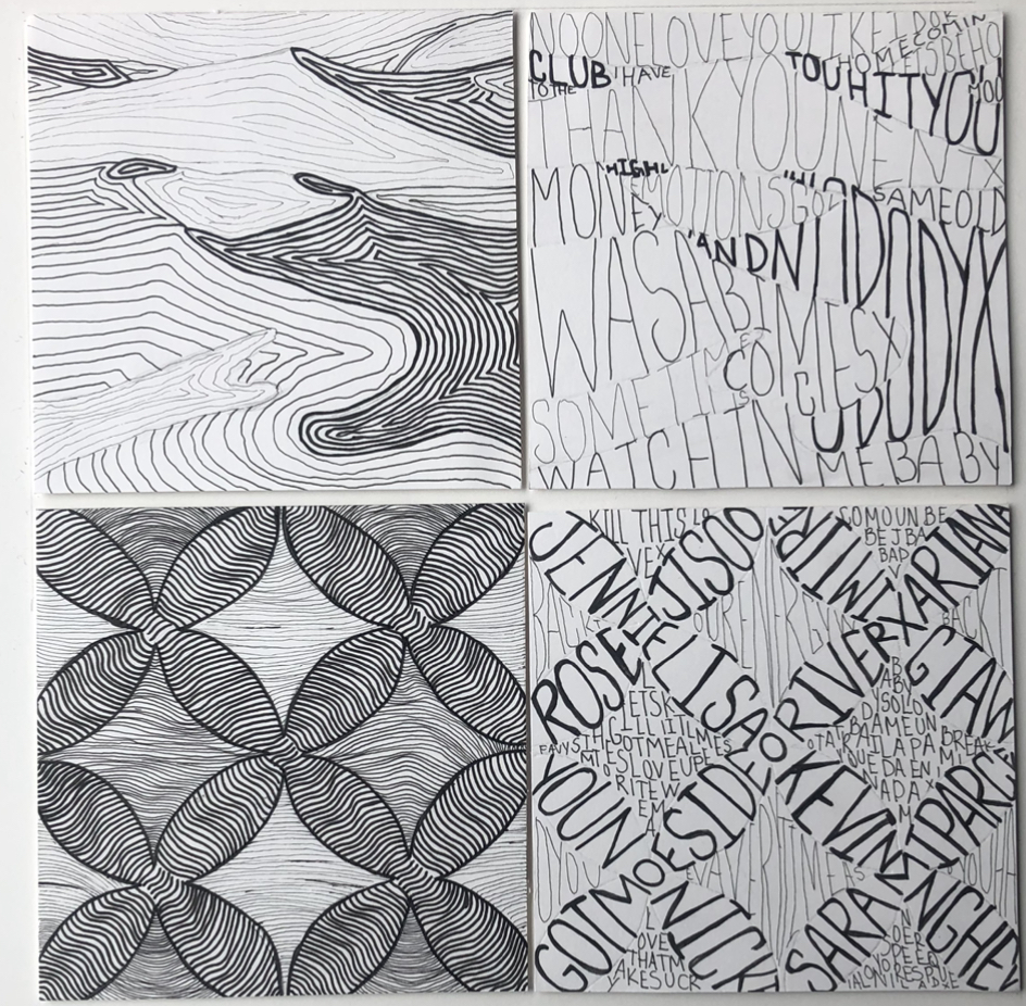
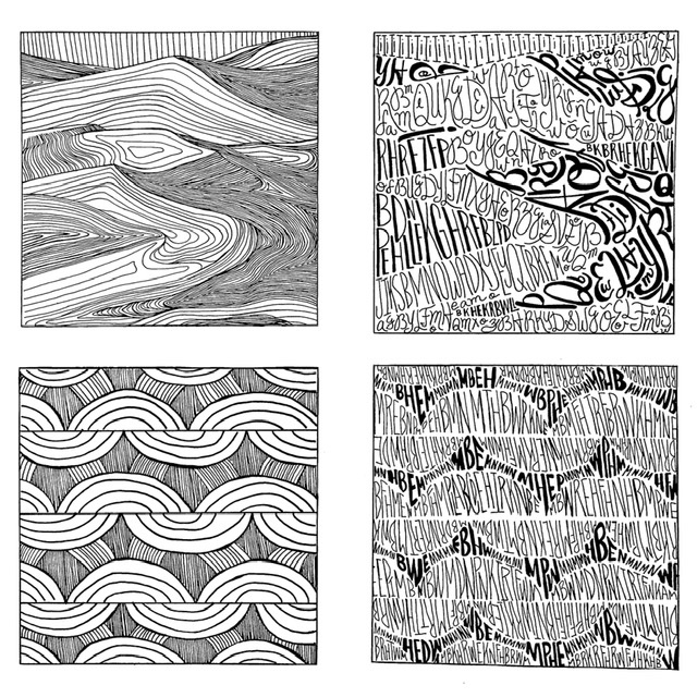
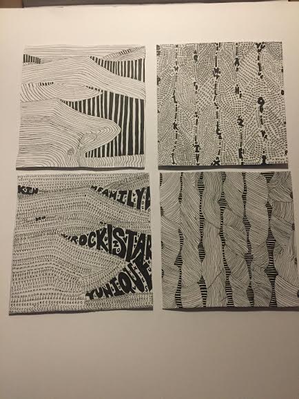
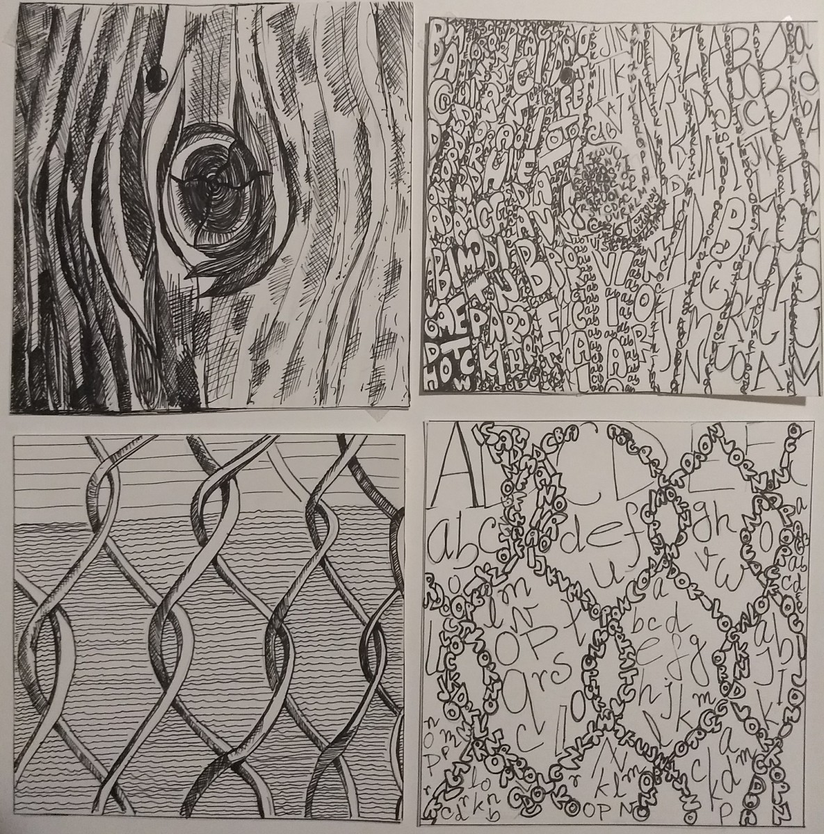
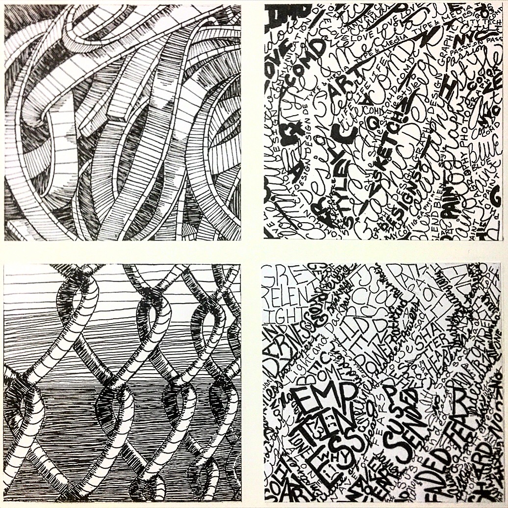
Overall I felt that I did a nice job on the lines part. I can tell the difference between the object and the background. The different shade and spacing of the strokes really defined the images.
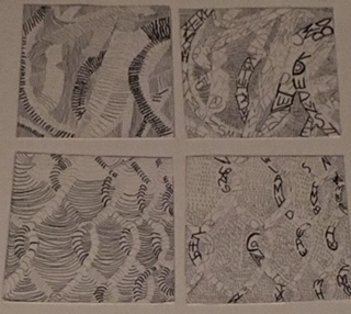
As for the patterns I felt like there is a lot of room for improvements. With so many words, it became a bit confusing for me to see the image.  Maybe I should have simplified it by having less words and then increased the size of the fonts and maybe play around with the contrast.
I need to work better on the mood. For the gates i did put a lot of words on how I felt about the gates, but i didn’t do that for the pasta.  Overall it was a great learning experience but I really
should put more time on making different sketches so I can generate more ideas a long the way and then maybe I could have done a better deliver on project 2.

Project 2: Texture and Pattern – Deliver


Texture – I’ve decided to stick with one sized pen for my line composition and arranged the lines closeness to each other as a way to show the different grays from the original image. I made some lines a bit bolder to add a little character to the final ink work. For the type composition on the other hand, I used bolder and larger sized type to for the darkest part of the image. I mixed script and sans serif for this composition.

Pattern – I went along with my first experiment for my final line composition. I mixed bold and thin lines in order to get the different grays from the image. Meanwhile, for the type composition, I decided to just use sans serif and I used two different pen size, sized 5 and 1, to get the gradients from the original image.

Project 2 : Texture & Pattern | step 5 -deliver

This is my final composition, for starters one thing I knew that would occur through the duration of this project was trail and error. Some of this things that worked for me in this project was not having an outline in the image forming the shapes for it to be translated in line and type. If I were to go back to a day ago I would buy more ink pens because midway of doing my ink compositions my pens were running out of ink. I feel like that had a big impact on how my project turned out. Something I learned in this project is how much of a mood a image can give you. Also how that mood can be developed using different lines and type.

Final Compositions

View post on imgur.com

This project was very difficult for me. The hardest part of the project was making the letters look identical to the original image but I tried my best. I enjoyed this project because it forced me to be creative and taught me how to experiment with different designs. I think I did pretty well on my line drawings which had a lot of organic shapes. For the next project, I will experiment on more sketches and try to keep on track with my work.


Final Compositions

I thought this project was quite interesting towards the middle of it. During the beginning of this project I was lost and confused because this was something that I’ve never done before and it required me to push myself and be more creative. To be honest I started becoming quite frustrated towards the sketching part due to me being to detailed in which required a lot of time to get these done. I also had so many ideas into what I wanted to put into my final pieces and it wasted some time for me. What I could’ve done better was to stop wasting so much time for my sketches because after all they’re just sketches. In the end I’ve figured it all out and I thought it my pieces were great since I took back feedback and put them into my work which worked out in the long run. My creative process for this was long, but it was worth it and I’m proud of my work.

Final Texture & Pattern


During this project I learned to be more experimental. At first I only stuck to one way/line usage , but towards the end I just tried what I thought would look good and it came out good. If I had a change to redo this it would be to plan this out further ahead and I would also try to be more experimental because the possibilities were endless. I will definitely plan ahead for my new project. The most successful thing for me was replicating the movement in the original image to my own drawing.

Final Compositions

The Photo is facing the wrong way, it is supposed to be vertical not horizontal. I really struggled finding a good balance between light and dark, I was either too light or too dark. Once I finally found my middle ground I didn’t have to edit much. For the type pasta composition I made the dark areas darker and I also added more dark lines in the pasta one. For my pattern pieces it was a little less of a struggle, I believe this because the pattern image had a lot less going on and the shades were clearer. I think my type composition for the pattern turned out nicely and it was the most fun to do especially creating the medium tones.

so this is all my compositions filling up spaces and adjusting light and darkness was kinda hard but overall these compositions looks good and if I had to do it again I would simply just try to make the dark areas more darker and fill the empty spaces with lines or texts and now I know how important light-dark adjustments, lines and textures are for a design .