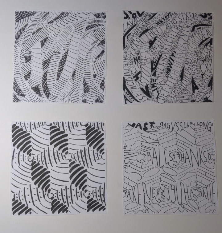
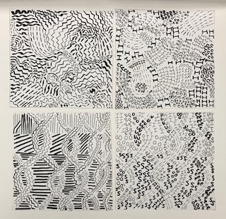
This is my final composition with the line pieces on the left and the text on the right.

This is my final composition with the line pieces on the left and the text on the right.
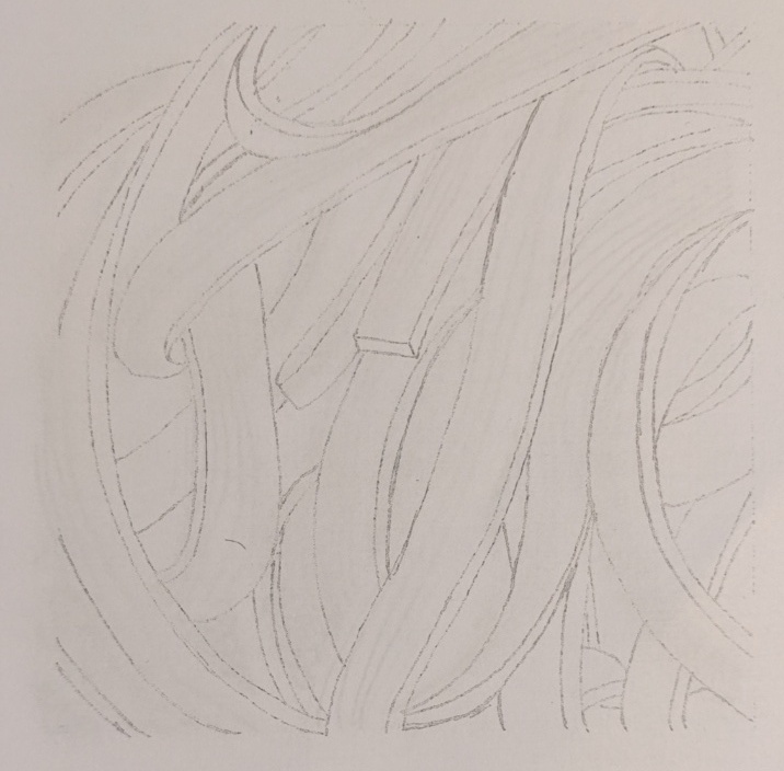
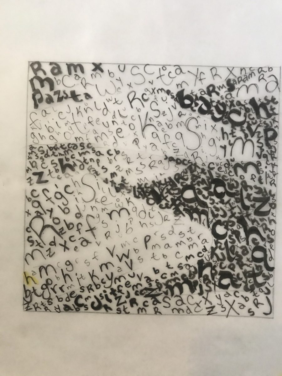
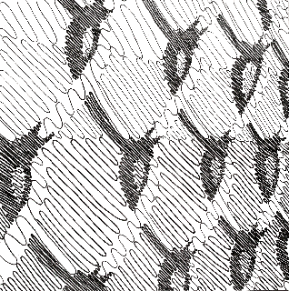
this is the sketch of the pasta

on this one, I tried to have vertical lines along with the pasta and curve line for the dark area but then I realized it doesn’t work well with each other. the hardest part of this idea is that it is hard to make the lines look even.
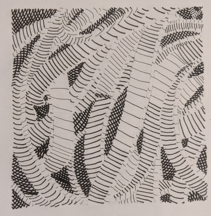
this is my final inking with horizontal lines I used thicker inking pen for the dark part and also increase the intensity to make the dark darker. I used the thin inking pen for the lightest part and also space them out so it make the contrast more clear.
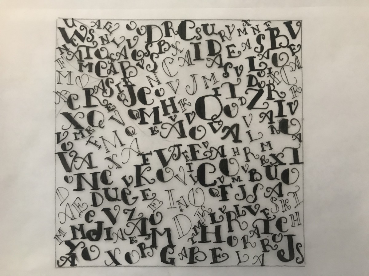
this is my final composition with text on this on I chose a san serif typeface with the dark area using bold and the lightest area using condensed / light version of the typeface I found this is really fun and the bold text really stand out compared to the rest.
this is the pencil sketch and I found out that coloring is wrong and it can’t have outlines
I really like this idea because it does show a clear difference between the darker and lighter area but on this one, the position of the dark and light area is incorrect.
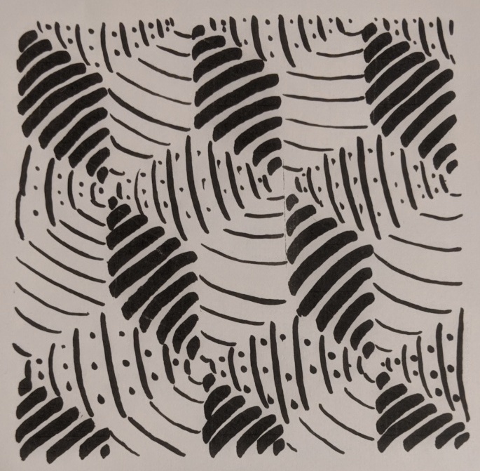
this is the refined version of the same idea where I use lighter inking pen for the lighter part and thicker lines for the darker part. I also add dotted lines in one of the areas.
While doing the lines I recognized that the texture of the dunes was part flowing down and the other part was static with no movement at all. I decided to represent this with a mixture of fun, serifed type to represent the flowing sand. While the san-serifed typography represents the parts where the sand texture looks static.
This was the first type drawing, I was still figuring out the thickness of the lines and the typography I was going to follow. Here I did all cursive with inking brush and pen.

Again a more artistic approach. The typography was more of a statement. It says: Sloggishly flowing down.
For this ornamental pattern, I selected medieval-looking, ultra-serifed typography perfect to give that retro feeling that I got from the original picture.

Pattern Case Study:
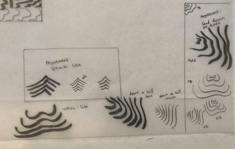
I felt an ornamental and retro mood from the pattern. Therefore I started studying Ornamental lines. Drawing different ornamental lines of several widths allowed me to create a pattern to work with and guide me while I was working on the bigger picture.
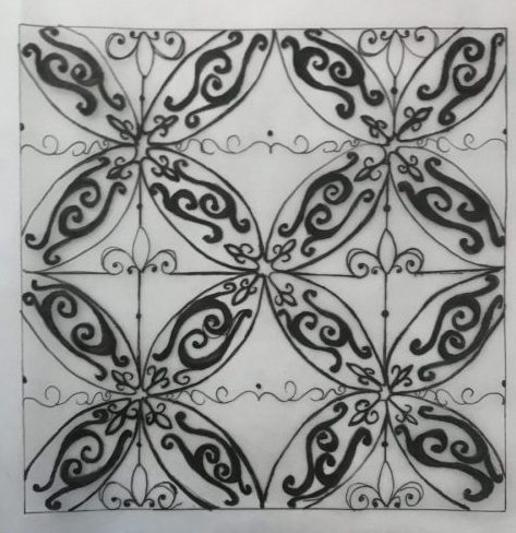
For this line pattern, I selected a theme which was the “Fleur-de-lys”. The fleur is very representative of the ornamental designs and found it a perfect inspiration for this design. I based the darker colors of the composition just by the thickness of the pens and not by repetition and filling the space.
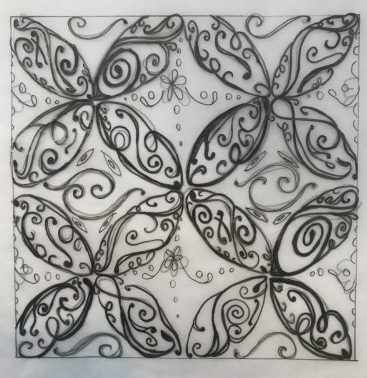
Pattern Line drawing with ornamental and retro lines. Repetition and thickness allowed me to make the darker spaces seem denser and fuller.
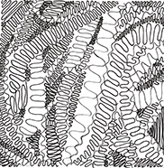
Texture Case Study: Sand Dunes
The texture picture I selected had sand dunes in it, this picture made me feel tranquil and serene. In the following case study I decided to test how lines could mimic the downward motion as sand in the desert dunes. I tested several line designs of different thickness to see which most effectively conveyed a sense of smoothness and flowing motion the sand has while it trickles down from the dune peaks. I followed my designs taking these lines as inspiration

First texture line composition, simple lines that went down recreating the downward motion of the dunes. Here I tried to understand how to represent motion through lines. Mostly used the ink brush to represent shadows.
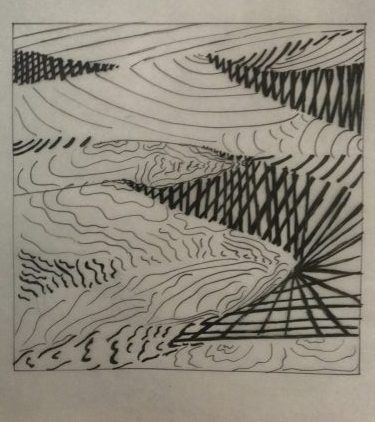
This is my second composition trying to understand how the different lines give out different feelings and emotions.

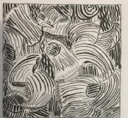
In the third ink composition I decided to go all out and get artistic with the lines. Traced each line with thin ink pen, this was great because this gave me greater understanding of how the shadows and highlights worked in the original picture. After I was ready to continue to the second part of the project
4 pencil sketches trying to figure out how to set a mood with lines
First ink compositions. Later I realized outlines weren’t necessary. I was searching for lines that would set the tranquil and ornamental mood I set for both pictures.
My Texture portion of this project required the most effort to get the results I desired. I did over 6 sketches. In the end, I like my decision to incorporate very zig-zag lines it made the piece look more messy and uneasy.
The Pattern design made e feel a sense of entrapment like I was stuck and couldn’t get out. Somehow the was more easy for me to convey than my pattern. I loved the lettering part of this process it was very fun and felt creative.
Overall I would say that this project was very time-consuming but I enjoyed learning about the creative process and repetition that allot of professors talk about.
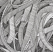
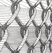
In the texture assignment, I worked on the pasta. For the pattern, I worked on the fence.
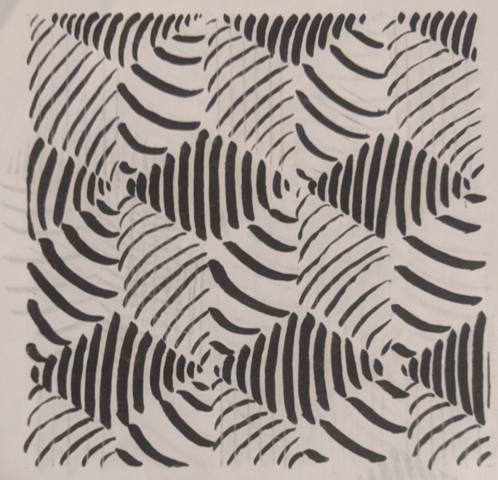
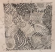
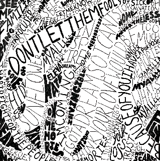
The Texture of the pasta reminded me of a chaotic feeling a feeling of uneasiness. The pasta turned towards different directions and was overall very messy looking. I tried to convey that in my work. This was the first design that came to mind and i think it was too clear and not messy enough so I explored more.
Texture
I tried something messier and thought it convey what I saw more accurately
Texture
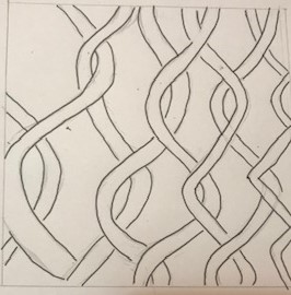
For my pattern, I saw something more clear that looked like entrapment and I conveyed that in my image. Entrapment but simplicity at the same time.
Pattern
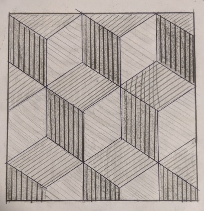
For my Texture and Pattern project I chose the Pasta photo(Fettuccine-looking one) as a texture and the Chain-link fence photo as a pattern.
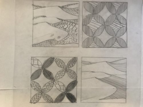
To me the Pasta image makes me think about a messy situation, stress, something that is all over the place, and unorganized. These were some of my initial type and line sketches for it:
The Fence image is a pattern in perspective and it gives me a more unified feeling than the Pasta image does. It also gives off an oppressive mood because of the nature of the image. These were some of my sketches in line and type for it:
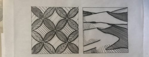
In the end I didn’t necessarily go with all my sketch ideas and in some cases I just ended up making a whole new composition. But in a way my sketches helped me decide what I thought could and could not work to make my final compositions, or what I needed to change to make them better.
These are my 4 final ink compositions:
 .
.
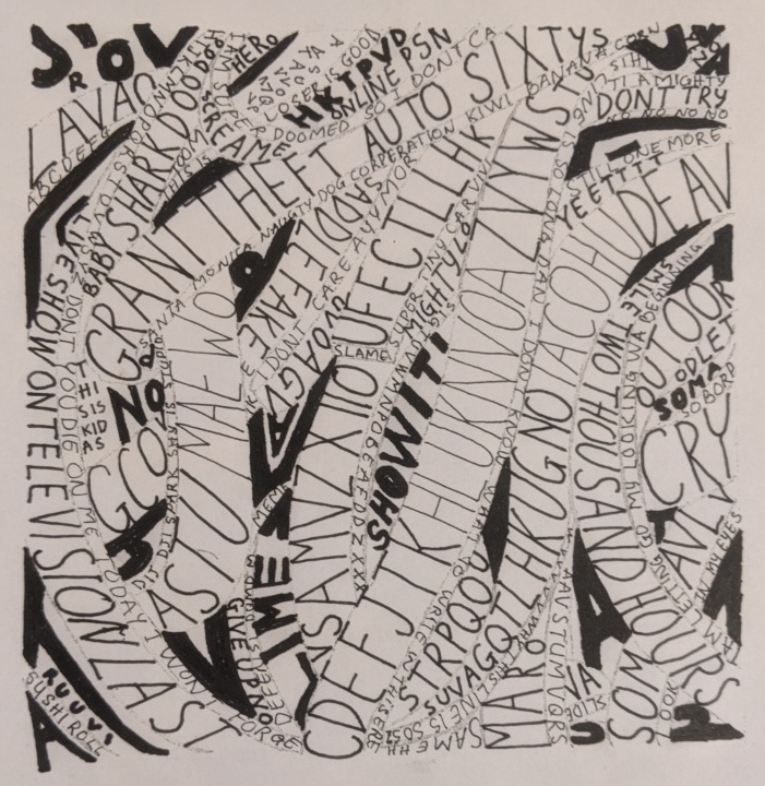
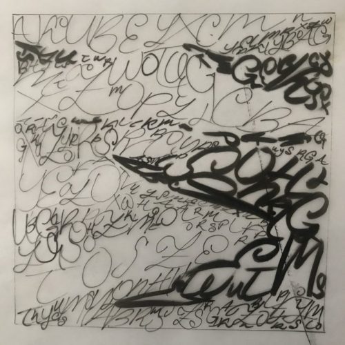
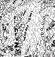
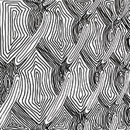
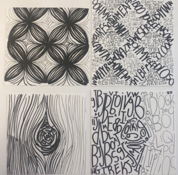
For my Pasta compositions I did a good job and I was able to show the contrast necessary to show depth. For my Pasta made with lines I decided to make each element like a continuous line going inward. They almost look like shapes but if you look closely you can see that they aren’t connected. My lines did touch a little in some places, and thats something I wish I could’ve done better. For my Pasta made with type I decided to fill the spaces with sentences/words from lyrics, going in different directions and using thicker and thinner fonts for the lighter and darker parts. This one is my favorite.
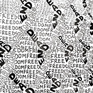
For my Fence compositions I’m okay with what I made but I feel like they could’ve been a little better. For my Fence made with lines the contrast is visible to me, but I question if it could have a larger contrast. I felt like one of my sketches came out better than my final composition. For my Fence made with type, I actually really like my idea. I made the fence using the words “dead end” and “warning”, while using the word”freedom” to fill in the background. I feel like there was a little white spaces in places there shouldn’t be, and that some of the type isn’t understandable because it might blend in together, but overall I like it.
Making this project wasn’t easy. It was very tedious and it was hard to come up with ideas that I felt would actually work. But at the same time it was a little fun and I liked that within the boundaries of what lines and typography styles we could use for this project, it was still broad enough for everyone to bring in their own creativity.
The OpenLab is an open-source, digital platform designed to support teaching and learning at City Tech (New York City College of Technology), and to promote student and faculty engagement in the intellectual and social life of the college community.

 Here are my final compositions of line and text. After experimenting with the line weight i think i achieved it well.