
Originals | Design
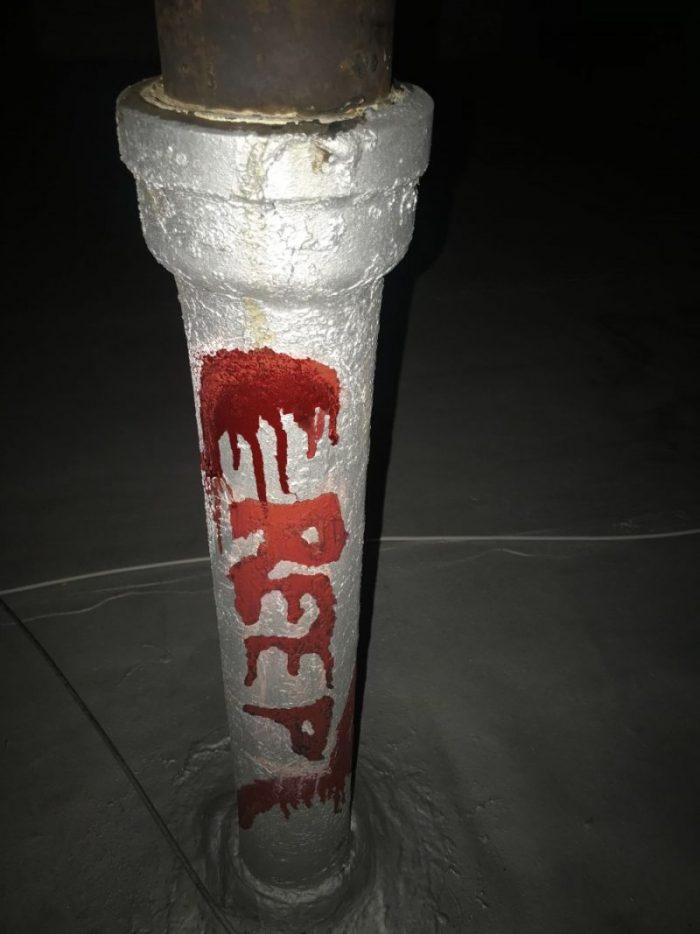
“Bloody Creep”
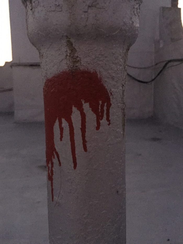
My favorite one out of all of the compositions. This is an old rusty pipe with a rather sinister-looking red spray paint over it. This was my favorite because I had to put in plenty of effort to achieve typography that would match the spray paint. The first drafts over the print out were done with clean, round lines; which caused a total mismatch if I compared it with the look of the spray paint. The professor indicated to me that the type had to match the mood of the object. I had many issues finding the correct letters because of the shape of the blob; I tried a horizontal “M”, and then a vertical “E”. The letter “E” made more sense but what word would express what I was seeing in the pipe? The smudge looked like blood dripping down, so I thought about the word “Terror” for the mood. I tried but couldn’t make the smear look like a “T” therefore I looked for synonyms of the word terror and came up with the word “Creep”. To achieve this “Creepy” look I had to write the word in chalk, then smear it with my hands, and grab wet cotton balls and dab it over the chalk to get the “Bloody” look. Overall had a lot of fun with the process of making this setup.
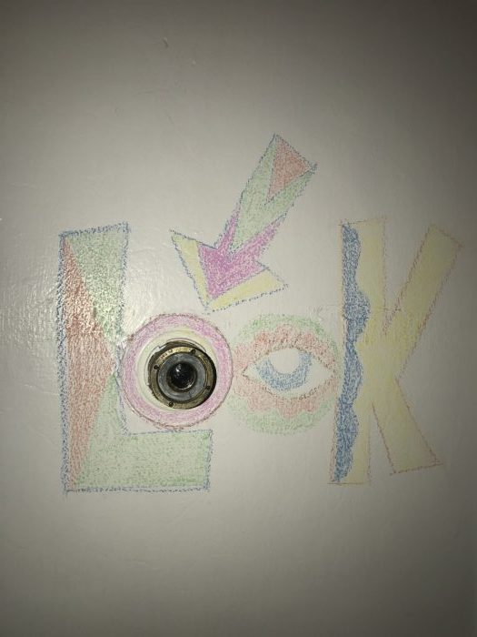
“Look Through the Peephole”
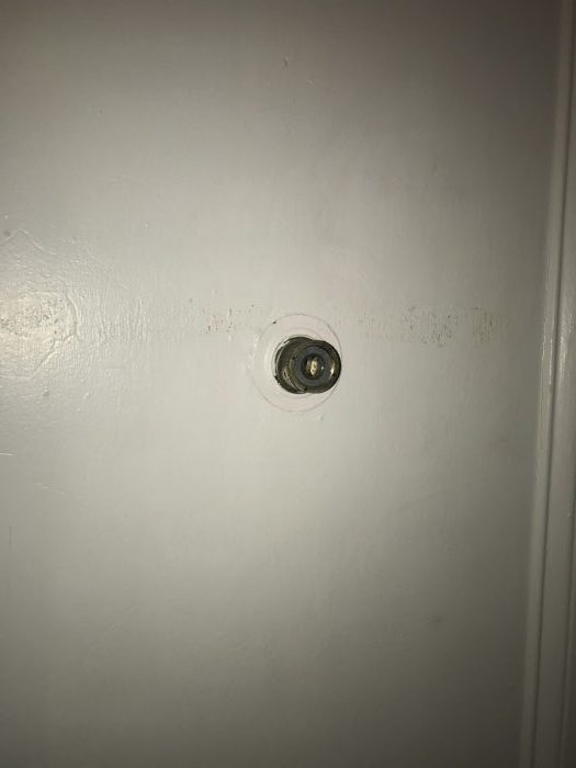
This is a door viewer, the ones that allow an individual to look from the inside to the outside of a door. It was only natural I decided to go for a word like “Look” because that’s exactly what you do when you use this object. Plus the peek hole is a round shape that simulates an “O”. Finding the mood for this composition was a child’s play because the object already had the shape and a word that matched the item. I opted to go with bright colors because since it’s something you have to “look at” it demands your sight’s attention and what better way to do that other than with colors and bold letters.

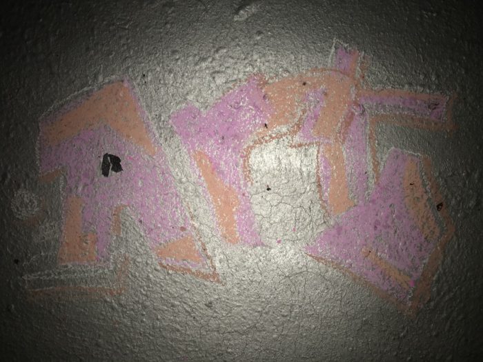
“Rubber on Ground”
This arrangement worked out because of the black rubber on the floor that gave me the idea to have it function as a counter of the letter “A”. I went for the word “Art” because I think graffitis are art.


“Bloody Creep” look way better in color 😀
Surprisingly the starting point is pretty legible and the color you used are super similar. Even though the ‘C’ is still different from the rest of the word, it still gives the same mood.