

Museum Visit – The Frick Collection Museum
Leave a reply

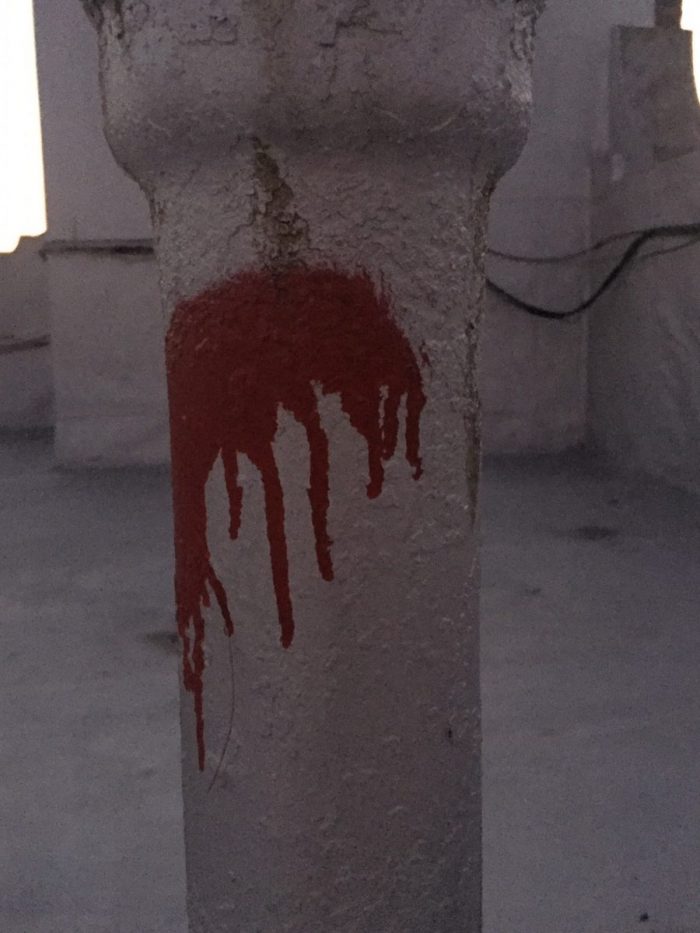
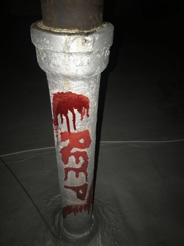
My favorite one out of all of the compositions. This is an old rusty pipe with a rather sinister-looking red spray paint over it. This was my favorite because I had to put in plenty of effort to achieve typography that would match the spray paint. The first drafts over the print out were done with clean, round lines; which caused a total mismatch if I compared it with the look of the spray paint. The professor indicated to me that the type had to match the mood of the object. I had many issues finding the correct letters because of the shape of the blob; I tried a horizontal “M”, and then a vertical “E”. The letter “E” made more sense but what word would express what I was seeing in the pipe? The smudge looked like blood dripping down, so I thought about the word “Terror” for the mood. I tried but couldn’t make the smear look like a “T” therefore I looked for synonyms of the word terror and came up with the word “Creep”. To achieve this “Creepy” look I had to write the word in chalk, then smear it with my hands, and grab wet cotton balls and dab it over the chalk to get the “Bloody” look. Overall had a lot of fun with the process of making this setup.
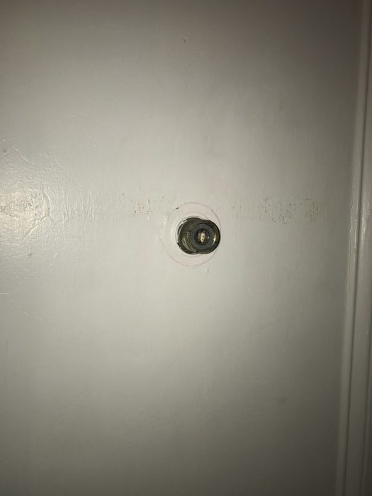
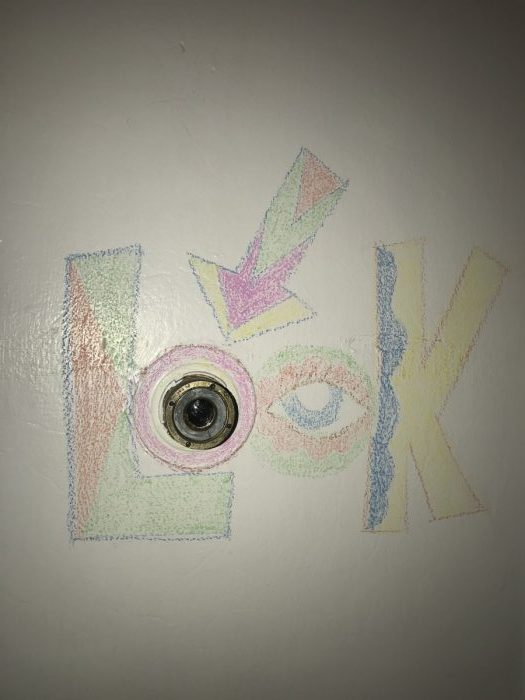
This is a door viewer, the ones that allow an individual to look from the inside to the outside of a door. It was only natural I decided to go for a word like “Look” because that’s exactly what you do when you use this object. Plus the peek hole is a round shape that simulates an “O”. Finding the mood for this composition was a child’s play because the object already had the shape and a word that matched the item. I opted to go with bright colors because since it’s something you have to “look at” it demands your sight’s attention and what better way to do that other than with colors and bold letters.

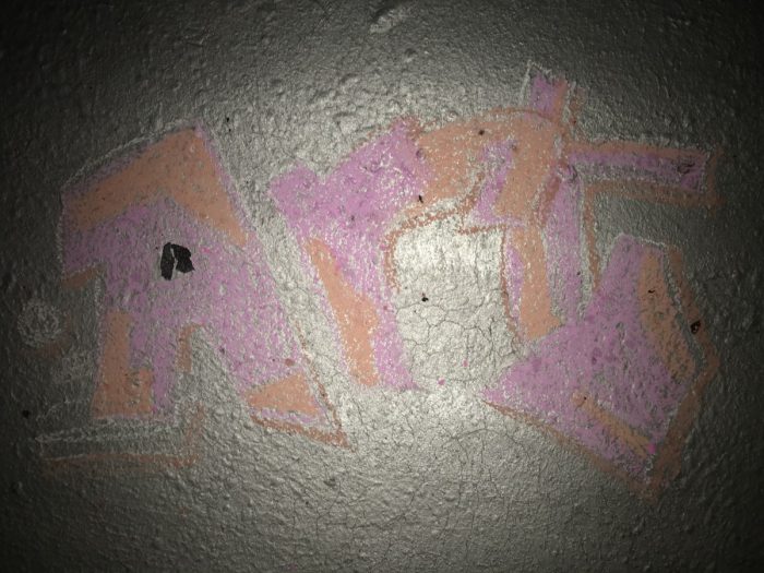
This arrangement worked out because of the black rubber on the floor that gave me the idea to have it function as a counter of the letter “A”. I went for the word “Art” because I think graffitis are art.

IsadoraMartinez-AnComposition
IsadoraMartinez-TriadComp
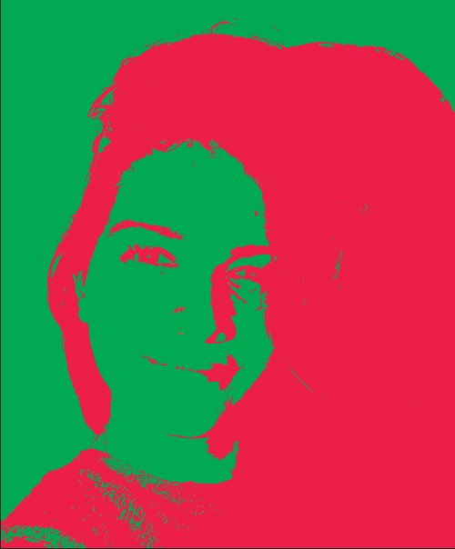
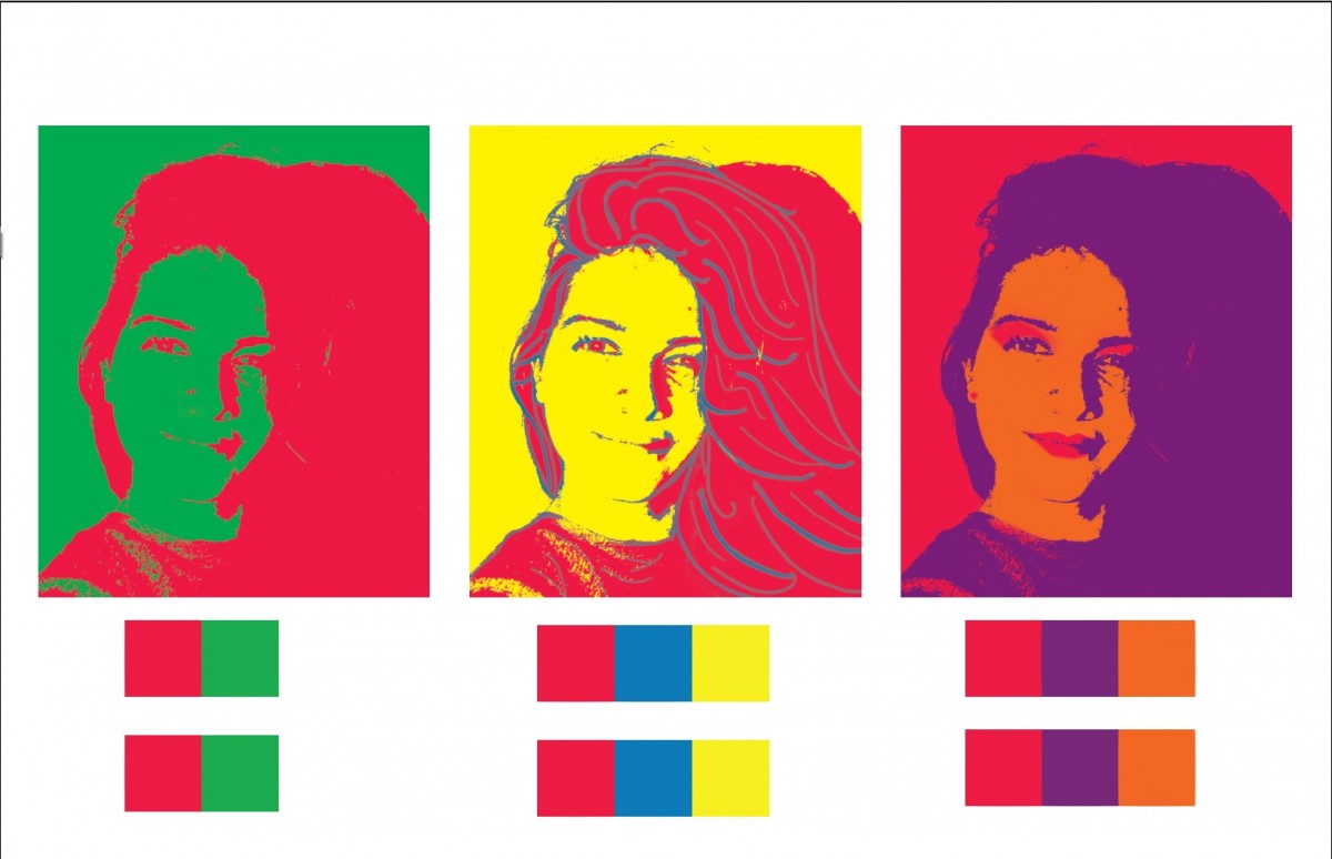
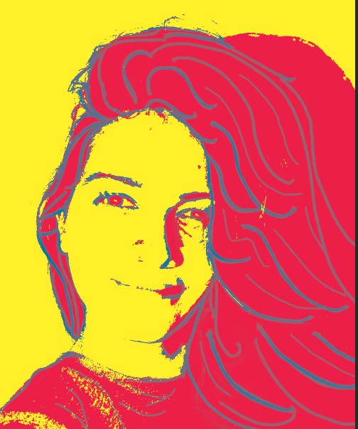
What I learned with this project is that colors have a psychological meaning on the viewer, and if the combination of colors is not balanced the composition will be spiky on the viewer’s eyes. For example, I selected red as my favorite color, while I was creating the complementary color composition I realized that adding green to it generated a clash in the image since they are both strong colors. To remediate this I decided to add the green in the background and red in the foreground and it toned down the intensity of the complimentary composition.
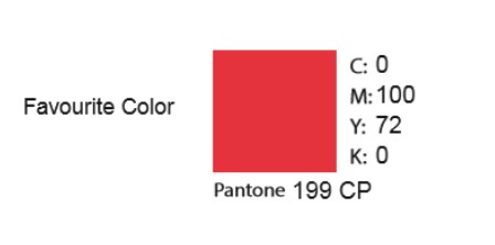
Isadora Martinez’s favorite color, RED
I chose the color red because for me it’s a powerful color. It is a color that motivates people to take action, we associate it with love, passion, energy danger, strength, and war. This resonates with me because I’m the kind of person that if there’s a problem to be solved I always decide to take immediate action. It’s an intense color that demands immediate attention. I even researched the psychological meaning of the color which has tremendous effects on the viewer, it increases metabolism, increases respiration rate and even raises blood pressure.
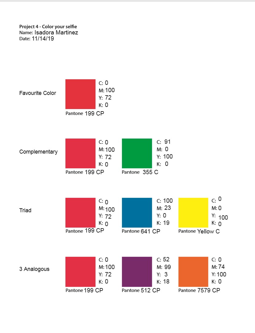
Isadora Martinez Color Wheel
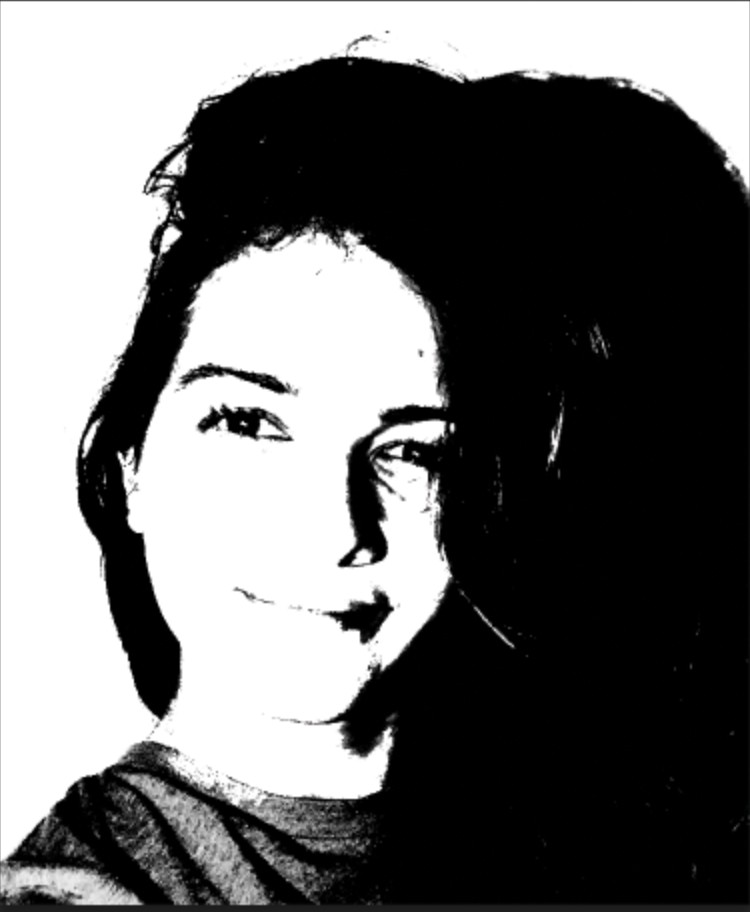
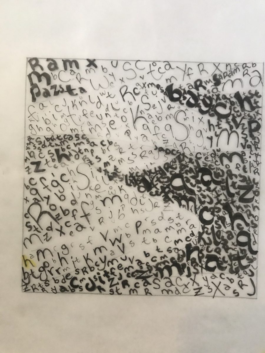
Isadora Martinez b&w high contrast image
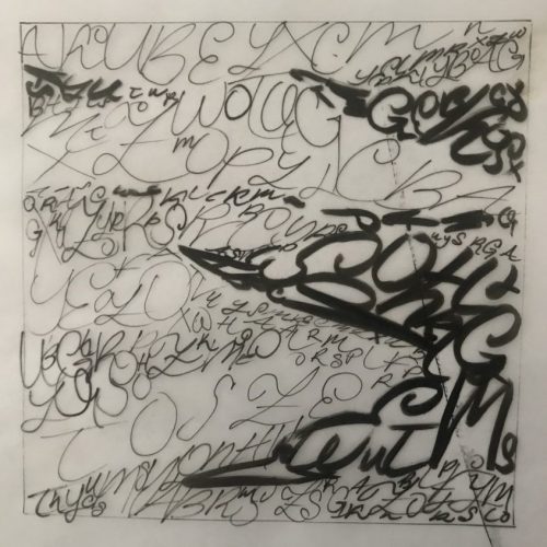
While doing the lines I recognized that the texture of the dunes was part flowing down and the other part was static with no movement at all. I decided to represent this with a mixture of fun, serifed type to represent the flowing sand. While the san-serifed typography represents the parts where the sand texture looks static.
This was the first type drawing, I was still figuring out the thickness of the lines and the typography I was going to follow. Here I did all cursive with inking brush and pen.

Again a more artistic approach. The typography was more of a statement. It says: Sloggishly flowing down.
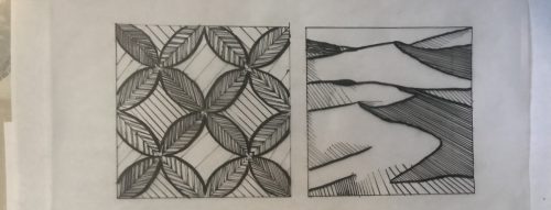
For this ornamental pattern, I selected medieval-looking, ultra-serifed typography perfect to give that retro feeling that I got from the original picture.

Pattern Case Study:
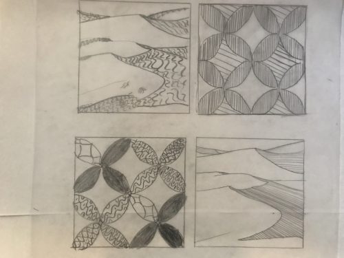
I felt an ornamental and retro mood from the pattern. Therefore I started studying Ornamental lines. Drawing different ornamental lines of several widths allowed me to create a pattern to work with and guide me while I was working on the bigger picture.
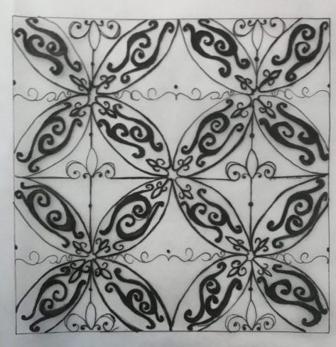
For this line pattern, I selected a theme which was the “Fleur-de-lys”. The fleur is very representative of the ornamental designs and found it a perfect inspiration for this design. I based the darker colors of the composition just by the thickness of the pens and not by repetition and filling the space.
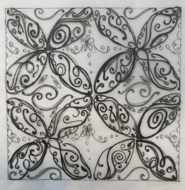
Pattern Line drawing with ornamental and retro lines. Repetition and thickness allowed me to make the darker spaces seem denser and fuller.
Texture Case Study: Sand Dunes
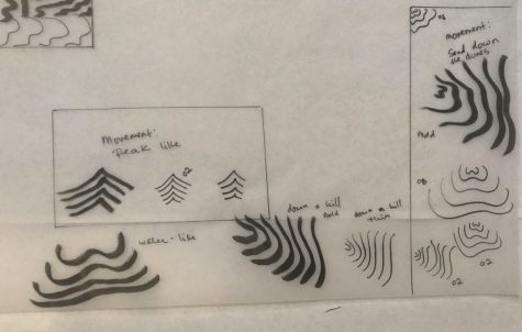
The texture picture I selected had sand dunes in it, this picture made me feel tranquil and serene. In the following case study I decided to test how lines could mimic the downward motion as sand in the desert dunes. I tested several line designs of different thickness to see which most effectively conveyed a sense of smoothness and flowing motion the sand has while it trickles down from the dune peaks. I followed my designs taking these lines as inspiration

First texture line composition, simple lines that went down recreating the downward motion of the dunes. Here I tried to understand how to represent motion through lines. Mostly used the ink brush to represent shadows.
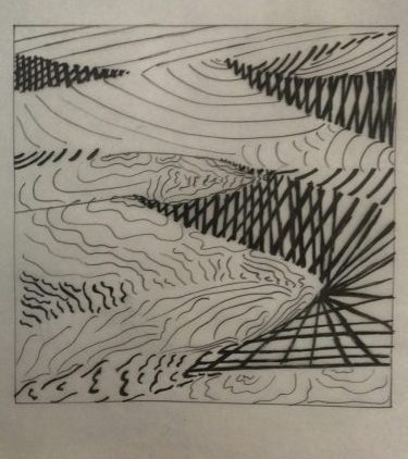
This is my second composition trying to understand how the different lines give out different feelings and emotions.

In the third ink composition I decided to go all out and get artistic with the lines. Traced each line with thin ink pen, this was great because this gave me greater understanding of how the shadows and highlights worked in the original picture. After I was ready to continue to the second part of the project
4 pencil sketches trying to figure out how to set a mood with lines
First ink compositions. Later I realized outlines weren’t necessary. I was searching for lines that would set the tranquil and ornamental mood I set for both pictures.
The OpenLab is an open-source, digital platform designed to support teaching and learning at City Tech (New York City College of Technology), and to promote student and faculty engagement in the intellectual and social life of the college community.

