Monthly Archives: November 2019

History of Favorite My Color

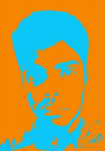
My favorite color is orange. However, on the color wheel, red-orange suits more of the tone of orange that I liked.  Growing up, I always based my favorite color on those that I looked up to just to fit in, so as I grew older I wanted a color that fits me (unusual, full of laughter, spontaneous, trusting and bright: this is just some elements that fit into the history of the color red-orange. 

Fact: The word orange stemmed from the Old French and Anglo-Saxon orenge. Before the name orange appeared, it was yellow-red. Another way of saying yellow-red was “geoluhread”.

This color conveys enthusiasm, vitality, encouragement, energy, balance, protection self- assertion, opportunity, adventure, ambition, confidence, exotic, and surprisingly , it was a color used among the royals. 

In the fifteen hundreds, artists used orange to create drama. The orange pigment then was made out of a highly toxic mineral called orpiment, which contained traces of arsenic.

In the case of product promotion, this bright color attracts the eye to the consumer to alert them that the price is cheap. 

The history and usage of the color orange/ red-orange is never ending and interesting.

P.S. I am so glad I chose this as a favorite color of mine. Orange rocks.

Final Compositions

complementary triad analogous
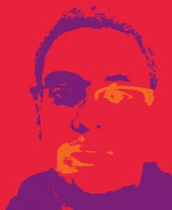
If you can look back at my step 3 post, you can see nothing has changed. I kept them the same because I felt that the style of my compositions were perfect for the colors I worked with. I learned how color can either make or break a creation. I also learned how to create a focal point(s) in different ways with color. In the previous selfie project I practiced making a focal point but it was with a gray scale. If I had more time for this project I would use a different selfie,because some images work while other don’t.Also while turning my selfie into a high contrast composition I lost some of the details, so another selfie would help with that issue. I will definitely apply the use of working with color for any other project I have. My work process was to create a folder of the same file, but switch up the colors I was working with to get a different outcome. If I can do that strategy in another project I will.

Project 4: Compositions

MatthewColon-ComplCompMatthewColon-TriadComp MatthewColon-AnComp
My favorite color is red, the vibrant hue makes it go well with anything from clothing to interior designing. After researching the color red I found out that its characteristics were daring, determined, energetic, and aggressive. For its social & cultural meanings red is among the most powerful colors in Indian culture and has various important meanings. To list some of them are, fear/fire, wealth/power, power, seduction, and beauty. I chose it because it has been my go to color since I was a toddler. 

Project 4 : Color your Selfie |step4 -deliver

.

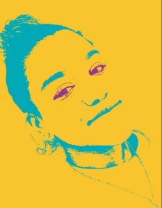
This so far has been my favorite projects for a number of reasons, one being that  I learned a lot of things. I learned about color and how they can have a huge affect on the final outcome of anything. I also learned how to find colors on a pantone book and the difference of RGB and CMYK. Also throughout this project I was excited to be learning the basics of photoshop. Something I would do better is made my original black and white picture more high on contrast.


Project 4 : Color your selfie |step 3 -develop

What I choose from the color wheel was printed as blue-green. Which is turquoise, to make this color you’d have to mix blue and green. Blue represents calm, the sea, freedom, sensitivity and other meanings of depth. As the color green  means growth , harmony, freshness and environment. Having the characteristics of the two colors that make up turquoise they sort of intertwine making turquoise mean communication , energy, wisdom, wholeness. emotional balance.  Turquoise was an important color back then to the Native Americans, they often made mention to it as the “stone of life” . I chose this color because as a little girl I always chose this color instead of blue or green because I felt like it popped out more. This color also reminds me of when I am at the beach in the Dominican Republic and people are walking around selling necklaces that had a turquoise colored stone.

History of Green “Step 3- Develop”

The color green to many people is not a color, but in fact a symbolic representation of life, purity, ecology, luck, and rebirth. Green is universally associated with nature and many people believe that it has a higher meaning and place. In many Muslim countries, many believe that green means green man: symbol of fertility. Green not only gives people the understanding of life and nature, but also grants people luck. The reason why I chose the color green for this project was because it represents hope and a healthy life for me. It has always been one of my favorite colors since I was a child and I believe that it brings our nature together as a whole collective. All throughout the world many countries think the color green represents impurity, luck, and bad news. Many people all have their own understanding of the color green, but to me it sticks because it has gave me the idea of hope and believing. Green also represents my personality a lot because the idea of being lucky throughout my neighborhood is scarce. Many people in my area don’t finish high school or attend college. I was lucky enough because through perseverance and hard work I made it to where I’m today. Green is not only a color, but a universal representation of life.