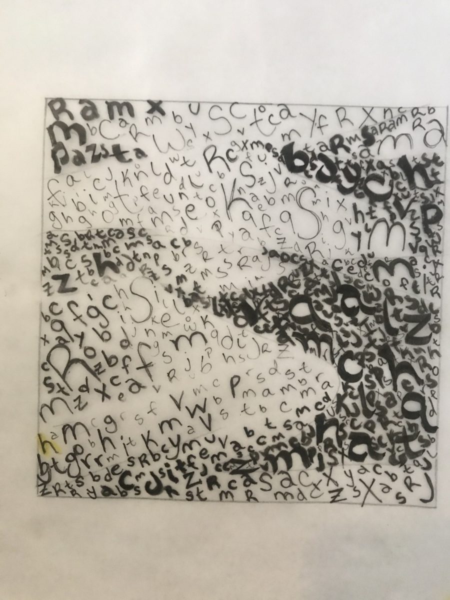
For my final collage it took me a long time to create something unique. Since we’re on Project 3 already I wanted to create something that was different in which I added a little hat cut out form the carvings of my dark tabloid images so that it resembles a sort of festive theme background. I got this inspiration from my third collage, but decided to add a little bit more so that it can give it more life. I also cut out a piece of my sweater from one of my lighter darker images from my tabloids so that it acted as a blanket. I also decided to incorporate hans from magazines that were actually holding onto something, but I decided that I wanted it to clench onto the blanket. The focal point for this collage can be a variety of things, but I wanted it to be the different tones of my eyes and mouth. I’ve decided to keep my grey scale simple by going downwards from dark to light. This project was really fun and it gave me so many ideas on how to push this through.
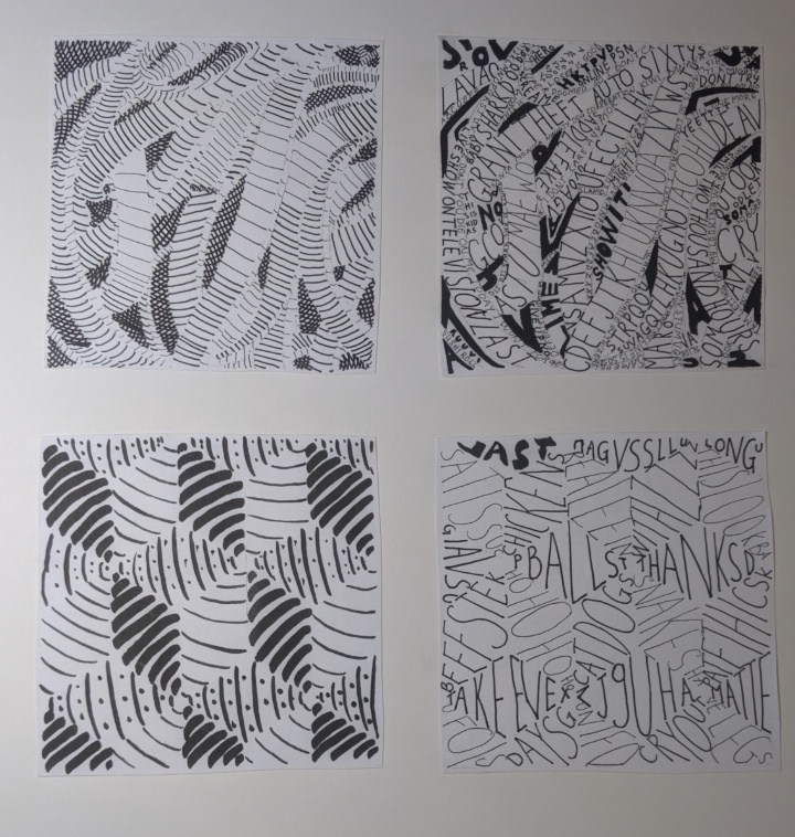

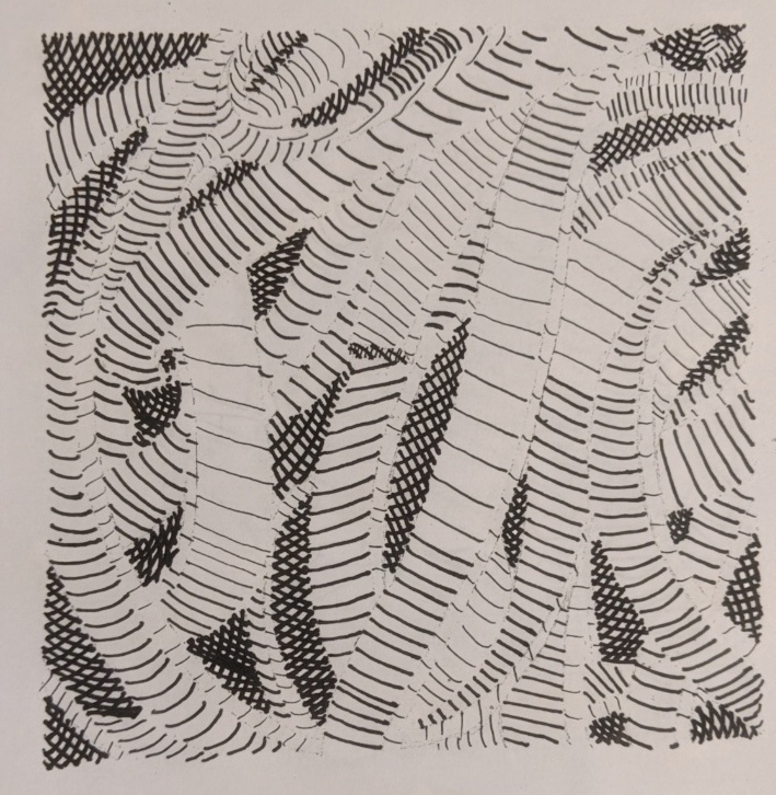
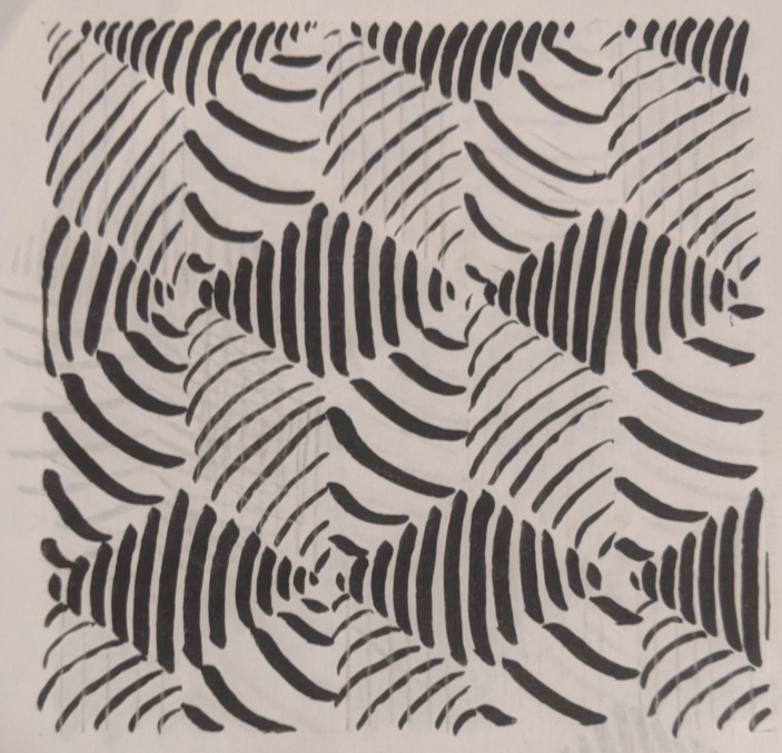
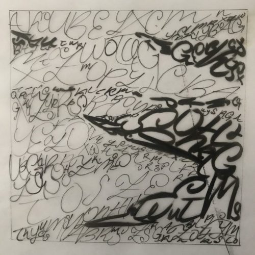


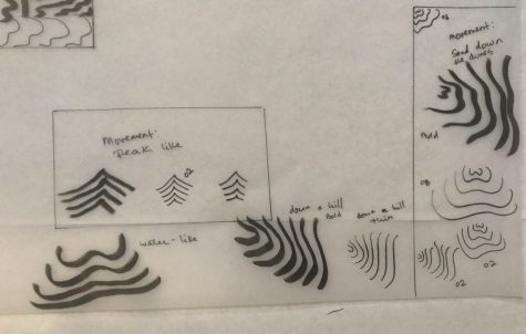

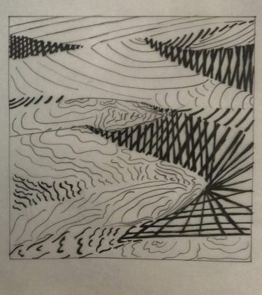

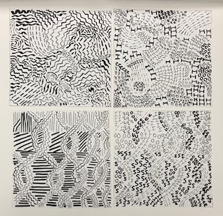
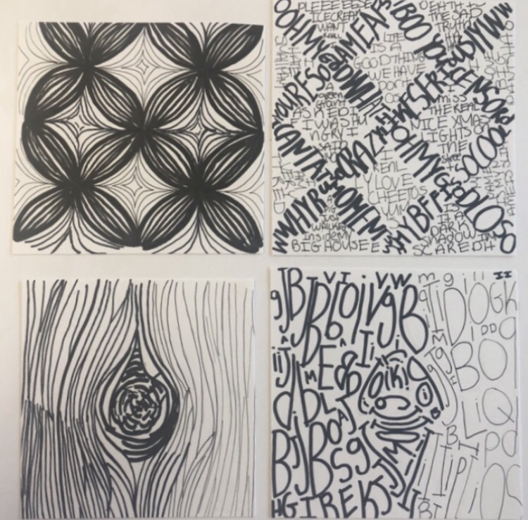 Here are my final compositions of line and text. After experimenting with the line weight i think i achieved it well.
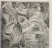
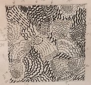
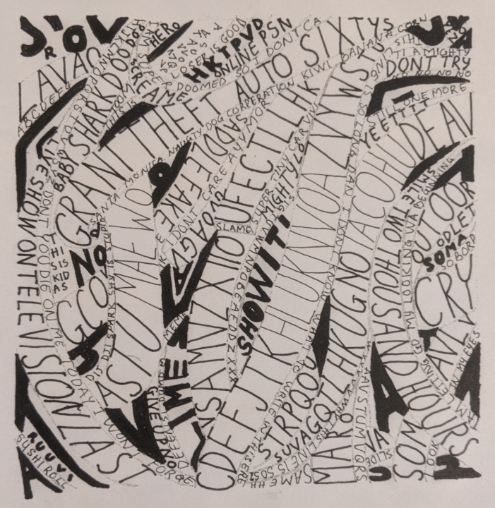
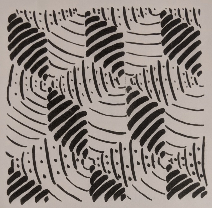
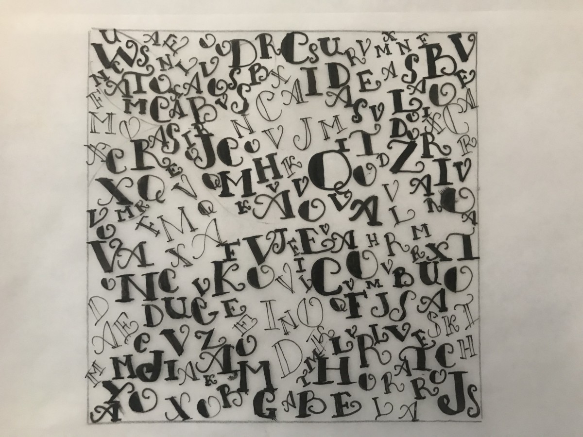
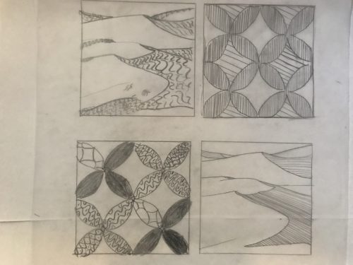
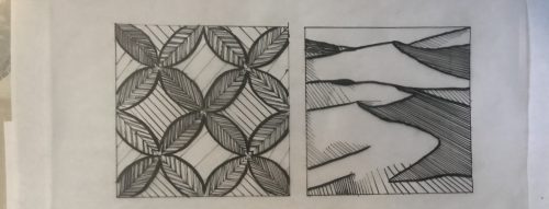