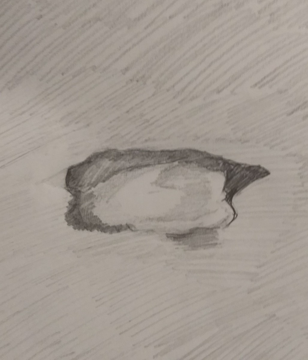
OBVIOUS


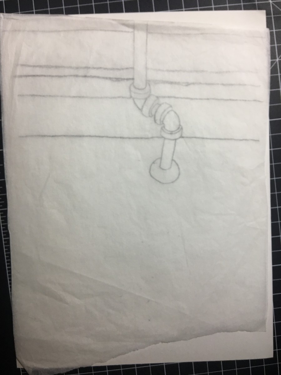
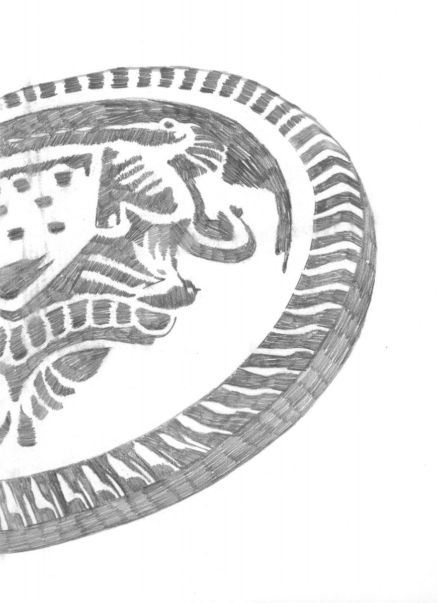
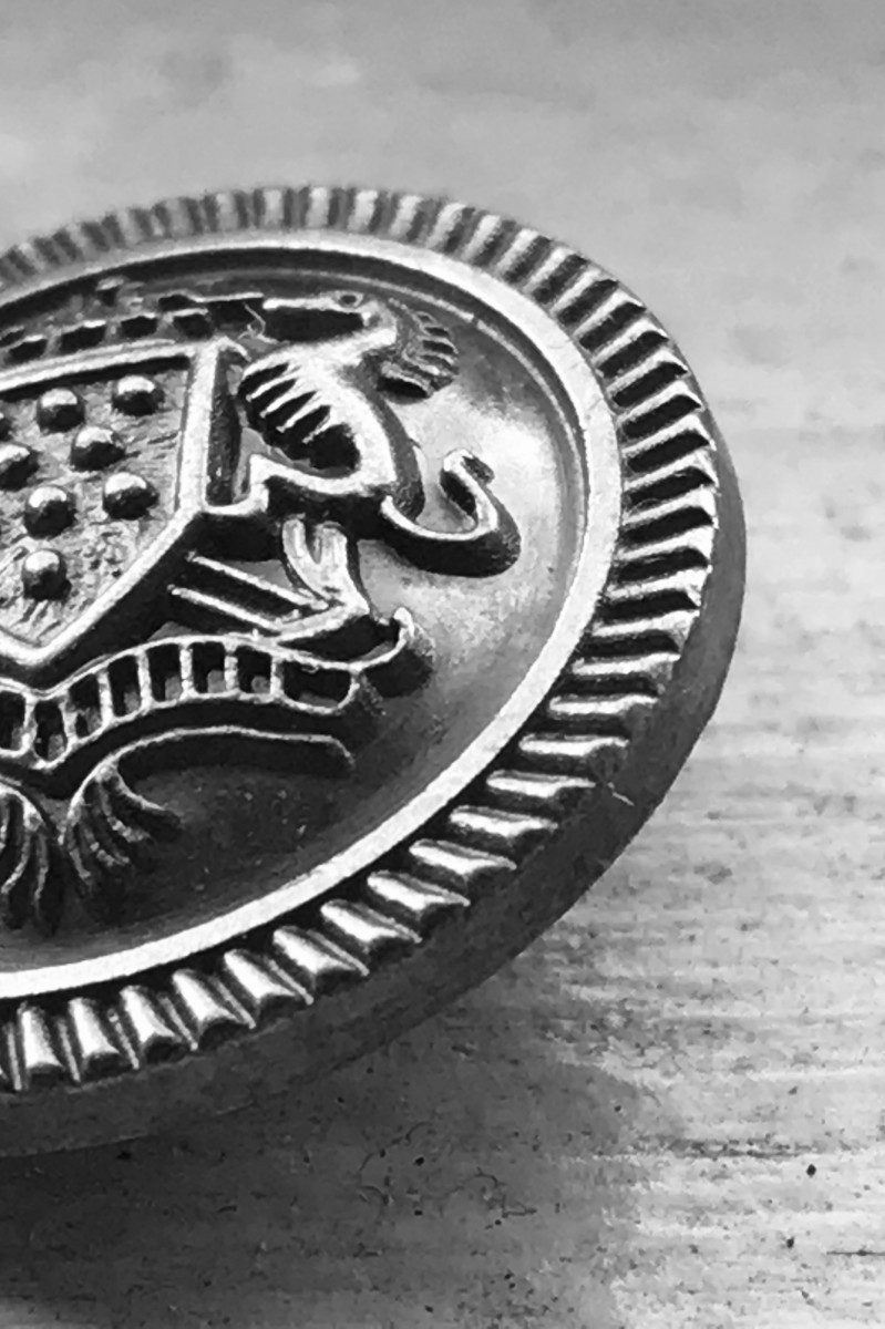
The Button – I’m actually happy how this one turned out while sketching it, but in order to make it a successful obvious, I have to size down the figure to give it that 30/60 (figure/background) relation.
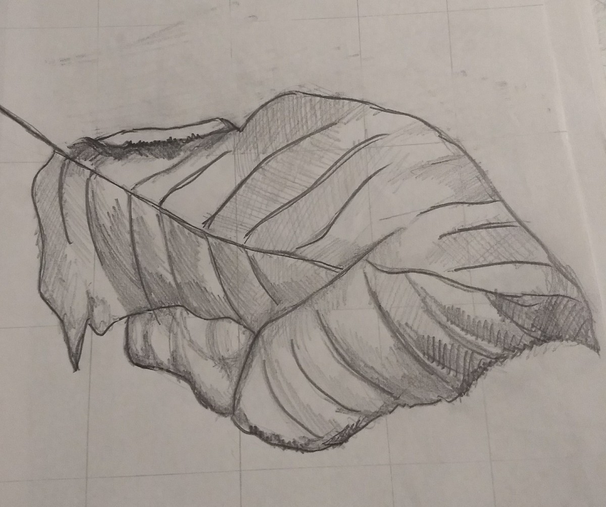
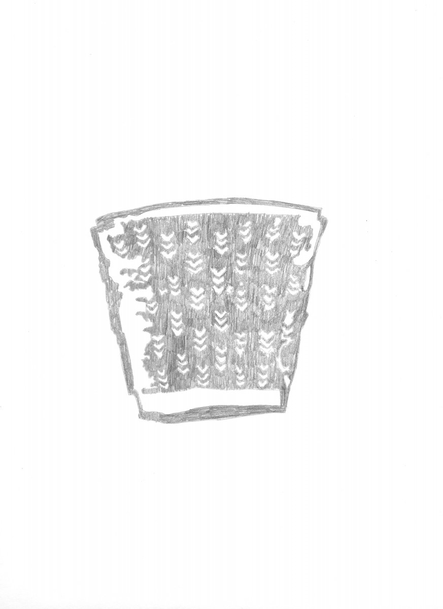
Tattered Cup – I also like the sketch for this one because while it’s just a discarded cup, when simplified, without the “noisy” look of the background, the cup shines, like it has more character too it. It looks much more interesting and it also achieves the 30/60 relation in an obvious image.
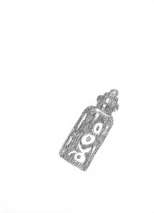

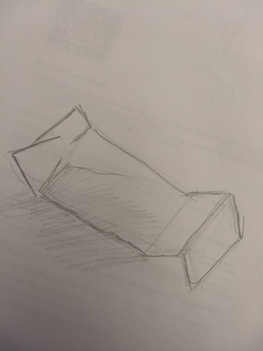
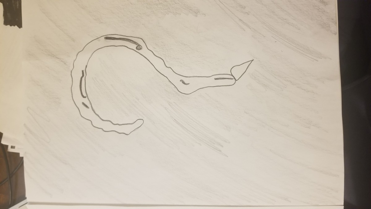
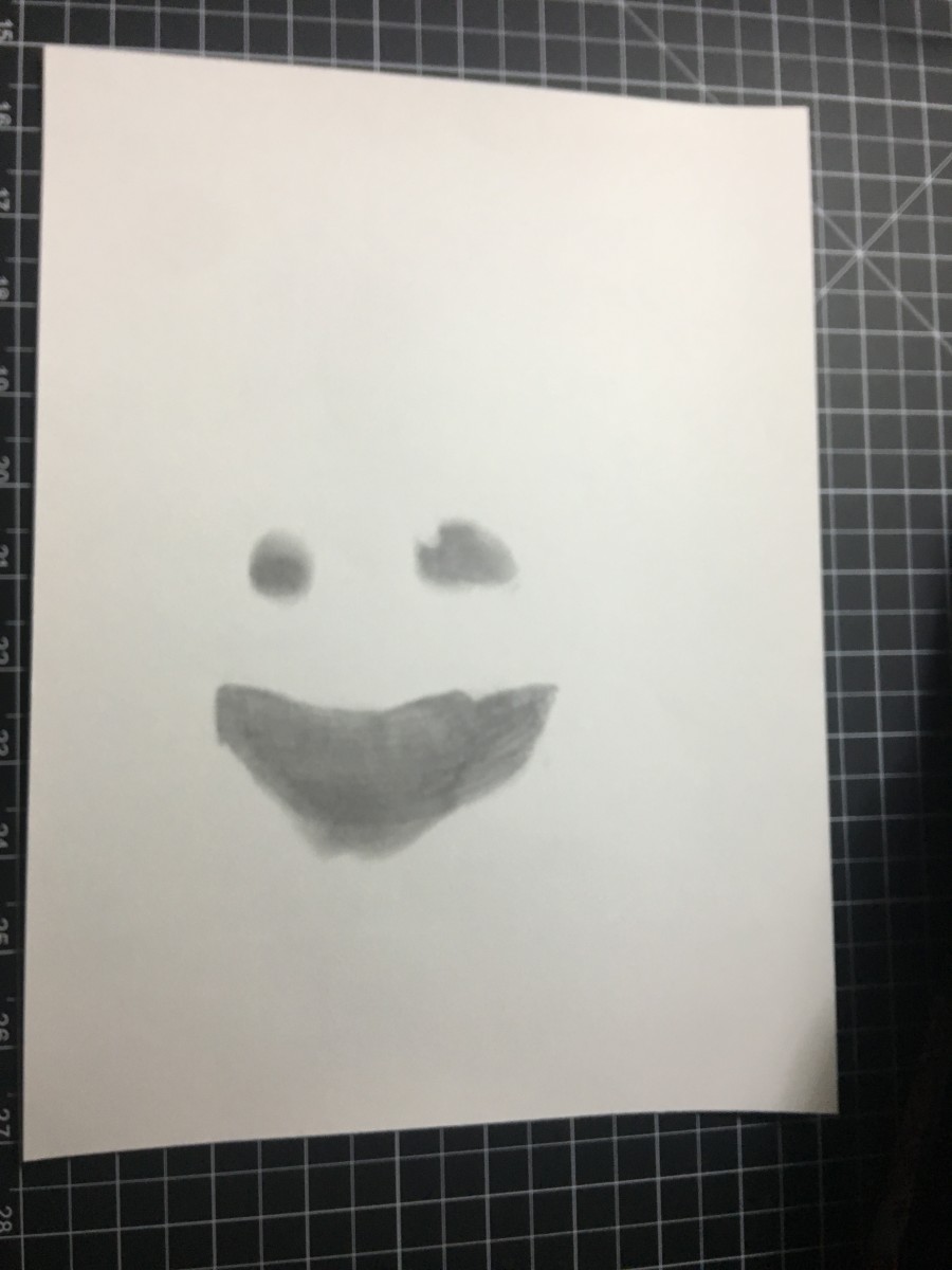
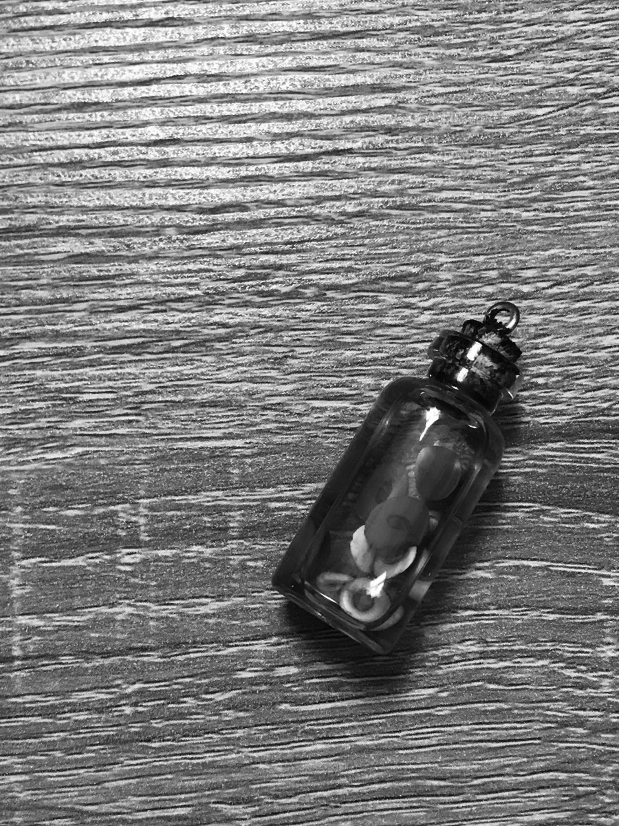
Little Bottle – I honestly feel indifferent about this one because while I actually like the image I took of it, it’s really clear as to what it is, and clearly an obvious, the sketch just turned out quiet boring, there’s nothing much to it’s look and super simplified for my taste.
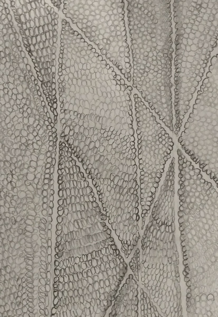
AMBIGUOUS

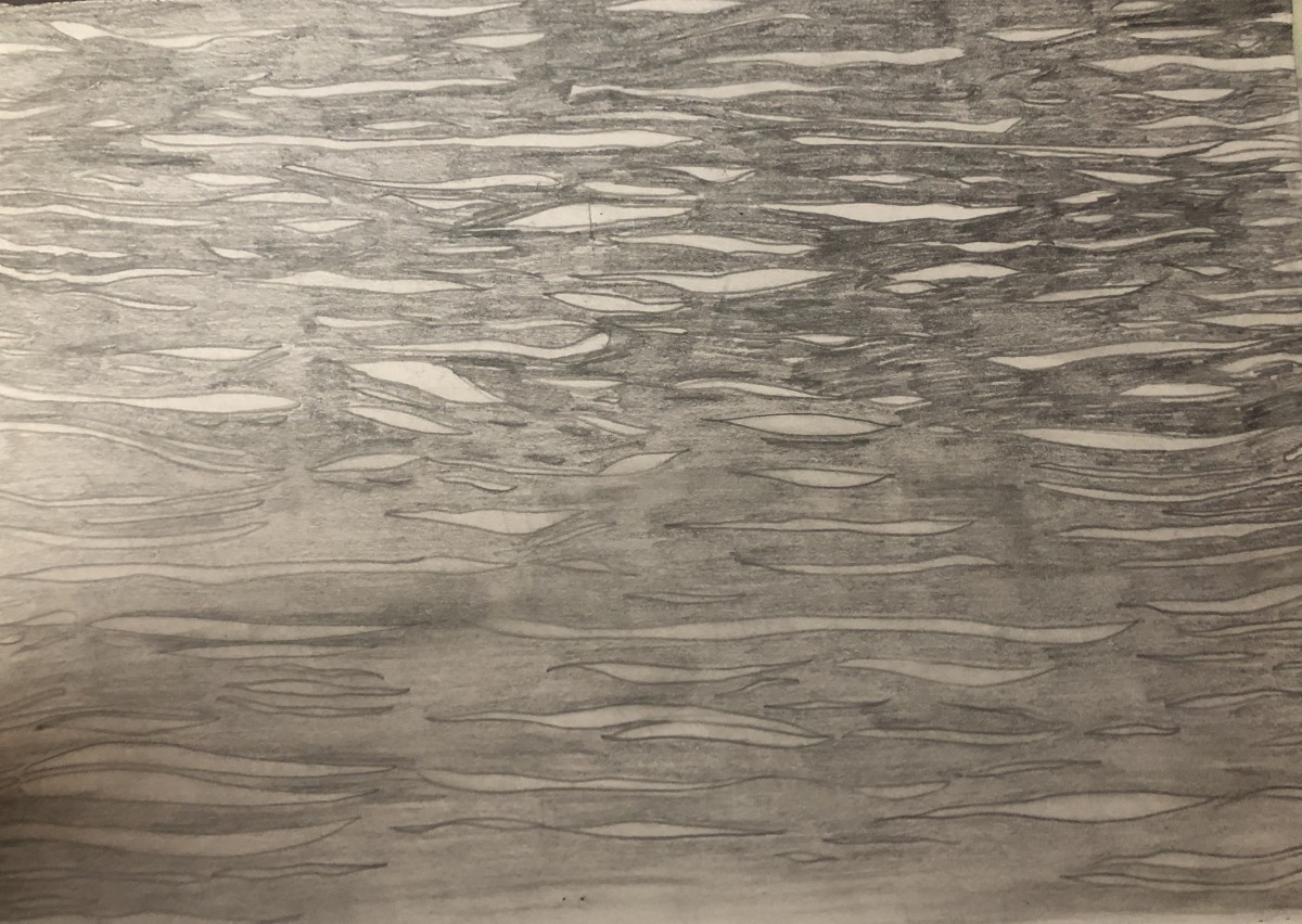
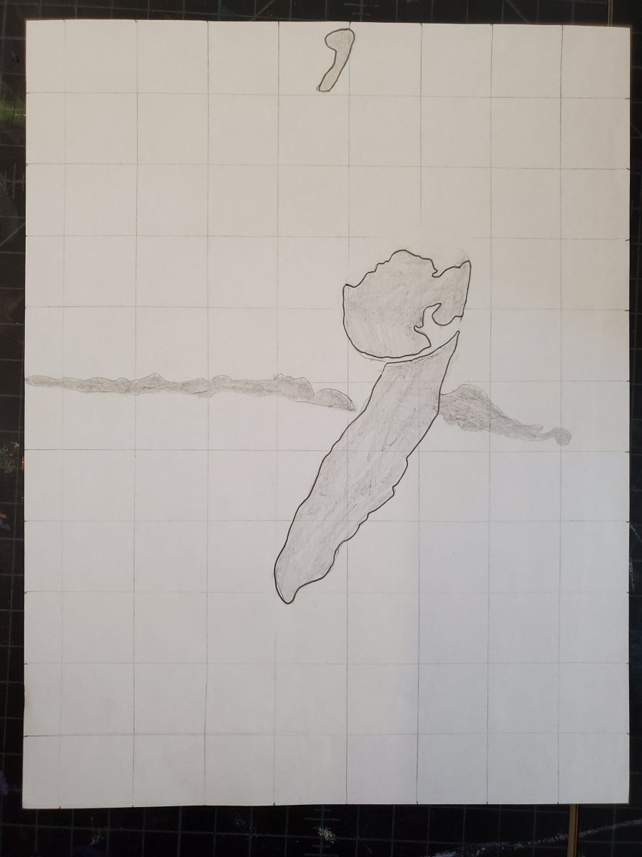
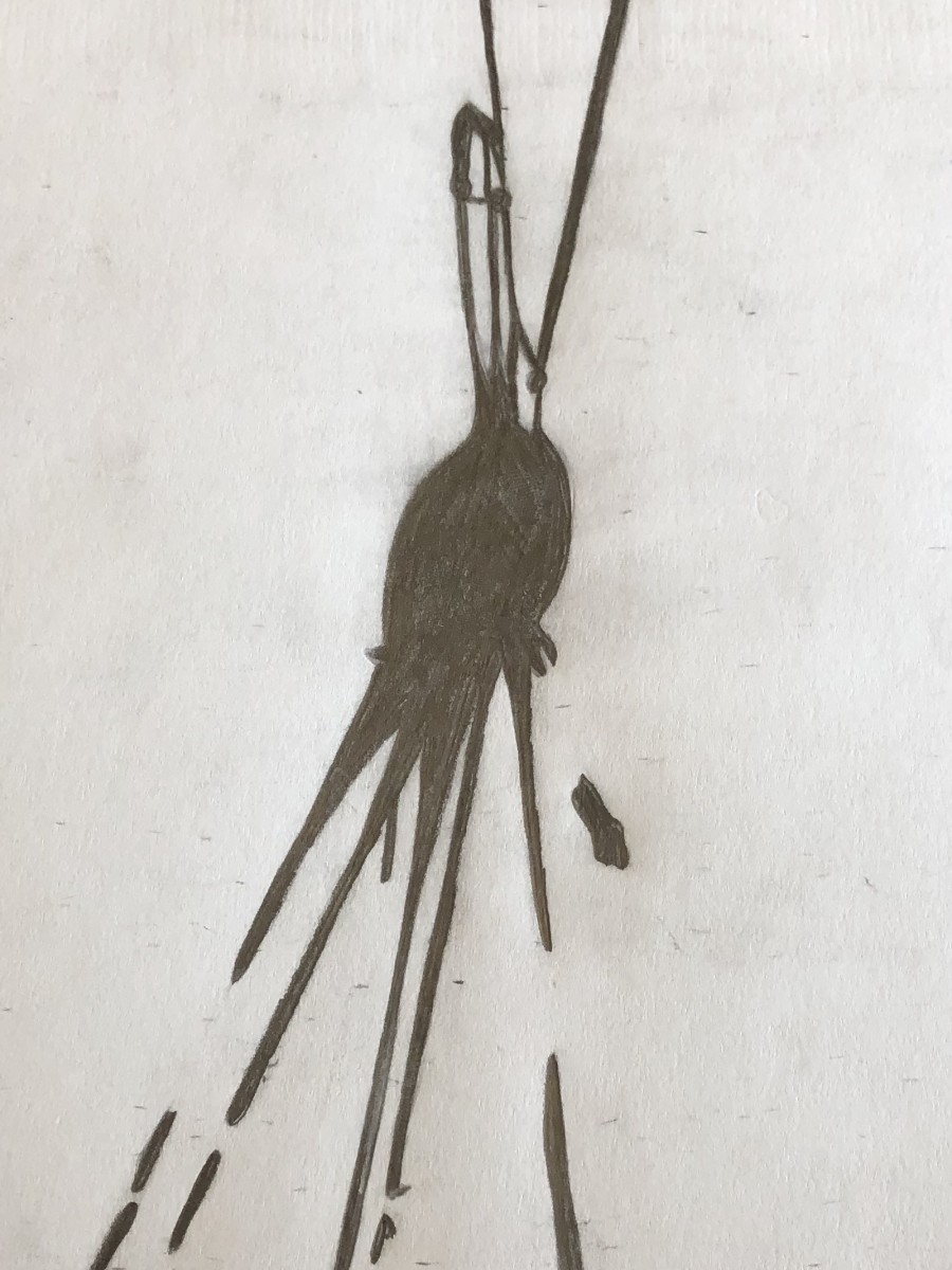
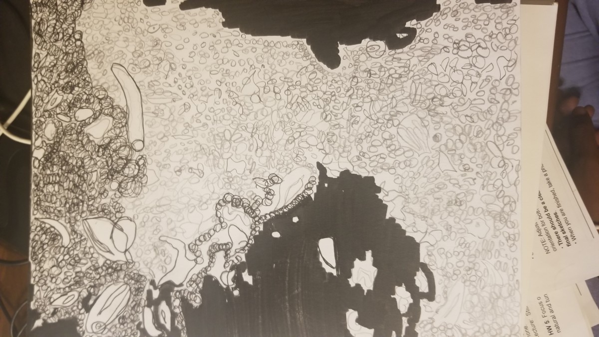
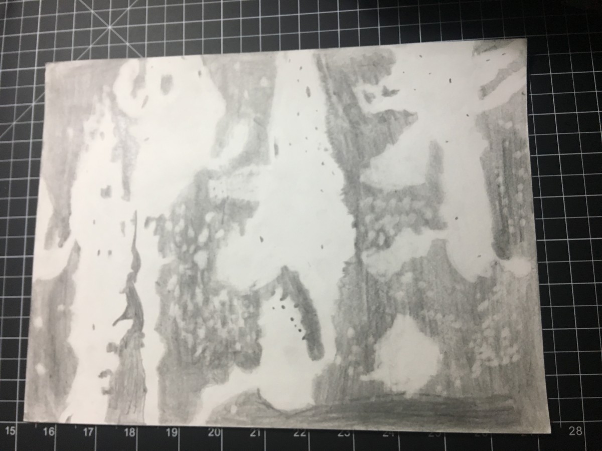
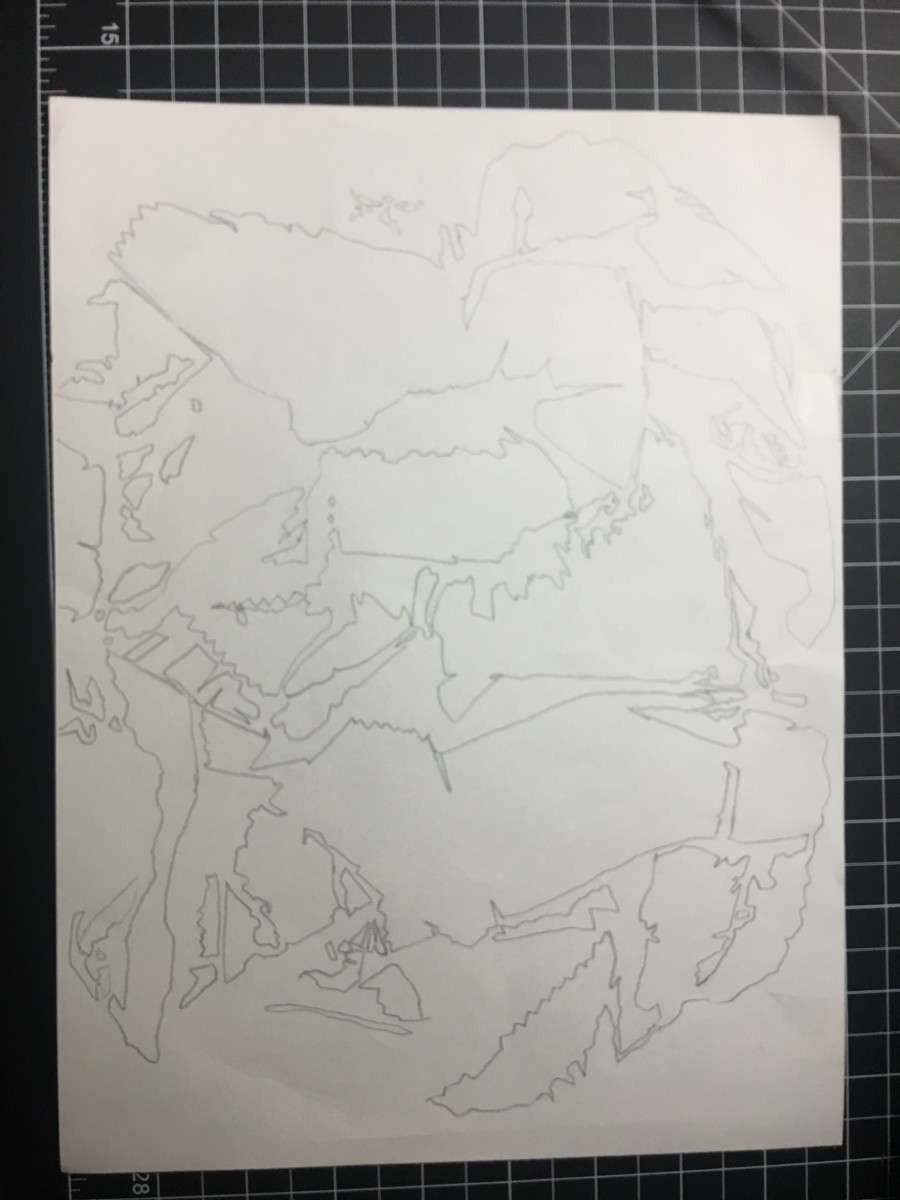
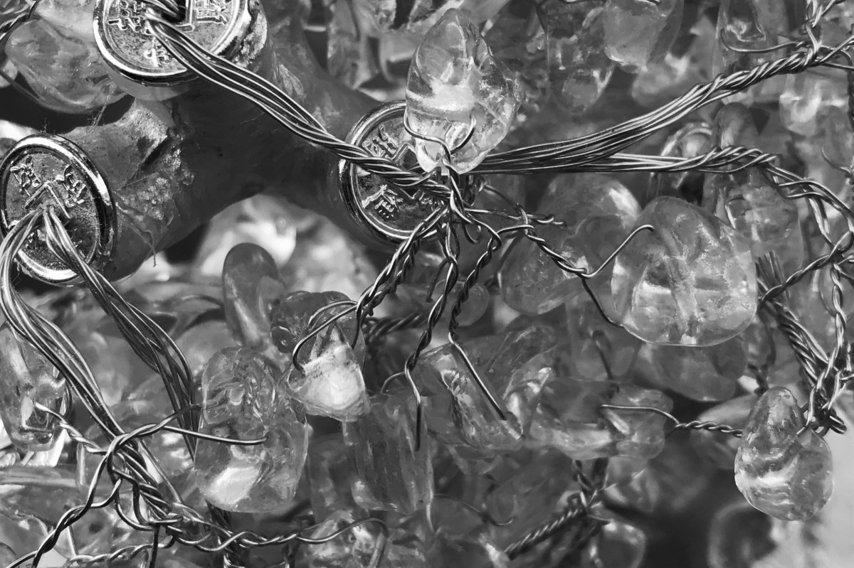
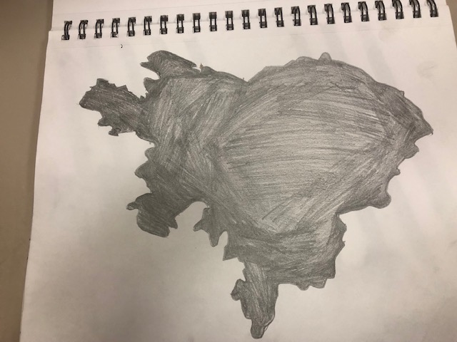
Money Tree – For this one, I was exploring what’re my options in order to create a simplified ambiguous drawing of the photo I took. I was also testing out inking at the same, trying to have control over my lines for this image specifically because it has a lot of tricky spots to ink personally. I’m actually been leaning on going for this image for my final ink drawing on Bristol board.
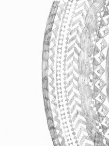
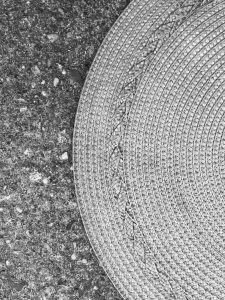
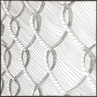
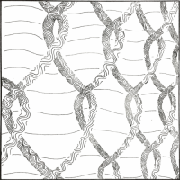
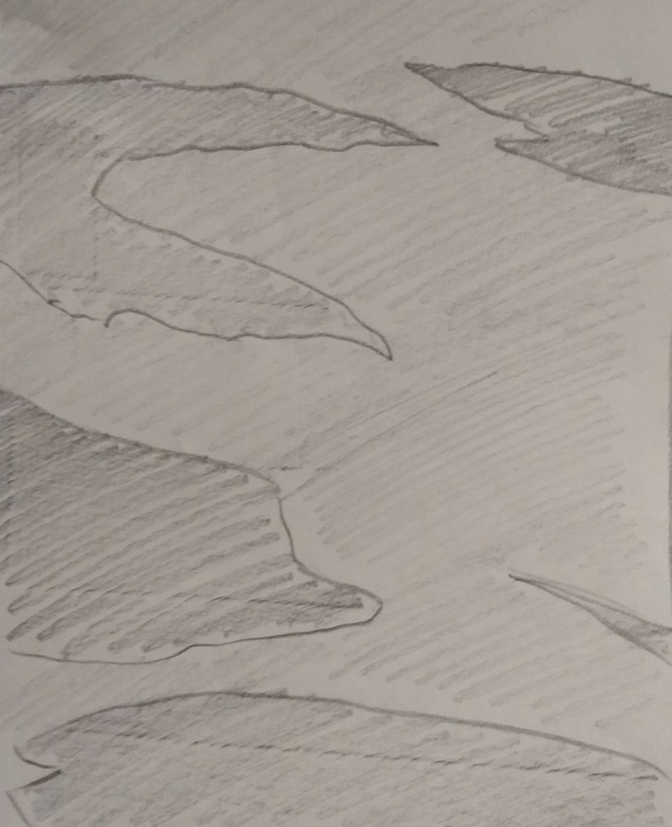
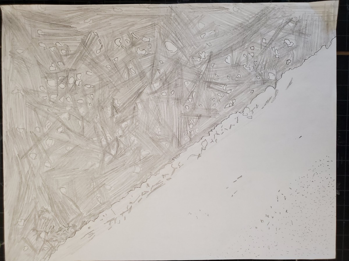
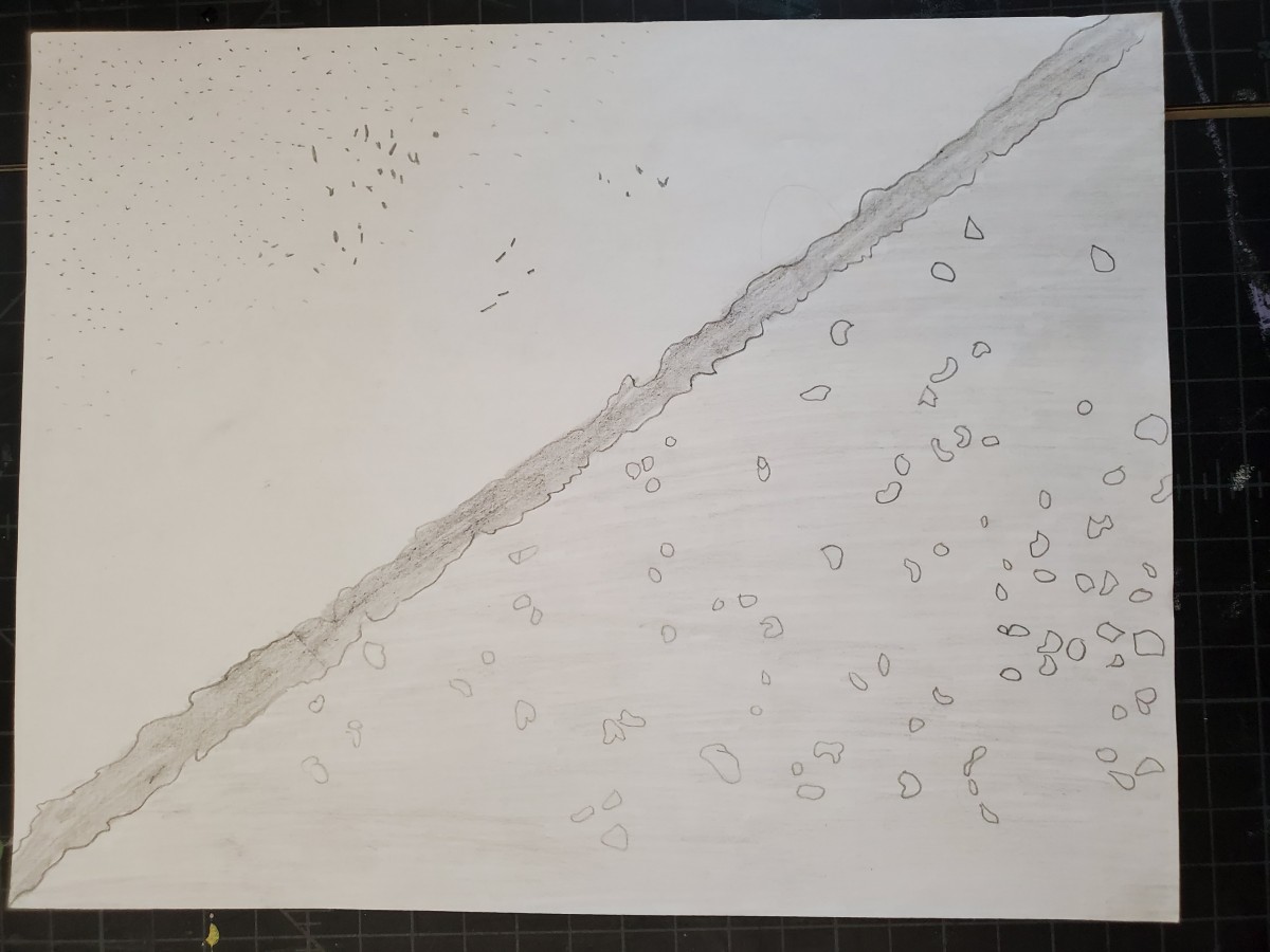
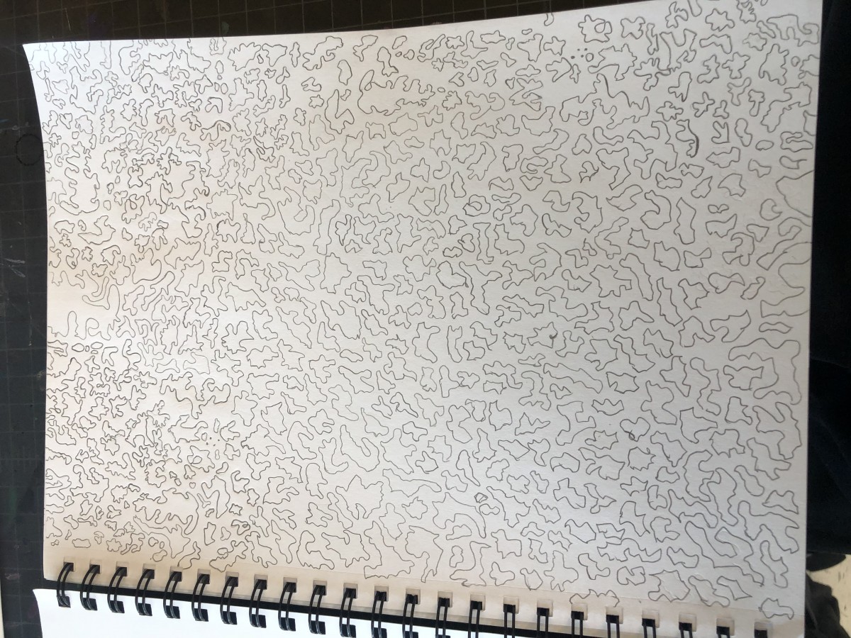
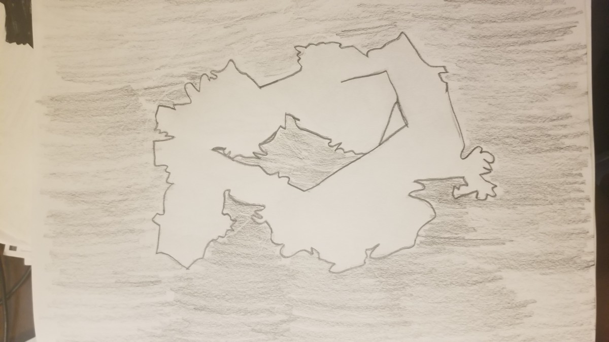
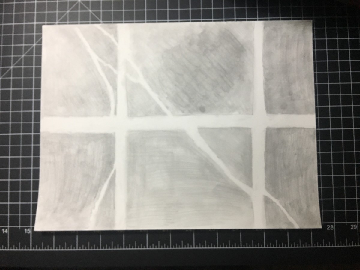
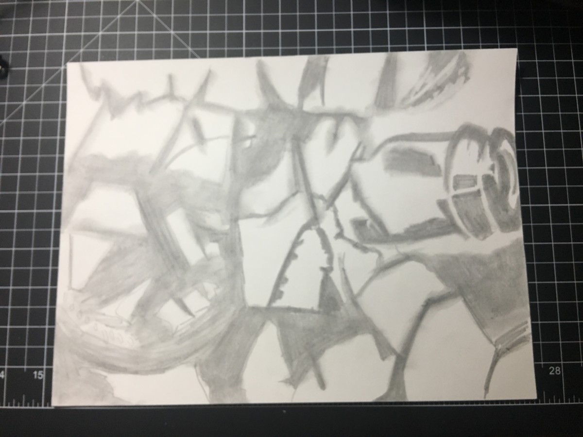
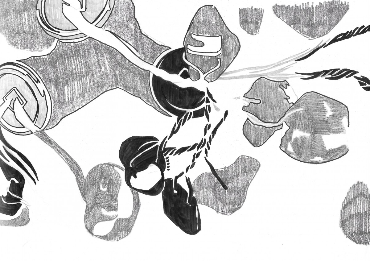
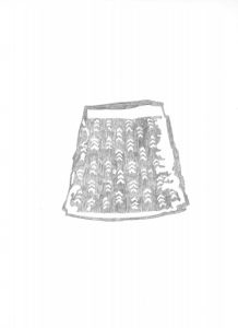
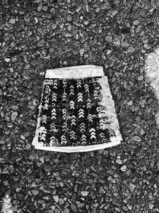
The mat – I had trouble deciding which ones to shades during the sketching process for this one, but I later on came up of making some kind of geometric patterns out of the weaving on the mat, and I personally think it didn’t turned out that bad. I also did a close up view of the mat for the sketch in order to achieve simplicity.